I usually try to avoid political or religious debates ... but as an impartial data analyst, it is possible to analyze data about something, without entering into the debate. In this blog post, I try to walk that fine line, and analyze data about the political leanings of religious groups in the US.
To get you in the mood for this blog post, here's a photo showing a few items from my friend Reggie's extensive collection of religious antiques. Over the years, I'm sure he's collected enough religious items to fill a warehouse!
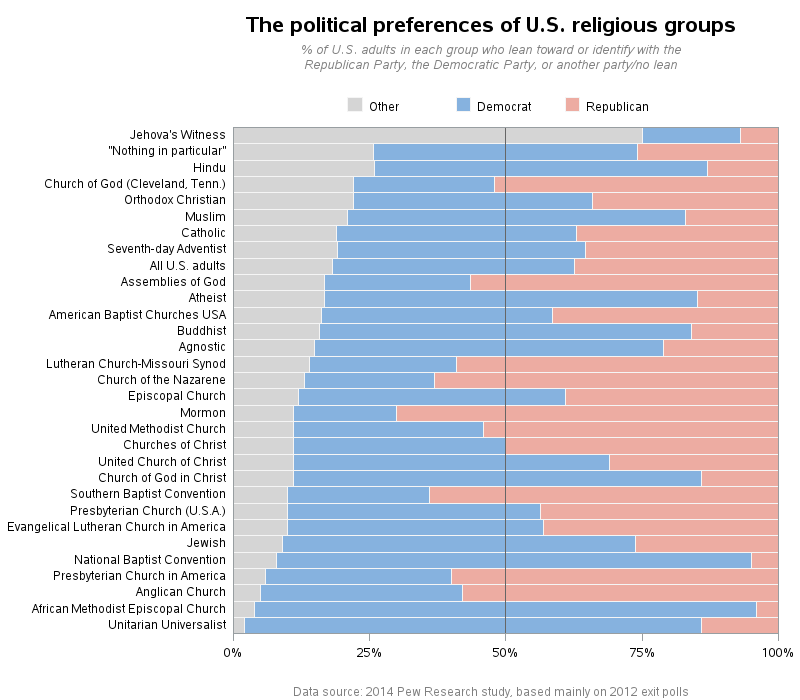
I was recently perusing a Pew Research study about U.S. religious groups and their political leanings, and saw the following graph. The graph caught my attention, and I thought I "got it" ... but later I realized I hadn't really gotten what they were trying to show.
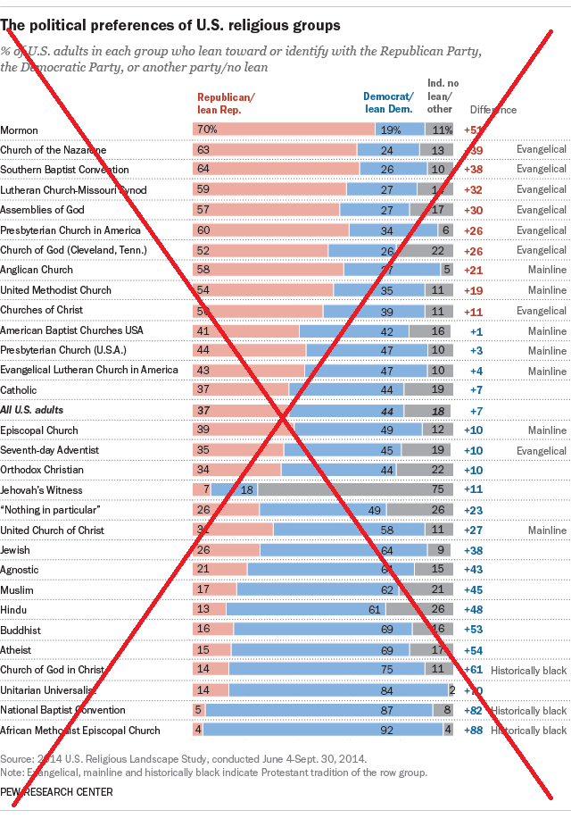
At first glance, I thought the graph showed which religion leaned most Republican and most Democrat (with an emphasis on Republican, since it seemed to be sorted that way). Upon further examination, I noticed that the graph was actually sorted by the difference between the Republican & Democrat leanings (the column of numbers to the right of the bars). I suppose that's an interesting number, but it seems like that's only important in situations like when you're analyzing a whole state and trying to determine which way it will go in a presidential election.
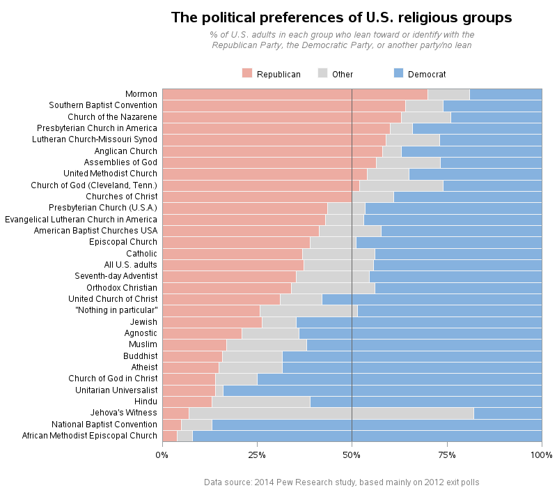
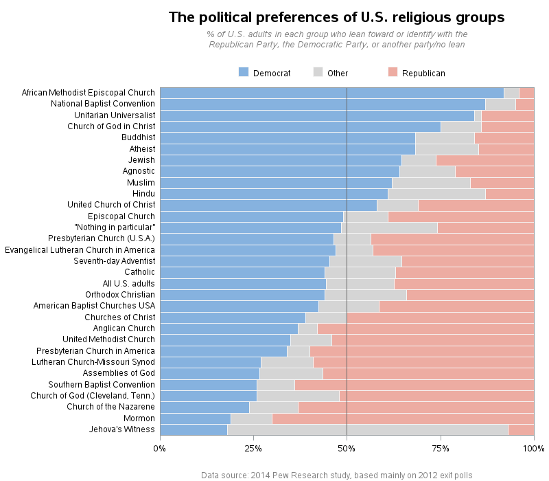
So I started working on my own graph, hoping to show what is actually important about the data (at least in my opinion). Here are some of the changes I made:
- I get rid of the difference column, and sort the bars by the percent political affiliation values.
- I generate three separate graphs - one for each political affiliation. By comparison, the Pew graph seems to be biased towards showing the Republican data well, but makes it more difficult to analyze the data for the other political parties.
- I right-justify the religion names, so it's easier to see which bars they go with.
- I normalize the values for each bar, so the bars visually go to 100, and form a nice straight non-distracting edge (whereas they used integer values, and sometimes the values don't add up to 100%, and therefore the bars look a little jagged along the right).
Here are my bar charts - if you want to see more details, click the images below to see the interactive graphs, with mouse-over text for each bar:
How do you like the new graphs? Do you think religious affiliation of voters will play a major role in the upcoming political election? What other information could perhaps be combined with the data in the graphs to make them more useful in helping predict the impact on the election? So many questions!
I'll wrap it up with a random photo of a church that my friend Joy saw on one of her trips. Can you guess the religion and probable political leanings of the people who might attend to this church? (leave your guess in a comment!)


5 Comments
I think your graphs are a big improvement. It would be even more interesting to add the percentages of the population that identify with each religion (including the "nothing in particular" category), and the percentage of each that typically vote.
St. Basil's Cathedral in Moscow?
You are correct, Austin!
The famous "onion domes..." Would it be possible to obtain the SAS code that made the cool graphs? Thanks!
Here's a link to the SAS code!
http://robslink.com/SAS/democd88/us_religious_political_leanings_info.htm