If you give an artist some tools, they can create a pretty picture. Sure, they might have a preferred tool - but they can probably do a pretty decent job no matter what you give them (paint, colored pencils, watercolor, charcoal, etc). And creating pretty graphs in SAS is no different, as the example in this blog post will show ...
But first, speaking of art, here is a picture of Lamia (one of my favorite friends from college) and her sister, with their versions of Starry Night. They certainly are two beautiful variations of the same theme, don't you think?!? (Hi Lamia!)

And now, let's talk graphs & maps! ... A while back, you might remember that I showed how to create a really nice looking map using SAS/Graph Proc GMap. GMap is SAS' traditional software for creating maps, and it was specifically made for that purpose. It gracefully and easily handles things like polygons with multiple segments, and allows you to easily specify separate datasets for your response data (values used to color the map), and the geographical map you want to plot the data on.
But some of you might not have access to SAS/Graph, and therefore you can't use Proc GMap. And although I strongly encourage you to license the SAS/Graph product, there is an alternative way to create maps using Proc SGplot (which is included in Base SAS). Proc SGplot has a polygon statement, which allows it to draw the map polygons, and fill them with colors - given the right set of inputs, these polygons can look a whole lot like a map. The trick is providing all the right inputs!
First, you'll need a dataset with the map polygons. With SAS/Graph we ship polygon maps for all the countries, which makes it very convenient. Another way to get polygons would be to import ESRI shapefiles using Proc MapImport ... but, similar to the maps, that proc is also part of SAS/Graph. In my case, since I have SAS/Graph, I'm going to use mapsgfk.us_counties.
Once you have a dataset with map polygons, you're still not quite finished. Proc GMap is built to gracefully handle map areas with multiple discrete, non-contiguous areas, having the same id (by simply assigning a unique segment number to each area). But with Proc SGplot polygons, you must have a unique id variable for each segment. Therefore, to satisfy that requirement, I create a new id variable which combines both the id and the segment number, using code like this:
data maryland_map; set mapsgfk.us_counties (where=(statecode="MD")); length id_plus_segment $50; id_plus_segment=trim(left(id))||'_'||trim(left(segment)); original_order=_n_; run; |
Now that you've got your map, you'll need to combine your response data with the map. There are multiple ways to join datasets in SAS, and I prefer using Proc Sql. The code below joins the map and response data (the data which will control the coloring of the polygons) by the id variable (there is a unique id for each county). Note that Proc Sql could possibly change the order of the observations in the map dataset, and therefore I sort it again to make sure it's in the original order.
proc sql noprint; create table combined as select unique maryland_map.*, response.idname, response.region from maryland_map left join response on maryland_map.id=response.id; quit; run; proc sort data=combined out=combined; by original_order; run; |
And now, we're pretty much ready to plot the Maryland county map, as colored polygons, using the following code:
proc sgplot data=combined noborder noautolegend; polygon x=x y=y id=id_plus_segment / group=region fill outline lineattrs=(color=cxcccc99) dataSkin=matte; styleattrs backcolor=cxcccc99 wallcolor=cxcccc99 datacolors=(cx336633 cx993333 cx848421 cx29636b); run; |
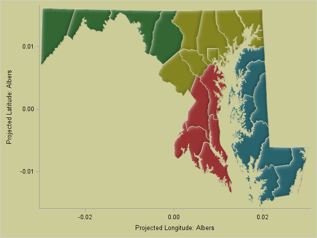
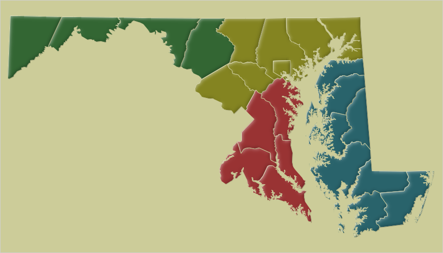
Hmm ... but we don't want those axes to show up. And we want to control the aspect ratio so that 1 unit in the x-direction is equal to 1 unit in the y-direction. And then, once the aspect ratio is correct, we want to specify a horizontal and vertical size for the png file, so that it 'fits' the map.
ods graphics on / imagename="&name" height=5.25in width=9.2in; proc sql noprint; select (max(y)-min(y))/(max(x)-min(x)) into :aspect from combined; quit; run; proc sgplot data=combined noborder noautolegend aspect=& polygon x=x y=y id=id_plus_segment / group=region fill outline lineattrs=(color=cxcccc99) dataSkin=matte; styleattrs backcolor=cxcccc99 wallcolor=cxcccc99 datacolors=(cx336633 cx993333 cx848421 cx29636b); xaxis display=none; yaxis display=none; run; |
It's looking more and more like a real map, eh?!?
And now, all we have to do is add some text labels. With my Proc GMap example, I used annotate to add the labels, since that provides the maximum flexibility. Proc SGplot provides similar annotation functionality, but with slightly different syntax. Once you create that annotate dataset, you simply specify it using the sganno= option. If you'd like to see the exact syntax for all the annotated text (including the use of unicode characters for the 'bullets' in the list, and using the "monotype corsiva" font for the fancy 'N' in the north arrow), you can check out the full SAS code at this link. And here's the final map, with the annotated text:
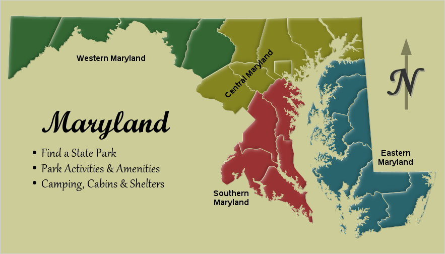
As you can see, I had to work a little harder to use Proc SGplot rather than GMap, but the results came out looking pretty good. Have you created any geographical maps with SAS software other than Proc GMap? If so, feel free to share in a comment!
Click here to see more examples about creating maps with Proc SGplot!
Dec 2017 Update: An official Proc SGmap is now available!


8 Comments
This seems to be the same method I described in my SGF 2015 paper "Mapping out SG Procedures and Using PROC SGPLOT for Mapping" (https://support.sas.com/resources/papers/proceedings15/3193-2015.pdf)?
Glanced at your paper just now - looks like they both use "ods graphics" to create polygons that look like maps ... but the details seem pretty different. I frequently say "there are always (at least) 10 ways to do the same thing in SAS!" :)
Interesting read, however ... the link to the full code does not reveal the code to create the example.
Made use of Sample 53367 (http://support.sas.com/kb/53/367.html) to get a code sample.
Ahh - thanks for the heads-up! ... I've fixed the link to my SAS code now:
http://robslink.com/SAS/democd91/maryland_sgplot_info.htm
For another example and discussion, see "Create a map with PROC SGPLOT."
This is cool - I was impressed when Sanjay showed me a US map done this way. One interesting thing which I have meant to try is that it is possible to annotate images in the polygons with SGPLOT. Now that you have inspired me (and shamed me since I've know about this for a couple of years) - I will have to try it out!
As always enjoyed reading it Rob.
Thanks!