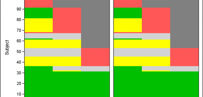
Tag: Proc SGPANEL

Data Visualization
Sanjay Matange 6
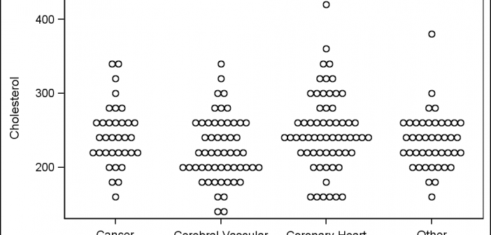
Scalable Turnip Graph

A Turnip Graph displays the distribution of an analysis variable.  The graph displays markers with the same (or close) y coordinate by displaying the markers spread out over the x-axis range in a symmetric pattern.  Recently, a question was posted on the SAS Communities page regarding such a graph. Here is an example of

Data Visualization
Sanjay Matange 16
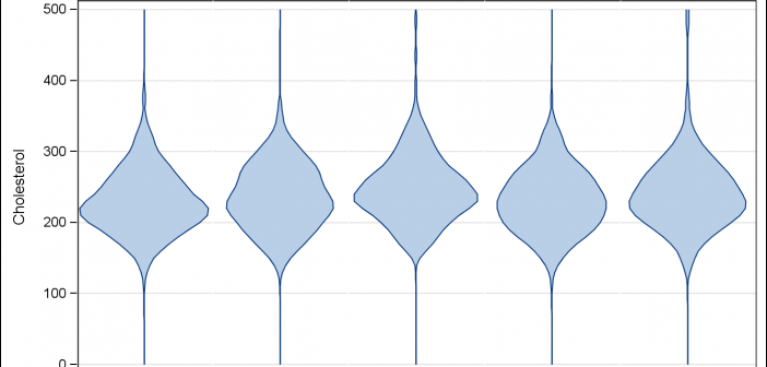
Violin Plots

Over the past month or more, I have been in a conversation with SAS user James Marcus, on creation of some new displays for visual communication of uncertainty.  These include display of densities using a "Violin" plot, "Density Strips" and more.   With his permission, I can share some of the

Data Visualization
Sanjay Matange 2
LFT Panels

CTSPedia.org is a website of Knowledge Base for Clinical and Translational Research.  On this site you can find sample graphs for statistical analysis of safety data for Clinical Research.  Graphs included in this resource have been submitted by contributors, and include a graph for Liver Function for different tests by treatment.

Data Visualization
Sanjay Matange 0
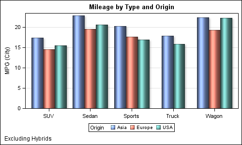
Cluster groups

The topic of cluster groups comes up often.  By cluster group I am referring to the feature in bar charts where the group values are displayed side by side. With SAS 9.3, SG Procedures support stack or cluster grouping for Bar Charts and overlay or cluster grouping for all other