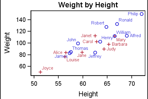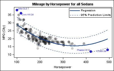
Most simple graphs generally include graphical representation of data using various plot type such as bar charts, scatter plots, histograms, box plots step plots and more. Both SG procedures and GTL provide many easy ways to create such graphs. However, for many real world use cases, we need to display related textual data in
Tag: MarkerCharacter
In the first article on Getting Started with GTL, we discussed the basics on how to create a graph using the Graph Template Language. This involved the creation of a "statgraph" template using the TEMPLATE procedure, and then associating data with the template to create the graph using the SGRENDER
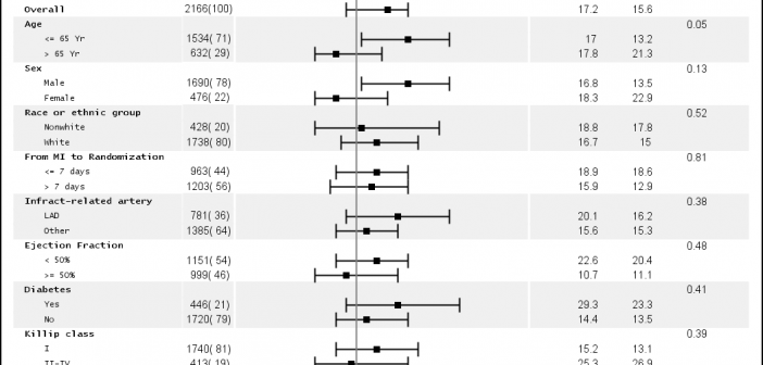
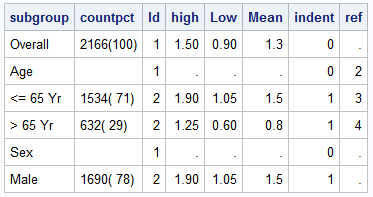
Just a few days ago our "super-duper tech support trooper" called in asking for the link to the subgrouped Forest Plot with bold headings. She was referring to this Forest Plot with Subgroups I had posted earlier. However, as you can see, while the subgroup values are indented from the subgroup headers, the headers
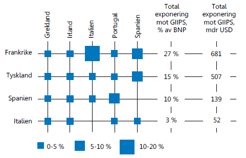
Recently, I came across an interesting graph showing Euro contries bank exposuro to GIIPS countries, as percent of GNP. Here is the graph: I thought I would see how far I can get in making a similar graph using SAS. I made up some data with response values for a Product x
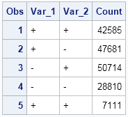
This post is a result of an intriguing question posed by a user on the SAS communities' page. How to create a bar chart where the category is a combination of two variables var_1 and var_2 (each with values of '+' and '-'), and get a X axis that shows each
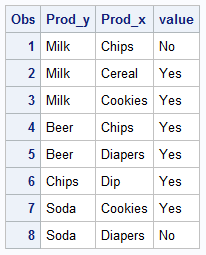
The parable of beer and diapers is often related when teaching data mining techniques. Whether fact or fiction, a Heat Map is useful to view the claimed associations. A co-worker recently enquired about possible ways to display associations or dependency between variables. One option is to show the dependency as a node
A new book from SAS Press, "Statistical Graphics Procedures by Example" co-authored by Dan Heath and I has now been published (phew!). For both Dan and I, this was our first foray into writing a book, so it was highly educational to say the least. The key idea behind the presentation
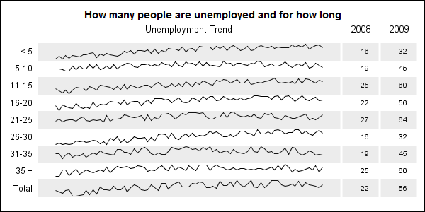
When viewing time series data, often we only want to see the trend in the data over time and we are not so concerned about the actual data values. With multiple time series plots, forecasting software can find clusters to help us view series with similar trends. Recently I saw a graph showing the trend of unemployment