Search Results: panel (76)

Data Visualization
Dan Heath 6
They go where you put them

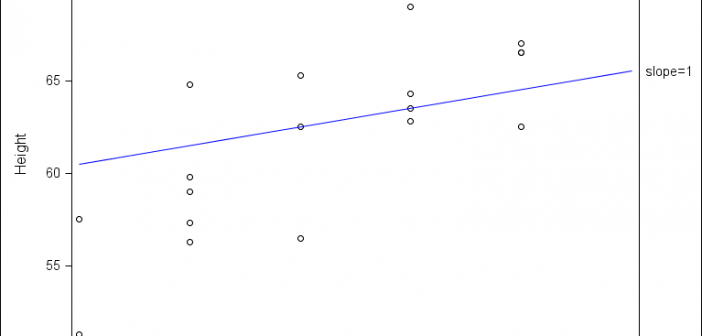
An issue that SAS/GRAPH users have wrestled with in the past has been how to put tick marks at irregular intervals on their axes. In PROC GPLOT, if you specify irregular intervals using the ORDER option on the AXIS statement, the procedure’s axis kicks into a “discrete” mode, where the

Data Visualization
Sanjay Matange 5
Adding a spark to your data

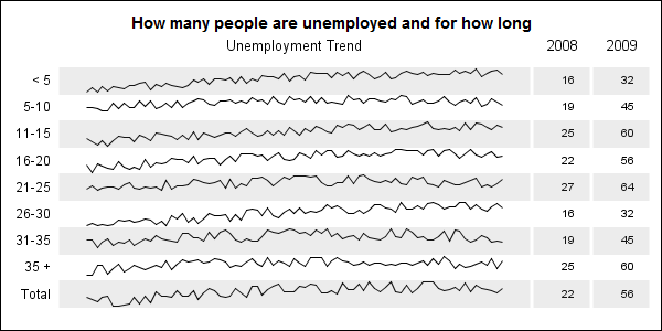
When viewing time series data, often we only want to see the trend in the data over time and we are not so concerned about the actual data values.  With multiple time series plots, forecasting software can find clusters to help us view series with similar trends. Recently I saw a graph showing the trend of unemployment

Data Visualization
Sanjay Matange 4
Hello, World

Welcome to this new blog on data visualization at SAS. Our goal is to engage with you on a discussion about analytical and business graphics for reporting and interactive applications. Our primary focus will be on ODS Graphics and related topics, but we look forward to a lively discussion on all things

1 6 7 8