Search Results: box (88)

Data Visualization
Sanjay Matange 6
Binary Response Graph

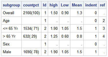
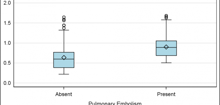
Often we need to plot the response values for binary cases of a classifier.  The graph below is created to simulate one seen at http://www.people.vcu.edu/ web site of the shock index for subjects with or without a pulmonary embolism.  In this case, the data is simulated for illustration purposes only. There

Data Visualization
Sanjay Matange 1
The HIGHLOW Plot

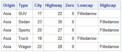
SG Procedures and GTL provide you with a large set of plot statements, such as BarChart, ScatterPlot, BoxPlot and more.  You can use them for the intended purpose, and all is well and good.  However, the real fun starts when you leverage a plot to do something that was not

Data Visualization
Sanjay Matange 0
More symbols, you say?

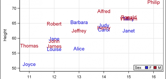
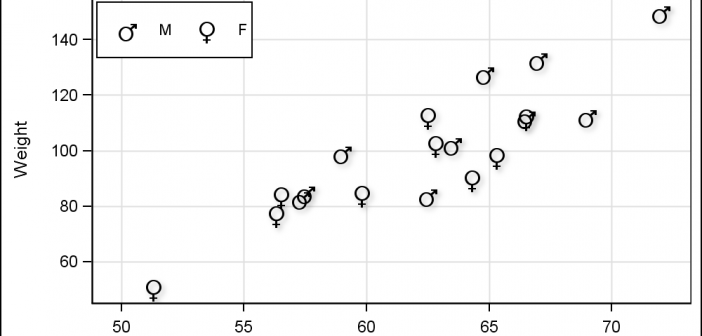
Users have often expressed the need for more marker symbols.  ODS Graphics supports over  30 scalable marker symbols, both filled and empty.  As mentioned in an earlier article, with SAS 9.4, filled markers can now have outlines and fills, and can also have special effects. Also with SAS 9.4, now you

1 5 6 7 8 9