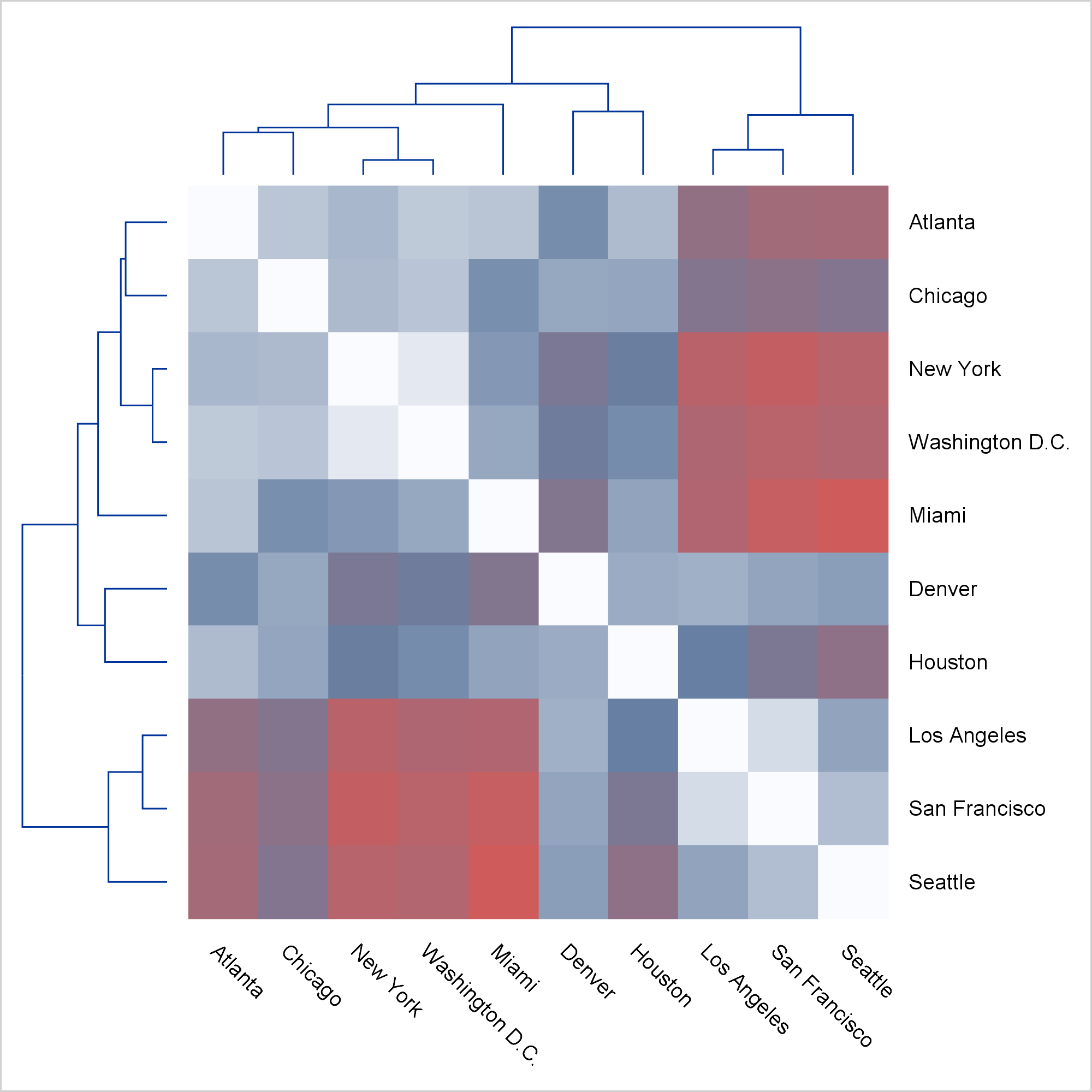
I was recently shown a graph like this one and asked if ODS Graphics could make a graph like this.
Click on graphs to enlarge.
The answer is "Yes!" While you might never want to make precisely this graph, the techniques that I use apply to many situations. First, notice that this is not a graph; it is three graphs (or four if you count the empty graph in the top left corner). It is constructed in such a way that it appears to be a single unified graph. Today, I focus on the steps needed to make a graph that is composed of multiple heterogeneous components.
When you are shown a graph and asked to construct it in ODS Graphics, several questions should run through your mind: Is it a single plot or is it composed of multiple plots? Does it only appear to be multiple plots? Can I make it in PROC SGPLOT or do I need the GTL? You can use PROC SGPLOT to make most single plots. When there are multiple heterogeneous plots, you need to use GTL. In some cases (like in the forest plot), many things appear in the plot. It might appear at first glance to be composed of multiple plots, but it is actually a single plot that you can make by using PROC SGPLOT. Here, the answer is clear. There are multiple plots in the graph, and you need to use GTL. Also, PROC SGPLOT does not currently support dendrograms.
You need to think about what graphing statements to use. Here, the graph is composed of two dendrograms and a heat map (DENDROGRAM and HEATMAPPARM statements). The HEATMAPPARM statement is used because we are providing ODS Graphics with all of the cells. Use the HEATMAP statement when you want ODS to bin and compute counts and display them as colors. In general, use a graph-typePARM statement when you want to do the computations yourself; use the corresponding statement that does not have PARM in its name when you want ODS Graphics to do the computations.
You need to think about the types of the axes. Linear axes map numbers to positions on a line using linear interpolation. Discrete axes display different values in different places on the axis. New values are displayed in the next available position. You can plot numeric variables on linear or discrete axes. Character variables are always displayed along a discrete axis. (You might want to control the position of values by using an underlying numeric variable and a linear axis. For example, see Axis tables in PROC SGPLOT and the GTL.) Here, the heat map has two discrete axes. Each aligns with a discrete axis in each dendrogram. Each dendrogram also has a linear axis. The dendrograms are plotted first, so they control the order of the values on the shared discrete axes.
You also need to think about what the data set needs to look like. When there are multiple heterogeneous plots, the data set might be composed of multiple rectangular sections, each of different sizes. Blocks of missing values fill in the open sections and make the data rectangular. Here, there are two nonmissing sections. The 10x10 heat map is constructed from 100 observations and three variables (row ID, column ID, and value). Each dendrogram is constructed from the same PROC CLUSTER output data set. It has 19 rows and three variables (that provide the name, parent, and height). The dendrogram and heat map data sets are merged in a DATA step. The 19 dendrogram observations are followed by 81 observations that contains all missing values for the three dendrogram variables. It is perfectly normal to have blocks of missing values when creating multiple heterogeneous plots in a single graph. Although it is not necessary for a small data set such as this one, care was taken to keep only the needed variables to minimize the data set size.
In the first steps, you create the data set. PROC CLUSTER creates an OUTTREE= data set that contains the instructions for drawing the dendrograms.
proc cluster data=sashelp.mileages(type=distance) method=average
     pseudo outtree=dendrogram(keep=_name_ _parent_ _height_);
   id City;
run; |
The mileages data set is a lower-triangle distance matrix. You can use PROC IML to fill in the upper triangle.
proc iml; use sashelp.mileages; read all into d[rowname=city colname=c]; d = d <> 0; d = d + d`; create d from d[rowname=city colname=c]; append from d[rowname=city]; quit; |
Each distance is displayed as a color in the heat map, and the values of the ID variable, City, are displayed in the row and column tick values. The next step reformats the 10x10 matrix into a 100x1 vector, and makes the row and column variables from the variable names. The variable names are processed (adding blanks and periods) so that they match the values of the City variable that are used to make the dendrogram.
data heatmap(keep=row col dist);
   length Row Col $ 20;
   set d;
   array m[*] _numeric_;
   row = city;
   do i = 1 to dim(m);
      call vname(m[i], col);
      col = tranwrd(col, 'New', 'New ');
      col = tranwrd(col, 'San', 'San ');
      col = tranwrd(col, 'Los', 'Los ');
      col = tranwrd(col, 'DC' , ' D.C.');
      Dist = m[i];
      output;
   end;
run; |
The following step merges the data sets.
data all; merge dendrogram heatmap; run; |
The template has a LAYOUT LATTICE that creates a ROWS=2 and COLUMNS=2 display. Inside, you provide four LAYOUT OVERLAYs, one for each cell. The first cell (top left) is empty, the second and third (top right and bottom left) contain dendrograms, and the fourth (bottom right) contains the heatmap. A series of options in the LAYOUT LATTICE and LAYOUT OVERLAY statements ensure the alignment between the component plots and produce a unified graph.
proc template;
   define statgraph HeatDendrogram;
      begingraph / designheight=defaultdesignwidth;
         layout lattice    / rowdatarange=union columndatarange=union
                             rows=2 columns=2
                             columnweights=(0.15 0.85) rowweights=(0.15 0.85);
            layout overlay; entry ' '; endlayout;
            layout overlay / xaxisopts=(display=none) yaxisopts=(display=none)
                             walldisplay=none;
               dendrogram nodeID=_name_ parentID=_parent_ clusterheight=_height_;
            endlayout;
            layout overlay / xaxisopts=(display=none reverse=true)
                             yaxisopts=(display=none reverse=true) walldisplay=none;
               dendrogram nodeID=_name_ parentID=_parent_ clusterheight=_height_ /
                             orient=horizontal;
            endlayout;
            layout overlay / yaxisopts=(display=none reverse=true
                                        displaysecondary=(tickvalues))
                             xaxisopts=(display=(tickvalues)) walldisplay=none;
               heatmapparm y=col x=row colorresponse=dist /
                             colormodel=(cxFAFBFE cx667FA2 cxD05B5B);
            endlayout;
         endlayout;
     endgraph;
   end;
run; |
The option DESIGNHEIGHT=DEFAULTDESIGNWIDTH sets the height to the default width and creates a square plot. The options ROWDATARANGE=UNION and COLUMNDATARANGE=UNION align the X axes of the heat map and the first dendrogram and the Y axes of the heat map and the second dendrogram. The options COLUMNWEIGHTS=(0.15 0.85) and ROWWEIGHTS=(0.15 0.85) reserve 15% of the horizontal and vertical axes for the dendrograms and 85% for the heat map.
The first LAYOUT OVERLAY is empty, and the ENTRY statement inserts a blank into it. Subsequent LAYOUT OVERLAY statements suppress normal axes by using options such as XAXISOPTS=(DISPLAY=NONE), YAXISOPTS=(DISPLAY=NONE), and WALLDISPLAY=NONE. Several axes are reversed from their default orientation by the REVERSE=TRUE option. Tick values appear on the right because of the DISPLAYSECONDARY=(TICKVALUES) option in the last LAYOUT OVERLAY. Tick values appear on the bottom because of the DISPLAY=(TICKVALUES) option in the last LAYOUT OVERLAY.
Options in the DENDROGRAM statement set the node ID, the parent ID, and the cluster height. The first two options in the HEATMAPPARM statement set the row and column variables. The COLORRESPONSE= option specifies the variable whose values are displayed as colors (the distance variable). The COLORMODEL=(CXFAFBFE CX667FA2 CXD05B5B) option maps the smallest distances to shades of white, intermediate distances to shades of blue, and the largest distances to shades of red. These are the colors from the three-color ramp in the HTMLBLUE style, but the colors are rearranged into a different order.
You use PROC SGRENDER to make the plot.
proc sgrender data=all template=HeatDendrogram; run; |
This all seems easy when you see the complete template. It is harder when you write it from scratch. If you want to make a graph like this, delay worrying about the axis options. My first attempts looked more like this.
proc template;
   define statgraph HeatDendrogram;
      begingraph;
         layout lattice    / rows=2 columns=2;
            entrytitle "First Attempt: Display the Three Components";
            layout overlay; entry ' '; endlayout;
            layout overlay;
               dendrogram nodeID=_name_ parentID=_parent_ clusterheight=_height_;
            endlayout;
            layout overlay;
               dendrogram nodeID=_name_ parentID=_parent_ clusterheight=_height_ /
                             orient=horizontal;
            endlayout;
            layout overlay;
               heatmapparm y=col x=row colorresponse=dist /
                             colormodel=(cxFAFBFE cx667FA2 cxD05B5B);
            endlayout;
         endlayout;
     endgraph;
   end;
run;

proc sgrender data=all template=HeatDendrogram;
run; |
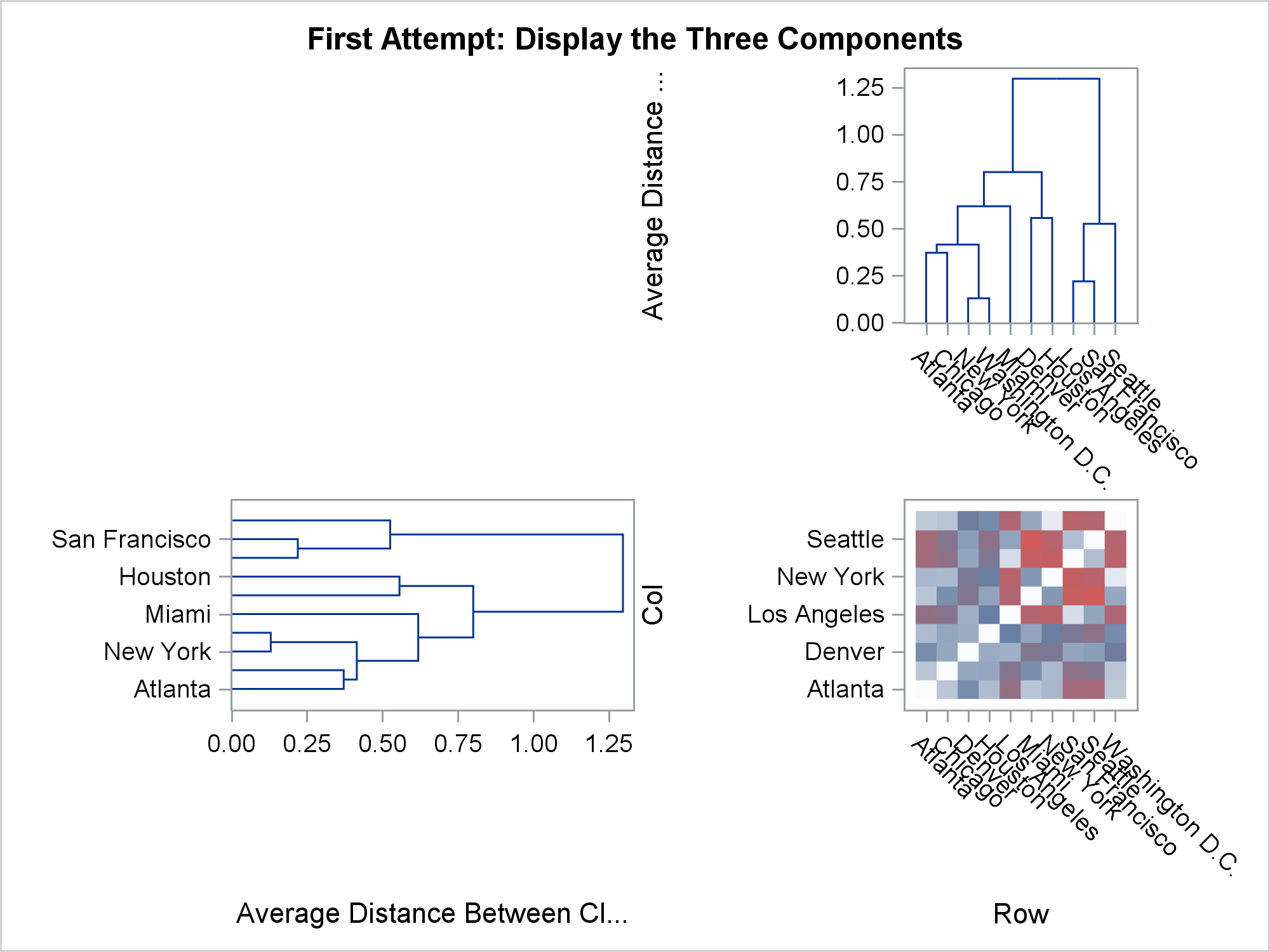
Even though this graph is not close to correct, it is a great starting point. Next, worry about aligning the discrete axes and providing some more room for the heat map (so that ticks are not thinned) by adding options to the LAYOUT LATTICE.
proc template;
   define statgraph HeatDendrogram;
      begingraph;
         layout lattice    / rowdatarange=union columndatarange=union
                             rows=2 columns=2
                             columnweights=(0.25 0.75) rowweights=(0.25 0.75);
            entrytitle "Second Attempt: Display and Align the Three Components";
            layout overlay; entry ' '; endlayout;
            layout overlay;
               dendrogram nodeID=_name_ parentID=_parent_ clusterheight=_height_;
            endlayout;
            layout overlay;
               dendrogram nodeID=_name_ parentID=_parent_ clusterheight=_height_ /
                             orient=horizontal;
            endlayout;
            layout overlay;
               heatmapparm y=col x=row colorresponse=dist /
                             colormodel=(cxFAFBFE cx667FA2 cxD05B5B);
            endlayout;
         endlayout;
     endgraph;
   end;
run;

proc sgrender data=all template=HeatDendrogram;
run; |
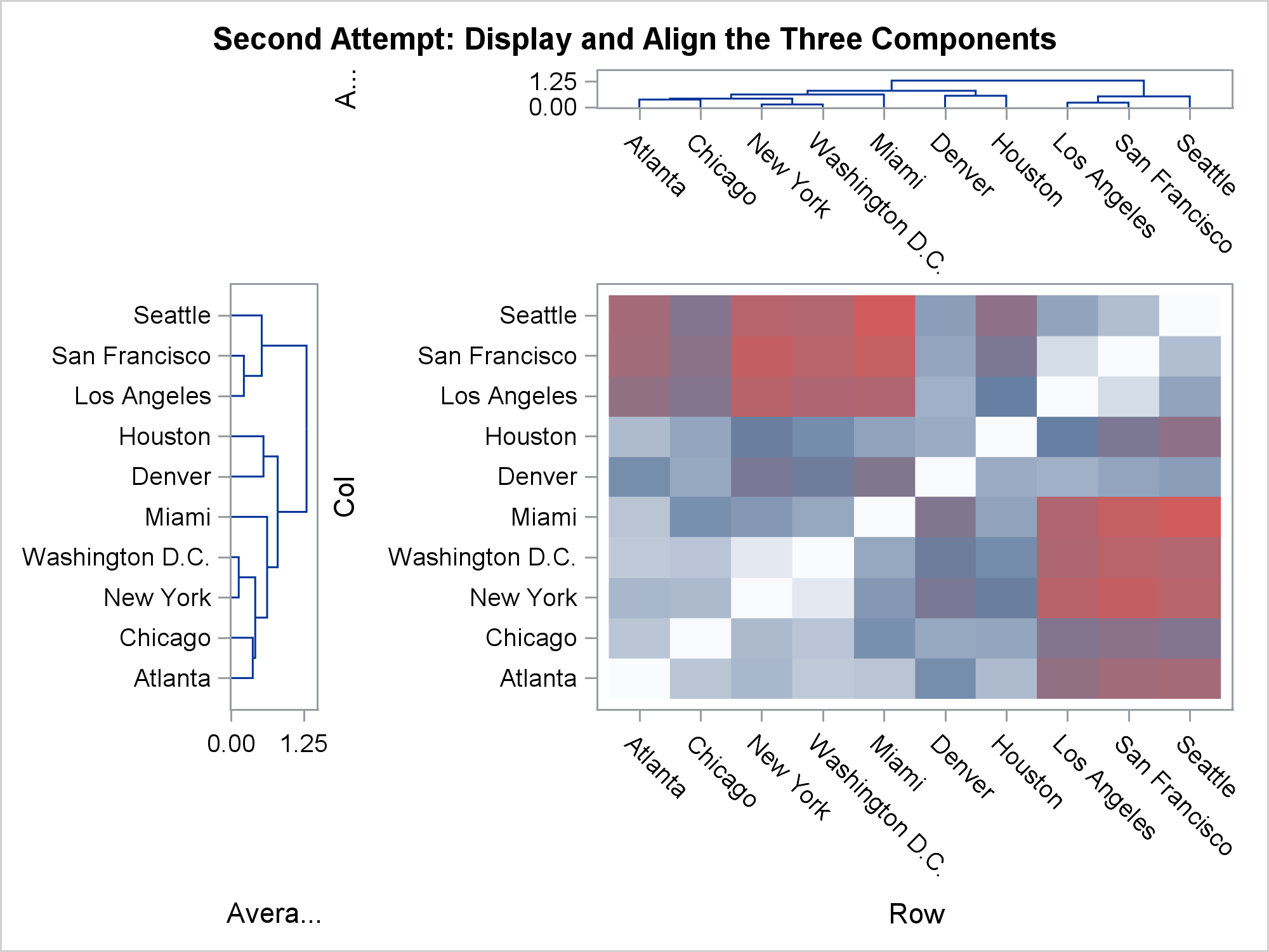
Now we that have the same ticks everywhere, it is easy to reverse axes and suppress axes, ticks, tick values, and axis labels. The last option that is needed to create the final plot is the DISPLAYSECONDARY=(TICKVALUES) option, which displays the Y tick values on the right. This is not the same as providing an independent Y2 axis. There is one Y axis, but the tick values are displayed on the right instead of on the left.
Do not worry about putting everything into the template (or PROC SGLOT step) on the first try. The steps where tick labels are not suppressed are important for ensuring that everything is properly aligned, particularly when you are working with discrete axes. Nothing about ODS Graphics is hard if you break the problem down into steps and iteratively build the final graph.


4 Comments
Thanks Warren for sharing this tip!
How did you rotate the dendrogram graph on the left?
You may add the following parameter for the second dendrogram: xaxisopts=(display=none reverse=true).
This parameter will rotate the dendrogram graph!
I updated the GTL template to draw a colorer for the heatmap, which would be more attractive for publication.
proc template;
define statgraph HeatDendrogram;
begingraph / designheight=20cm designwidth=24cm;
layout lattice / rowdatarange=union columndatarange=union
rows=2 columns=2
columnweights=(0.15 0.85) rowweights=(0.15 0.85);
layout overlay; entry ' '; endlayout;
layout overlay / xaxisopts=(display=none) yaxisopts=(display=none)
walldisplay=none;
dendrogram nodeID=_name_ parentID=_parent_ clusterheight=_height_;
endlayout;
layout overlay / xaxisopts=(display=none reverse=true)
yaxisopts=(display=none reverse=true) walldisplay=none;
dendrogram nodeID=_name_ parentID=_parent_ clusterheight=_height_ /
orient=horizontal;
endlayout;
layout overlay / yaxisopts=(display=none reverse=true
displaysecondary=(tickvalues))
xaxisopts=(display=(tickvalues)) walldisplay=none;
heatmapparm y=col x=row colorresponse=dist /
colormodel=(cxFAFBFE cx667FA2 cxD05B5B) name="ht";
/*Add colorbar here*/
continuouslegend "ht";
endlayout;
endlayout;
endgraph;
end;
run;
proc sgrender data=all template=HeatDendrogram;
run;