Axis tables enable you to combine tabular and graphical information into a single display. I love axis tables. My involvement with axis tables dates back over 30 years to their ancient predecessor, the table that contains an ASCII bar chart. In the mid 1980s, I created a table in PROC CORRESP consisting of 5 columns of numbers and a series of asterisks to graphically show the percentage column. In Version 7, as ODS was being developed and we supported destinations other than LISTING, this was among the last tables that the ODS team provided options to create. A few years ago, I happily replaced my ASCII bar chart table with a graph using axis tables. Since then, I have also added axis tables to replace tables with ASCII bar charts in PROC REG. Axis tables are also used in PROC LIFETEST and have numerous uses in clinical graphs. Sanjay has blogged about them often. Today, I am going to discuss some differences between axis tables in PROC SGPLOT and in the GTL. With only a little more work than writing PROC SGPLOT code, you can access some of the increased flexibility of the axis table in the GTL.
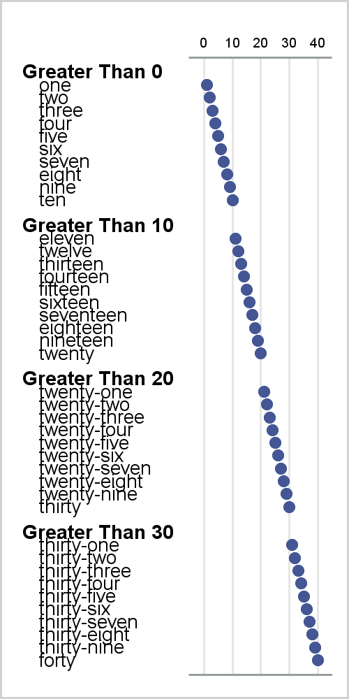
The following steps show how to make a simple graph that consists of an axis table and a scatter plot. The axis table consists of four groups of observations. Each group has a header and is separated from adjacent groups by blank lines.
data x(keep=n line value);
   do g = 1 to 4;
      Value = 'Head ';
      Line = catx(' ', 'Greater Than', 10  * (g - 1), 'A0A0'x);
      output;
      value = 'Body';
      do i = 1 to 10;
         k + 1;
         n = k;
         line = 'A0A0A0'x || put(k, words30.);
         output;
      end;
      value = 'Blank';
      line = repeat('A0'x, g - 1);
      n = .;
      if g lt 4 then output;
   end;
run;

data attrmap;
   id='mymap';    textcolor='Black';
   value='Head '; textsize=6; textweight='bold  '; output;
   value='Body '; textsize=5; textweight='normal'; output;
   value='Blank'; textsize=1;                      output;
run;

ods graphics on / height=500 width=250;
proc sgplot data=x noborder noautolegend dattrmap=attrmap tmplout='temp.temp';
   yaxistable line / position=left textgroup=value textgroupid=mymap;
   scatter y=line x=n / x2axis markerattrs=(symbol=circlefilled);
   yaxis reverse display=none;
   xaxis display=(noticks nolabel novalues);
   x2axis grid display=(noticks nolabel) valueattrs=(size=6px);
   label line='00'x;
   scatter y=line x=n / markerattrs=(size=0);
run; |
The TMPLOUT= option writes the underlying template that PROC SGPLOT creates to a file. After adding indentation, the template is as follows:
proc template;
   define statgraph sgplot;
      begingraph / collation=binary;
         DiscreteAttrVar attrvar=MYMAP_VALUE var=VALUE
         attrmap="__ATTRMAP__MYMAP";
         DiscreteAttrMap name="__ATTRMAP__MYMAP" /;
            Value "Head"  / textattrs=(color=CX000000 weight=bold);
            Value "Body"  / textattrs=(color=CX000000 weight=normal);
            Value "Blank" / textattrs=(color=CX000000 weight=normal);
         EndDiscreteAttrMap;
         layout lattice / columnweights=preferred rowweights=preferred
             columndatarange=union rowdatarange=union columns=2;
            Layout Overlay /  yaxisopts=(reverse=true display=none
                              type=discrete) walldisplay=none
                              yaxisopts=(display=none griddisplay=off
                              displaySecondary=none)
                              y2axisopts=(display=none griddisplay=off
                              displaySecondary=none);
               AxisTable Value=Line Y=Line / labelPosition=min
                         textGroup=MYMAP_VALUE Display=(Label);
            endlayout;
            layout overlay / cycleattrs=true walldisplay=(fill)
                             xaxisopts=(display=(line) type=linear)
                             yaxisopts=(reverse=true display=none
                             type=discrete)
                             x2axisopts=(display=(tickvalues line)
                             TickValueAttrs=(Size=6px) type=linear
                             griddisplay=on);
               ScatterPlot X=n Y=Line / subpixel=off primary=true
                           xaxis=x2 Markerattrs=(Symbol=CIRCLEFILLED)
                           LegendLabel="" NAME="SCATTER";
               ScatterPlot X=n Y=Line / subpixel=off Markerattrs=(Size=0)
                           LegendLabel="" NAME="SCATTER1";
            endlayout;
         endlayout;
      endgraph;
   end;
run; |
You can use it to create the same graph by submitting the template and calling PROC SGRENDER:
proc sgrender data=x template=sgplot; label line='00'x; run; |
The PROC SGPLOT YAXISTABLE statement is as follows:
yaxistable line / position=left textgroup=value textgroupid=map; |
The statement in the PROC SGPLOT graph template is:
   AxisTable Value=Line Y=Line / labelPosition=min
textGroup=MAP_VALUE Display=(Label); |
The YAXISTABLE statement requires one variable. This is the variable that is displayed in the graph. In contrast, the AXISTABLE statement in the GTL has two variables. The Y= option specifies the Y axis coordinates. By default, PROC SGPLOT sets this option in the template to specify the Y= variable from the primary plot, which in this case is the first SCATTER statement. In the GTL, you specify the Y= option before the slash. In PROC SGPLOT, you can specify this option after a slash.
The PROC SGPLOT example works because every line--every Y= value in the GTL--has a unique value. In particular, the first blank line consists of one nonbreaking space ('A0'x), the second blank line consists of two nonbreaking spaces ('A0A0'x), and the third blank line consists of three nonbreaking spaces ('A0A0A0'x). You must use unique patterns of nonbreaking spaces for this example to work. This could be come problematic in more complicated reports in which some lines might be the same.
PROC SGPLOT generates a LAYOUT LATTICE block that contains two LAYOUT OVERLAY blocks. The option COLUMNWEIGHTS=PREFERRED specifies that ODS Graphics is free to set the width of the axis table and the scatter plot based on the width of the axis table. In the GTL (but not in PROC SGPLOT) you can explicitly control the width by specifying a vector of column weights. For example COLUMNWEIGHTS=(0.75 0.25) creates an axis table that occupies 75% of the vertical space. For advanced uses of the axis table, you might want to explicitly control the axis table width, which means you need to use the graph template. Fortunately, PROC SGPLOT writes graph templates for you that you can save and modify.
This step creates a modified input data set:
data y; set x; RowID + 1; if value eq 'Blank' then line = ' '; run; |
This data set has a RowID variable that contains the row number. Blank lines consist of ordinary blanks and are no longer unique.
You can use a DATA step to edit the graph template. The following step changes the name to 'MyAxisTemplate', specifies weights to give both the axis table and the scatter plot 50% of the vertical space, and modifies the three Y=LINE options to specify Y=RowID.
data _null_;
   infile 'temp.temp';
   input;
   _infile_ = tranwrd(_infile_, 'sgplot', 'MyAxisTemplate');
   _infile_ = tranwrd(_infile_, 'columnweights=preferred',
                                'columnweights=(0.5 0.5)');
   _infile_ = tranwrd(_infile_, 'Y=Line', 'Y=rowid');
   call execute(_infile_);
run;

proc sgrender data=y template=MyAxisTemplate;
   label line='00'x;
run; |
Except for the change in width, these steps create the same graph as is shown above. By modifying the graph template, you can control the width of each panel, which gives you greater flexibility in making complicated reports.
For more information about using CALL EXECUTE to modify graph templates, see the free web book Advanced ODS Graphics Examples.
The preceding examples work as they do because they have a discrete Y axis. The following example creates a first plot that has a TYPE=DISCRETE Y axis and a second plot that has a TYPE=LINEAR Y axis:
data x(keep=n line);
   do g = 1 to 4;
      do i = 1 to 10;
         k + 1;
         n = k;
         line = put(k, words30.);
         output;
      end;
      line = repeat('A0'x, g - 1);
      n = .;
      if g lt 4 then output;
   end;
run;

data y;
   set x;
   rowid + 1;
   line = compress(line, 'A0'x);
run;

proc sgplot data=x noborder tmplout='a';
   yaxistable line / position=left;
   scatter y=line x=n;
   yaxis reverse display=none;
   xaxis display=none;
   label line='00'x;
run;

proc sgplot data=y noborder tmplout='b';
   yaxistable line / position=left;
   scatter y=rowid x=n;
   yaxis reverse display=none;
   xaxis display=none;
   label line='00'x;
run; |
The RowID variable in the Y data set contains the row number. The SCATTER Y=ROWID variable sets the Y= option in the AXISTABLE statement in the graph template. The TYPE=DISCRETE AXISTABLE statement is the following:
AxisTable Value=line Y=line / labelPosition=min Display=(Label); |
The TYPE=LINEAR AXISTABLE statement is:
AxisTable Value=line Y=rowid / labelPosition=min Display=(Label); |
Using a numeric row number as the Y coordinate variable in your scatter plot can make it easier to construct axis tables in PROC SGPLOT. This works well when you are not displaying Y axis tick values.


1 Comment
Pingback: Advanced ODS Graphics: Steps to think about when creating a graph - Graphically Speaking