Getting consistent group colors across different data sets for a graph is a common topic of interest. Recently a user wrote in to ask how to ensure that specific groups "values" for a bar chart get specific colors. The group values may arrive in different order, or some may be missing entirely in the data from day to day.
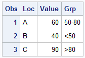
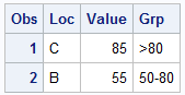 This is an important issue, and the SAS 9.3 Discrete Attributes Map feature was specifically created to address this issue. On the right are two data sets. Data Set #1 on the far right has 3 observations for Locations A, B and C with response values and group values based on the response. Data Set #2 has 2 observations for Locations C and B with response and group. Notice the locations and group values are in different order, and the group "<50" is missing entirely in data set # 2.
 By default, when colors are assigned by group values, the colors from the GraphData1-GraphData12 elements of the active style are used to color the bars. The style elements are sequentially assigned to each group in the order they occur in the data.
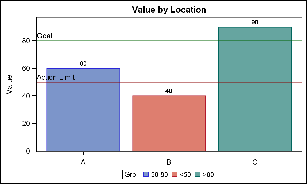
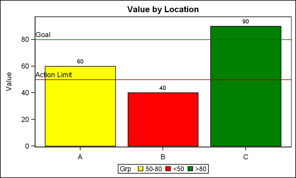
In the first graph on the right, group value "50-80" is read first, and hence gets the color from GraphData1, which is blue. The Location values on the X axis are shown in Data order.
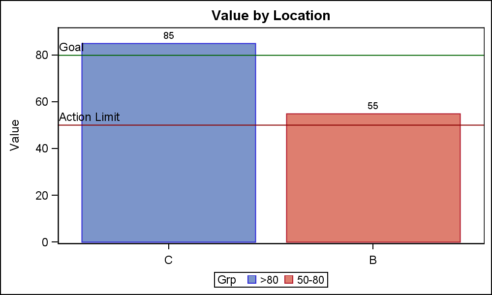 In the second graph on the right, the first Location in the data is "C" with a group values of ">80", so ">80" gets the blue color as shown in the graph and the legend. In such cases, where the data order and content can change from day to day for the same graph, it is necessary to retain the same color assignments across the graphs.
This is solved by using the Attributes Maps as previously described in my article on Discrete Attribute Maps.
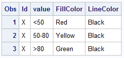 First, we create a discrete attributes map data set. This is like a format and the data set is like the SGAnnotate data set, with specific column names. "ID" specifies a name for the attr map, and a data set can have multiple ids for multiple maps. This id is used to specify the map to be used in the VBar statement. For each formatted "Value" in the data, we can specify the specific attributes to be used.
Here we have specified the FillColor and the LineColor. The value "<50" gets the fill color of red, and linecolor of black and so on. Additional attributes like line pattern or symbols can also be specified. The "Value" in the attr map should contain the formatted value.
 Now, we run data set #1 with the modified program shown below with the discrete attribute map data set provided in the DATTRMAP option on the procedure statement. We also provide the map id in the VBAR statement. These options are shown in bold in the code below. Note, each bar is now colored by the fill color specified in the attr map for each group value.
SAS 9.3 SGPLOT code:
title 'Value by Location';
proc sgplot data=bar3 dattrmap=attrmap;
vbar loc / response=value group=grp datalabel nostatlabel attrid=X;
refline 50 / lineattrs=(color=darkred) label='Action Limit' labelloc=inside labelpos=min;
refline 80 / lineattrs=(color=darkgreen) label='Goal' labelloc=inside labelpos=min;
xaxis display=(nolabel) discreteorder=data;
run;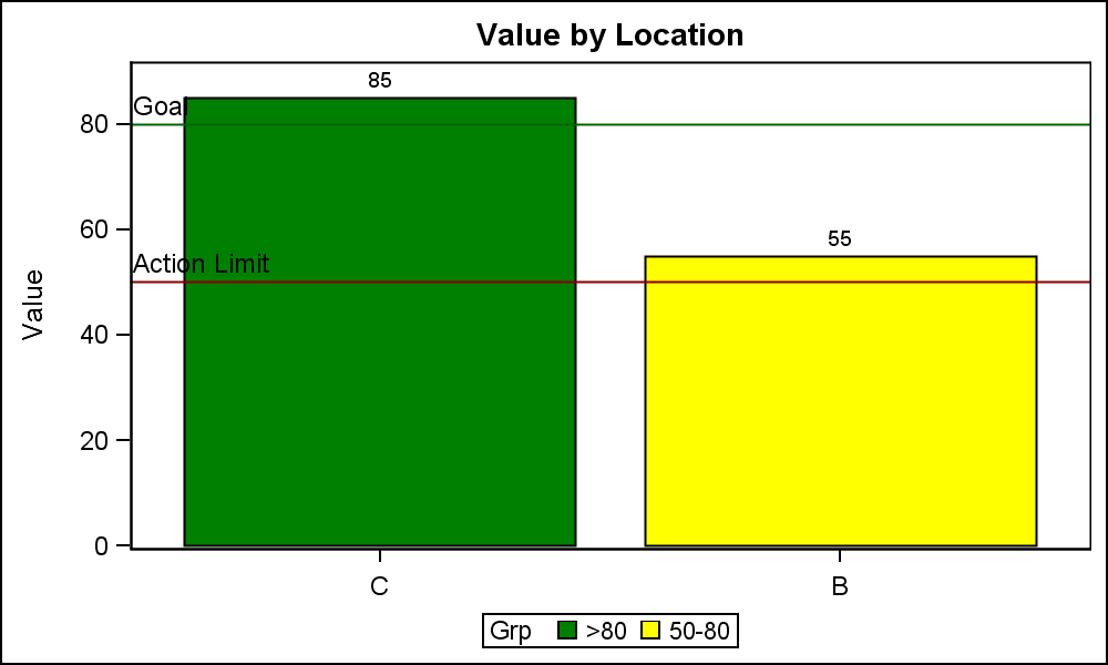
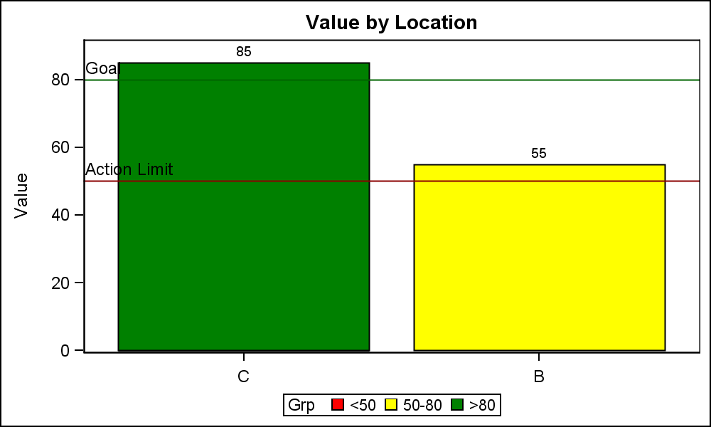
The same program can be run with Data Set #2 to create the graph shown on the right. Note, in the legend of the two graphs, the colors assigned for each group are exactly the same, regardless of the order of the data or the presence or absence of any group value. The values in the legend are in the order the group values are encountered in the data. So, the values are not in the same order. The legend values can be sorted if needed.
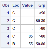 Often it is necessary to include all values in the legend, even if some values may be missing in today's data. In the graph on the right, I have included all possible group values in the data in the right order to ensure we can get all the values in the legend.
The presence of all groups in the correct order (in the legend) ensures that all group values are in the legend in the order we want. We know this data as it is in the Attr Map already, so we can pre-pend these additional observations into the data set as shown on the right.
Here is the final graph. Note, the colors are consistent across all graphs and the legend contains all three expected group values even though Data Set #2 does not contain the "<50" group.
 Such graphs are common across all domains including financial and clinical, where we always want the same treatments to be represented in the graph with the same color or symbol across different data set.
Full SAS 9.3 SGPLOT code: GroupColors_93_Fmt


14 Comments
These attribute maps are great. Thank you for them! Without attribute maps, when I wanted to traffic-light a scatterplot into low, medium, or high values, I would resort to splitting the y variable into three variables: y_low y_medium and y_high. It always felt foolish, but it worked. Attribute maps make this much easier and clearer.
Is there a way to utilize template colors in the attributes map dataset (e.g., graphData1, graphData2, etc) instead of specific colors (e.g., Red, Yellow, Green, etc)? Thanks.
Yes. The various attribute columns (like FillColor) will take a color value or a Style-attribute. See the documentation.
The last sgplot procedure in the code below gives me the following warnings and then prints the bars in grayscale. Am I specifying the style-attribute incorrectly? Thanks.
WARNING: Invalid color "GraphData1:Color" specified. The color will be mapped to gray.
WARNING: Invalid color "GraphData2:Color" specified. The color will be mapped to gray.
WARNING: Invalid color "GraphData2:Color" specified. The color will be mapped to gray.
proc template;
DEFINE Style testStyle;
parent = styles.journal;
class graphData1/ color=CX1797FF; *Blue;
class graphData2/ color=CXD67F19; *Orange;
class graphData3/ color=CX00447B; *Dark blue;
END;
run;
data cars;
set sasHelp.cars (where = (make in ('Toyota' 'Ford' 'Jaguar')) keep = make);
fordFlag = (make = 'Ford');
run;
proc sql;
CREATE table makesDistinct AS
SELECT distinct make FROM cars;
quit;
data attrMap;
set makesDistinct;
length fillColor $25.;
id = 'a';
value = make;
if make = 'Ford' then fillColor = 'Blue';
else fillColor = 'Red';
output;
id = 'b';
value = make;
if make = 'Ford' then fillColor = 'GraphData1:Color';
else fillColor = 'GraphData2:Color';
output;
run;
proc sort data=attrMap; by id value; run;
ods listing style=testStyle;
title "Default template colors";
proc sgplot data=cars noautolegend;
vbar make / group = make;
run;
title "ID = a (specifying 'Red' and 'Blue' as fillColor in attrMap)";
proc sgplot data=cars dAttrMap=attrMap noautolegend;
vbar make / group=make attrId=a;
run;
title "ID = b (specifying 'GraphData1:Color' and 'GraphData2:color' as fillColor in attrMap)";
proc sgplot data=cars dAttrMap=attrMap noautolegend;
vbar make / group=make attrId=b;
run;
Using "GraphData1:Color" will not work in the FillColor column. To use style elements, you have to use the FillStyle column. With SAS 9.4M2 this has been renamed to FillStyleColor, but the old name should still work. FillStyle="GraphData1";
This works in SAS 9.3! Thank you.
For bar charts (PC SAS 9.3) using sgplot, does the y axis always start at zero? How can you change the y axis so it does not start at zero. I want this to happen dynamically each time the graph is produced.
The response axis (Y for VBAR) has a baseline intercept that is zero by default. If the response data has positive and negative values, the bars are drawn to the baseline. This can be be changed using the BaseLineIntercept option.
Thanks for this! Can a discrete attribute map be applied to a pie chart?
Thanks Sanjay.
I do have a question though.
I am creating a waterfall plot and I have to order the legend differently than what SGPLOT assigns automatically from the data based on the descending values of Tumor Reduction percentage. I am a beginner level in SAS Graphs, so can you please suggest an easy way?
thanks a lot.
I covered this exact issue in the article linked. One way is to use an Attr Map where the items are defined in the order you want, and use the "Show" column with a value of "ATTRMAP". This will cause all values from the attr map to be displayed in the legend (even if they are not in the data) in the order they are defined in the attr map.
Pingback: Automate the creation of a discrete attribute map - The DO Loop
Pingback: Two-dimensional convex hulls in SAS - The DO Loop
Pingback: Order the bars in a bar chart with PROC SGPLOT - The DO Loop