You created a graph of Response over Time by Severity where Severity has three levels, "Severe", "Moderate' and "Mild". How do you ensure that "Severe" is always red in your graph, regardless of the data order?
Normally, when creating any graph with a GROUP role, the distinct group values are assigned the style elements GRAPHDATA1 - GRAPHDATA12 in the order the values are encountered in the data. The first value gets GRAPHDATA1 and so on.
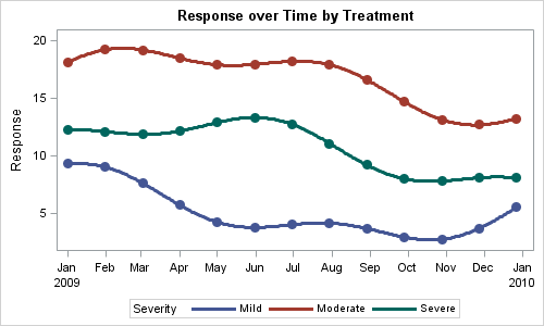
Here is what I get using a simple series plot:
SGPLOT code:
title 'Response over Time by Treatment'; proc sgplot data=SeriesGroup1; series x=date y=val / group=Severity lineattrs=(thickness=3); scatter x=date y=val2 / group=Severity markerattrs=(symbol=circlefilled size=11); xaxis display=(nolabel); yaxis label='Response'; run; |
In the data set, val2 has values only in every 30th observation, so we get scatter markers occasionally.
The data has observations with group="Mild" first , so it gets the first graph data element with the blue color for the default style. Moderate is next, so it gets graph data 2 (red), and Severe gets graph data 3 (green). These colors may not be ideal for the levels and we can derive a custom style. But let us go with this for now.
Now, let us say the data for a different drug test only has Mild and Severe data. Here is what you get:
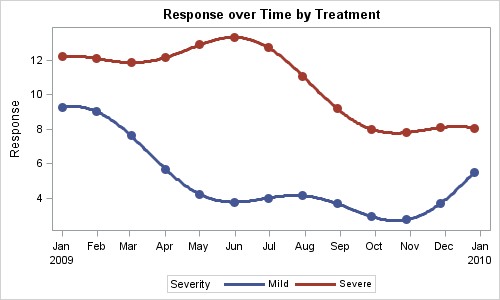
In this graph, the series plot for Mild is still blue, but now the series plot for Severe is red instead of green as it was in the first graph. So, the colors used depend on the order of the data, and not on the value of the data. More often than not, you would always want Severe to be the same color across all your graphs. This can be fixed, but it requires some coding tricks.
The SAS 9.3 Discrete Attribute Map is the solution for this and other related issues. You can use a discrete attributes map to define the attributes for a certain VALUE of the group variable. So, you can say, for group=SEVERE, use linecolor=red. By setting the visual attributes you want based on the value of the group variable, you can ensure that anytime "Severe" occurs in a group, it will be displayed using the line, fill or marker attributes you have defined.
With SG Procedures, you can define the discrete attributes map in a SAS data set by using specific column names and values to define the map. Here is what a map looks like for our application:
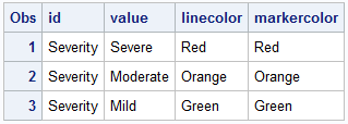
The required columns are ID and VALUE. Then, you need to provide the appropriate columns for the attribute you want to control. We associate this attribute map with our plot to get this graph:
SAS 9.3 Code:
ods graphics / reset width=5in height=3in antialiasmax=1100 imagename='SeriesMap1'; title 'Response over Time by Treatment'; proc sgplot data=SeriesGroup1 dattrmap=AttrMap; series x=date y=val / group=Severity lineattrs=(thickness=3) attrid=Severity; scatter x=date y=val2 / group=Severity markerattrs=(symbol=circlefilled size=11) attrid=Severity ; xaxis display=(nolabel); yaxis label='Response'; run; |
Note, we have created a SAS data set called AttrMap, and provided that to the SGPLOT procedure using the DATTRMAP option. Also, for the Series and Scatter plots, we have specified the ATTRID of "Severity" to associate the values with the map. The AttrId allows us to multiple definitions for maps in the same data set.
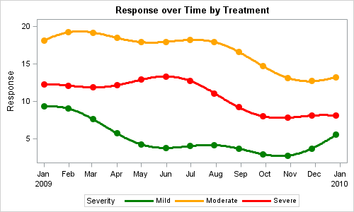
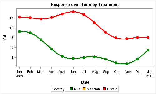
In this graph, each value for Severity has been rendered with the color we specified. Now, let us render this same graph with the data that has only Mild and Severe events. Here is the graph:

Now, we only have plots for Mild and Severe, but they are rendered with the correct colors that we have specified. Order of the data, or absence of some data does not have an adverse impact on our graph. AttrMap also allows for value="OTHER". Using that, you only need to define the values of interest to you.
Now, it would be nice if we could include all values from the Attributes Map into the legend. Even though we have only Mild and Severe events, it would be nice to know that we can also have Moderate events.
This feature is under development for SG Procedures. So, at this time to do this with SGPLOT, you will have to force all values to be present in the data. However, GTL does have this feature, and here is the GTL graph and code to do this.
SAS 9.3 GTL Code:
proc template; define statgraph seriesMap; begingraph; entrytitle 'Response over Time by Treatment'; discreteattrmap name='AttrMap'; value 'Mild' / lineattrs=(color=green) markerattrs=(color=green) fillattrs=(color=green); value 'Moderate' / lineattrs=(color=orange) markerattrs=(color=orange) fillattrs=(color=orange); value 'Severe' / lineattrs=(color=red) markerattrs=(color=red) fillattrs=(color=red); enddiscreteattrmap; discreteattrvar attrvar=AttrSeverity var=Severity attrmap='AttrMap'; layout overlay; seriesplot x=date y=val / group=AttrSeverity lineattrs=(thickness=3); scatterplot x=date y=val2 / markerattrs=(symbol=circlefilled size=11) group=AttrSeverity; discretelegend 'AttrMap' / title='Severity:' type=fill; endlayout; endgraph; end; run; proc sgrender data=SeriesGroup2 template=seriesMap; run; |
Note, in GTL, the discrete attributes map is defined inside the GTL code itself. Support for an external data set based attributes map is coming soon.
SAS 9.4 Sneak Preview: A cool new feature that applies to rendering of all curves and bar charts is the high resolution rendering done by setting the option SUBPIXEL=ON on the BEGINGRAPH statement. Here is the graph rendered using SAS 9.4. Note the smooth rendering of the plots.

In the next installment, we will discuss Range Attribute Maps.
Full SAS 9.3 code: DiscreteAttrMap


8 Comments
I started the article using Drug as the group variable, hence the titles saying "by Treatment". Then I changed it to Severity, for better association with color scheme (red for severe), but forgot to change the titles in the graph. Oh well...
Dear Sanjay,
I appreciate your Graphically speaking blogs very much.
A question about the number of colors possible. You state GRAPHDATA1 - GRAPHDATA12.
Is this the maximum number of different colors allowed? I encountered in sas9.3 that when specifying 15 colors in my template (with graphdata1- graphdata15) after about 10 colors the values of graphdata11-15 are not used, instead colouring starts again from graphdata1 value.
Actually I need 18 different colours in an horizontal bar chart..
Hope you can clarify this issue.
Sincerely,
Gerda
The default SAS supplied styles normally have 12 graph data elements defined used for group values. For each of these, color/contrastcolora are defined for all 12, linestyles for 11 and markers for 7. So, for a graph with series plot, the color will wrap back afer 12 values, line styles after 11. Yes, you can define as many elemenhts as you like and they will be used as long as the attributes are defined contiguously. So, if you define colors for 1-12, and 14-18, but not 13, it will stop at 12. Now, with attribute maps, you can also define as many values as you want in the map, including "OTHER". Let me know if this does not work, and I will write up an example.
For another example of using the discrete attribute map, see my article on how to specify the colors of groups. My example uses PROC FORMAT to define a data range that is used to color markers in a scatter plot..
Pingback: Attributes Map – 2 - Graphically Speaking
Pingback: Consistent Group Colors by Value - Graphically Speaking
Pingback: Clinical Graphs - Graphically Speaking
Pingback: Automate the creation of a discrete attribute map - The DO Loop