A frequent question we get from users is how to create a box plot with custom whiskers lengths. Some want to plot the 10th and 90th percentile, while other want the 5th and 95th percentiles. The VBOX statement in the SGPLOT procedure does not provide for custom whiskers. Also, unlike GTL, there is no parametric box plot statement, where you can provide your own statistics.
Here is a standard VBOX of mileage by Type grouped by Origin using the SGPLOT procedure.
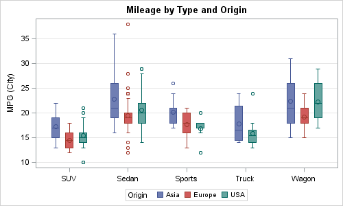
SGPLOT Code:
proc sgplot data=sashelp.cars(where=(type ne 'Hybrid')); vbox mpg_city / category=type group=origin grouporder=ascending; yaxis grid; xaxis display=(nolabel); run; |
How can we create a custom box plot with 10th and 90th percentile whiskers? With SAS 9.3, we have a way to create a parametric box plot using the new HIGHLOW plot statement.
First we have to run the MEANS procedure to obtain the necessary statistics for mileage by Type and Origin as follows:
proc means data=sashelp.cars(where=(type ne 'Hybrid')) noprint; class type origin; var mpg_city; output out=CarsMeanMileage mean=Mean median=Median q1=Q1 q3=Q3 p10=P10 p90=P90; run; data CarsMeanMileage; set CarsMeanMileage(where=(_type_ eq 3)); drop _type_ _freq_; run; |
The HIGHLOW plot statement comes in two flavors: TYPE=LINE (default) and TYPE=BAR. The first creates a floating line from low to high, and the second creates a floating bar from low to high. We will use a combination of these to create the graph:
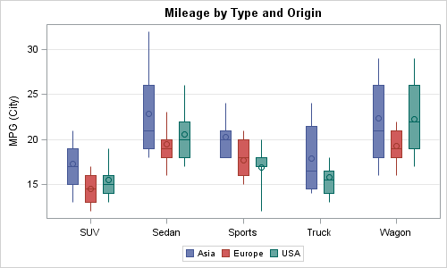
SAS 9.3 SGPLOT Program:
proc sgplot data=CarsMeanMileage nocycleattrs; highlow x=type high=p90 low=p10 / group=origin groupdisplay=cluster clusterwidth=0.7; highlow x=type high=q3 low=median / group=origin type=bar groupdisplay=cluster grouporder=ascending clusterwidth=0.7 barwidth=0.7 name='a'; highlow x=type high=median low=q1 / group=origin type=bar groupdisplay=cluster grouporder=ascending clusterwidth=0.7 barwidth=0.7; scatter x=type y=mean / group=origin groupdisplay=cluster grouporder=ascending clusterwidth=0.7 markerattrs=(size=9); keylegend 'a'; yaxis grid; xaxis display=(nolabel); run; |
Here are the details of this program:
- The first high low plot of type=line (default) plots the whisker from P10 to P90.
- The second high low plot of type=bar draws the upper quartile.
- The third high low plot of type=bar draws the lower quartile.
- The scatter plot draws the mean marker.
- This graph looks very similar to the standard VBOX except for the whiskers and outliers.
Since this graph is made up of all "Basic" plots, we can overlay any other basic plot we may want to display other features. In this example, we have added the display of the mean value above each mean marker.
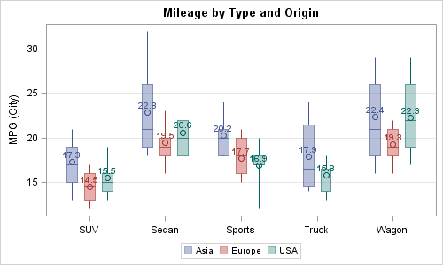
In this example, we lightened the fill color by making it 50% transparent. So, have to use two highlow line plots, one from P90 to Q3 and one from Q1 to p10. Then, we added a label to show the value of the mean in each box. The code is shown in the program file attached.
Finally, here is another sneak preview of a SAS 9.4 feature: Jittering. We have received many requests on this topic so jittering will be supported with SAS 9.4. In the example below, I have created a custom box plot using the technique above, and then added display of all the values using jittering. To do this, I have to merge the summary data with the original data. I will write up a detailed article with the code once SAS 9.4 is released.
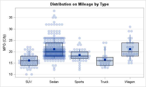
Markers are jittered on the category axis (in this case horizontal) when their Y value is within the tolerance level. Darker regions indicate more markers. The "Mean" value is shown with a square marker.
Full SAS 9.3 Code: BoxParm


6 Comments
Thank you for this post which is very useful.
I have a problem nevertheless.
I want to sort yaxis by order of median (by example).
I wrote the code below :
proc sort data=pdsmean; by median; run;
proc sgplot data=pdsmean nocycleattrs noautolegend;
highlow y=n_centre high=p90 low=p10 ;
highlow y=n_centre high=q3 low=median / type=bar barwidth=0.7 ;
highlow y=n_centre high=median low=q1 / type=bar barwidth=0.7;
scatter y=n_centre x=mean / markerattrs=(size=9);
yaxis type=discrete discreteorder= data;
xaxis grid display=(nolabel) ;
run;
Variable n_centre is declared as a numeric variable and my figure is not sorted by median of n_centre,
although I wrote "yaxis type=discrete discreteorder= data;.
Surprisingly, if I convert n_centre in a character variable, my figure is sorted.
Do you think that it is a bug or SAS, or I my program is somewhat wrong ?
Thank you for your opinion.
May be easier with the full program and data. Your data is sorted by median, so n_center is not in order. But in n_center is numeric but character, the default is ordinal.
I thought "type=discrete" was useful to treat a numeric data as a discrete data.
Below is a part of my data (sorted by median), n_centre is declared as numeric, n_centrec is declared as character.
n_centre Mean Median Q1 Q3 p90 p10 n_centrec
4 148.759 132.930 97.1600 185.120 244.420 68.0800 4
11 132.736 110.365 80.8500 168.875 296.690 45.0200 11
19 134.458 110.355 65.8750 172.579 248.851 42.9420 19
28 132.966 109.000 72.0000 164.000 242.000 51.0000 28
52 114.652 101.362 70.2810 142.450 196.894 48.2480 52
51 121.863 99.541 62.5140 161.350 243.150 37.0300 51
36 125.015 99.310 66.1200 155.700 231.012 46.6000 36
2 119.150 99.000 63.0000 148.000 228.000 41.0000 2
6 122.835 95.540 60.6700 155.250 239.020 41.2400 6
60 114.056 88.459 54.3330 145.689 213.075 37.5660 60
10 98.001 85.180 59.4500 120.250 168.900 40.2600 10
Thanks
Muriel, If you want to sort box plots by the median---or any other statistic---see the article "Order variables by values of a statistic" which has the complete details.
i like your custom boxes designe your designe is very beautiful i impress your work and designing.
Thank you so much,
This blog was really helpful.
I have few problems nevertheless.
First I want to include 'Total' in box-wishes plot.
This is the format of my variable that has been set to the x-axis,
proc format;
value provf
1='Province-1'
2='Province-2'
3='Province-3'
4='Province-4'
5='Province-5'
6='Province-6'
7='Province-7'
;
run;
As I am using the whole dataset ('ncd1') for creating the plot--I was wondering how would I be able to add the 8th box-whisker (i.e. 'Total') that gives the overall for all provinces combined here in this graph, https://bit.ly/2kpc6qV.
Thanking you in advance
my syntax is below;
proc sgplot data=ncd1 nowall noborder ;
vbox cvdtotal / category=prov clusterwidth=1 FILLATTRS=(color=VIYG transparency=.3) BOXWIDTH=.6
meanattrs=(size=7) lineattrs=(pattern=dashdashdot color=blue) whiskerattrs=(pattern=solid);
xaxis display=(noline nolabel noticks) label="provinces";
yaxis display=(noline noticks) label="Readiness index(%)";
format ma $maf. prov provf.;
keylegend / type=marker;
title;
run;