Creating bar charts with log response axis has come up a few times in the past few days. Before we look into how we could do this, it would be worth pointing out the considerable opinion in the blogosphere against use of log response axes for bar charts. See BizIntelGuru and here.
Both GTL and SG procedures do not support log response axes for Bar Charts. Both include the zero value on the response axis for a bar chart. But when all data is positive, could this be possible?
I tried setting the min value on the axis to a value > zero, and then set the TYPE=log option (in SGPOLOT). No luck. Neither VBar nor Needle statement did not allow the usage of a log axis in this case.
With SAS 9.3, there is a way out using the HighLow statement. Of course, we summarize the data using proc Means, and then we can use the HighLow bar with Type=bar to get the following graph:
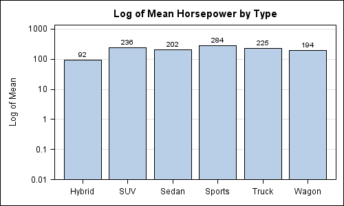
Bar Chart with Log Response Axis:
SAS 9.3 code:
title 'Log of Mean Horsepower by Type'; proc sgplot data=carsmean2; format mean 4.0; highlow x=type low=zero high=mean / type=bar highlabel=mean; yaxis type=log max=1000 offsetmin=0 label='Log of Mean' grid; xaxis display=(nolabel); run; |
To use HighLow in proc SGPLOT, we need a variable with a small value to represent the lower end of the bar segment. Since the statement does not force a zero value on the axis, now we can specify Type=log on the yaxis statement. Note, I have specified max=1000 on the yaxis just to get a feel for all the log values in this case. HighLow plot can look like a needle or a bar, and I have set Type=Bar. We also added a bar label at the top using the HighLabel option.
If you really need to use log response axis on a bar chart, it could be done as shown above. But it would be worthwhile to consider if it should be done.
Full SAS 9.3 code: Bar_With_Log_Axis


4 Comments
Sanjay,
You do amazing things with sg graphs and ODS. I attended your session at SGF and admire the work that you and your team are doing. Keep it up! I love the SGDesigner. A real time saver with powerful visuals in it.
But, and this is a big but, what you've suggested here is graph heresy. I know you're responding to what people asked you for, but those people asked you the wrong question. What you've done with this bar chart violates the most important tenant of bar charts around the world. And that is, for bar charts, never mess with the scale of the axis or start it at something other than zero. Why? Because the lengths of the bars matter, and matter a lot. If a bar is 2x longer than the bar next to it, you are primed to know that the value is 2x more than the other value. We are great at comparing things like that, and that's why bar charts are great, we can figure them out in a snap! Changing the scale to a log scale, or starting the axis at something other than zero destroys this relationship of bar length in bar charts and actually makes the bar chart misleading. Which I know you don't want to do.
You can read more about this at my blog at, http://t.co/PQp8YR2S
John, I agree with your comments regarding response axis scaling for bar charts. Just because we can do something does not mean we should. I will add a note of caution to the article about this.
However (you saw this coming), in SAS 9.3, we just got through adding a BASELINE option for bar charts. This was a specific requirement from a group of users. Needle plot already has baseline. While the default value of baseline is still zero, this option allows a user to set a different baseline, providing the opportunity to "tell the story they want".
I would like to hear how this is qualitatively different from usage of a log axis for odds ratio on a Forest Plot due to the large data range or stock plots that often use log base 2 axes. Our position as providers of the components is to make the DEFAULT behaviors in line with the principles of effective graphics.
Hi Sanjay,
I wrote a blog post at http://bit.ly/JIJwUL where I talk in more detail about the problem with using a log axis on a bar chart and I suggest an alternative for this use case.
Regarding your comment on using a log axis for odds ratios on a forest plot, I think we're talking apples and oranges. I'm not saying there is never a use for log axes. I'm saying you should stay away from them on bar charts because the lengths of the bars matter. If your graph isn't using bars, and you have extreme variations in your data range, then you may very well want to use a log axis, but just be careful and make sure your readers know what you're doing with the axis.
Finally, two interesting posts on the subject of graphic with extreme ranges. One, over at one of my favorite blogs http://www.datadrivenconsulting.com by Alex Kerin proposes many alternatives, but, in the end, finds no single solution. That post is at http://bit.ly/Ii61ma and there are lots of good comments on his post.
Another post, over at Chandoo's site, http://bit.ly/IHekUS actually proposed using a log scaled bar chart, Chandoo didn't do a whole lot of explaining the benefits and drawbacks to each method (he proposed 4), but his audience weighed in with some great alternatives and commentary. Check 'em out.
Thanks!
Pingback: How to use a log-scale on a histogram - The DO Loop