A user recently posted a question in the SAS communities forum about how to best display two measures by one classifier using a Bar-Line graph, where the scale of the two measures is vastly different. This got me thinking about various different ways to represent such data. Here are some of my thoughts, and I would like to hear what you think, and what are your ideas to improve upon these.
Let us take this simple data of Revenue and Shipment of goods by Year. In this case the values for Revenue are multiple orders of magnitude larger than Shipment:
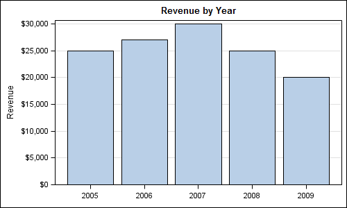
Let us start with the basic bar chart of Revenue x Year using the SGPLOT procedure:
Code:
title 'Revenue by Year'; proc sgplot data=revenue; vbar year / response=revenue stat=mean nostatlabel; xaxis display=(nolabel); yaxis grid; run; |
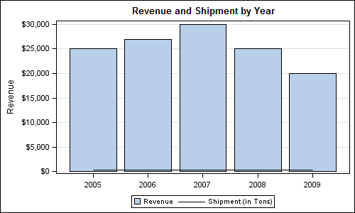
Now we will add the display of Shipment x Year on the same graph:
Code:
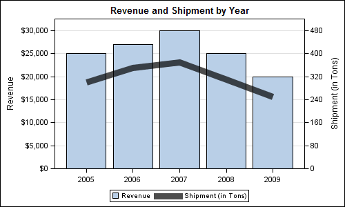
title 'Revenue and Shipment by Year'; proc sgplot data=revenue; vbar year / response=revenue stat=mean nostatlabel; vline year / response=shipment stat=mean nostatlabel; xaxis display=(nolabel); yaxis grid; run; |
A few things to note in this graph are:
- The magnitude of the Shipment values is two orders of magnitude smaller than Revenue.
- Since the Y axis is common for both, the display of Shipment is squeezed down.
- Since there are two different measures on the Y axis, the axis label is no longer applicable.
- Since the units of the two measures are different the Y axis values formatting is no longer correct .
- Since a series plot has some thickness, there is a small offset added to axes, causing the bars to float up from the baseline.
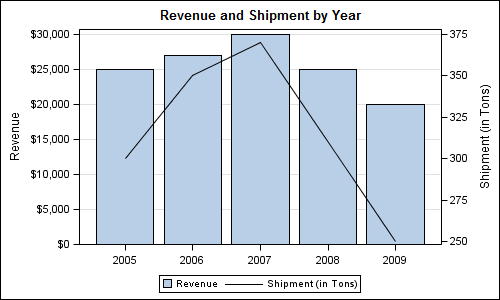
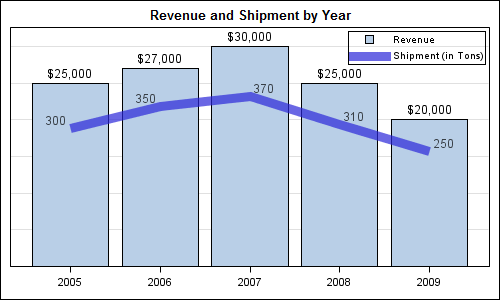
To address these, let us map the Series plot (Shipment x Year) to the Y2 axis. This allow each plot to be scaled independently on the Y axes.
Code:
title 'Revenue and Shipment by Year'; proc sgplot data=revenue; vbar year / response=revenue stat=mean nostatlabel; vline year / response=Shipment stat=mean nostatlabel y2axis; xaxis display=(nolabel); yaxis grid offsetmin=0; run; |
Note we specified YAXIS OffsetMin=0 to prevent the bars from floating. Now, each measure has its own axis, and things are looking better, however there are some issues :
- By default, VBAR is drawn with baseline of zero, while the baseline for the VLINE is the minimum of the data range.
- The axis grid lines from Y axis do not match the axis tick values on the Y2 axis.
- The Series plot representation needs more weight to match the Bar chart.
Code:
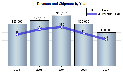
title 'Revenue and Shipment by Year'; proc sgplot data=revenue; vbar year / response=revenue stat=mean nostatlabel; vline year / response=Shipment stat=mean nostatlabel y2axis lineattrs=(thickness=10) transparency=0.3; xaxis display=(nolabel); yaxis grid offsetmin=0 values=(0 to 30000 by 5000); y2axis offsetmin=0 values=(0 to 480 by 80); run; |
Here we have forced the min value for Y2 axis to zero, and also adjusted the Y2 axis values such that we have the same number of tick values on both Y and Y2 axes. This ensures the grid lines line up on both axes. The axis ranges for Y and Y2 are independent (and unrelated), so it places the plot of Shipment nicely in the middle. We also increased the thickness of the line, added some transparency, so now both measures have equal importance on the graph.
It looks like we are getting there, but is there room for improvement? From "eye movement" point of view, one still has to look at the legend to see what the mapping is, then look at the appropriate axis to read off the values. This requires a lot of eye movement, and decoding the graph, while possible, is not easy.
To reduce eye movement and make decoding easier, what if we were to place the labels for the bar and line and put the legend closer to the data? Here is the graph, still using the SGPLOT procedure:
Code:
title 'Revenue and Shipment by Year'; proc sgplot data=revenue; vbar year / response=revenue stat=mean nostatlabel datalabel; vline year / response=Shipment stat=mean nostatlabel y2axis datalabel=Shipment lineattrs=graphdata1(thickness=10) transparency=0.3; xaxis display=(nolabel); yaxis grid offsetmin=0 values=(0 to 30000 by 5000) display=(nolabel novalues noticks); y2axis offsetmin=0 values=(0 to 480 by 80) display=(nolabel novalues noticks); keylegend / location=inside position=topright across=1; run; |
Since the values are displayed in the graph, we can get rid of the Y axis details to reduces clutter. Now the graph is looking easier to decode, the only problem being that the data values for the VLINE are not centered to avoid collision with the line itself. So, they move around a bit. At this point we may have reached the limit of what we can do with SAS 9.2 SGPLOT.
However, we can use GTL to force the label positions by using overlays of other plot types to draw the values for Shipment. We could use a ScatterPlot with MarkerCharacter, or another BarChart, with display of the bar itself turned off. We will use the latter in this case. While we are at it, I also embellished the display of the Shipment data.
GTL Code:
proc template; define statgraph Bar_line_2; begingraph; entrytitle 'Revenue and Shipment by Year'; layout overlay / xaxisopts=(display=(ticks tickvalues)) yaxisopts=(griddisplay=on offsetmax=0.15 offsetmin=0 display=none linearopts= (tickvaluesequence=(start=0 end=35000 increment=5000))) y2axisopts=(offsetmin=0 offsetmax=0.15 display=none linearopts= (tickvaluepriority=true tickvaluesequence=(start=0 end=480 increment=80))); barchart x=year y=revenue / barlabel=true name='a' skin=modern; barchart x=year y=Shipment / barlabel=true yaxis=y2 datatransparency=1; seriesplot x=year y=Shipment / yaxis=y2 name='b' lineattrs=graphdata1(thickness=10) datatransparency=0.3; scatterplot x=year y=Shipment / yaxis=y2 markerattrs=graphdata1(symbol=circlefilled size=15); scatterplot x=year y=Shipment / yaxis=y2 markerattrs=(symbol=circlefilled size=11 color=white); discretelegend 'a' 'b' / location=inside valign=top halign=right across=1; endlayout; endgraph; end; run; ods graphics / reset width=5in height=3.0in imagename='Bar_Line_GTL_2'; proc sgrender data=revenue template=Bar_line_2; run; |
The reason we had to use GTL code to do this is that SGPLOT procedure does not allow mapping a VBAR to the Y2 axis. Also, you cannot overlay a Scatter on top of a VBAR. Some of these restrictions have been removed with SAS 9.3 release. So, to take this last step, we used GTL which does not have any such restrictions.
What do you think of the above ideas? Does this graph look easier to decode, and would it be acceptable in your use cases? How would you represent such data and what would you do differently?
For more on a related topic, see article on multiple axis plots - The more the merrier. This article shows the usage of different colors for the plot and the associated axis that could be used here.
Full code: Bar_Line


6 Comments
Phew! This seems like a lot of work for 10 data points. Edward Tufte would recommend leaving them as a table.
Why bar and line? Surely both should be the same? Years form an ordered series, so a line would make sense if you want to show trends. People might be interested in the ratio of revenue to shipment. Calculating this and adding another series as bars would probably not make it clear, so I would support the use of lines.
As an aside, does 9.3 allow the x-axis to be the numeric scale when generating a bar chart (linearopts or timeopts)? That is, instead of treating it as a qualitative, discrete value,a numeric value representing the actual numbers collected.
Thanks
No, not for the Bar Chart, which always treats the category role as discrete. Bar Chart (VBAR) also summarize the response values by the category. However, you can use the NeedlePlot (SAS 9.2) or the HighLowPlot (SAS 9.3) to get the values drawn on a scaled axis with pre summarized data. With HighLowPlot, you can get a "Bar" like look.
Example:
proc means data=sashelp.cars;
class cylinders;
var mpg_city;
output out=carmeans_MpgByCyl mean=mpg_mean;
run;
data cars;
set carmeans_MpgByCyl(where=(_type_ ne 0));
format mpg_mean 6.1;
y0=0;
run;
proc sgplot data=cars;
highlow x=cylinders high=mpg_mean low=y0 / type=bar;
xaxis values=(3 4 5 6 8 10 12);
yaxis min=0 offsetmin=0;
run;
Thanks - the needle was my solution, as we're still in 9.2. Looking forward to highlow in 9.3.
Hi Sanjay, thank you for this! It has really helped with labelling.
Do you know in future versions of SAS (I'm currently using 9.2, but have limited access to 9.3) if it is going to be easier to add a character label at the end of the bar? Currently I use the BARLABELFORMAT=format option to display character values, however this becomes a problem when the variable does not contain discrete results.
Thanks.
With SAS 9.3, you can use the SGPLOT VBarParm statement to display any character string as a data label on a bar. VBarParm expects pre-summarized data. Or, you can overlay Scatter with MarkerChar on a VBarParm. With SAS 9.2 GTL, you can overlay a scatter plot with MarkerCharacter on a BarChart.