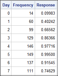
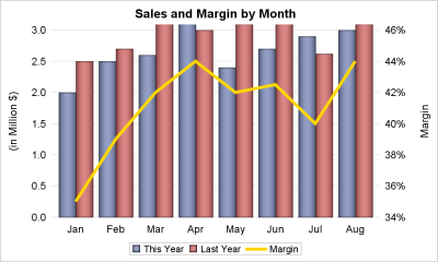
Tag: VBAR

Data Visualization
Sanjay Matange 0
Graph Table

A common scenario is where we have a table of multiple measures over time. Here we have a simple example of Frequency and Response by Day.  The Response is a linear function of the Frequency, as shown in the table on the left below. The  shape of the data is

Data Visualization
Sanjay Matange 0
Fun with Bar Charts

As Sheldon Cooper would say, this is the first episode of "Fun with Charts".  I did not find a cool term like "Vexillology" and "Cartography" is taken by map making, so let us go with "Chartology". Yesterday, I saw a couple of interesting bar charts as shown on the right.  I thought

Data Visualization
Sanjay Matange 0
G100 with SGPLOT

The GCHART procedure has a popular option called G100 to display all the subgroups in % format such that all the subgroup values add up to 100% for each group.   Each subgroup is labeled with its own % values. SGPLOT procedure does not such an option, but with a little bit of

Data Visualization
Sanjay Matange 0
Healthcare.gov numbers

Working at SAS, I consider myself fortunate to have the best employee benefits in the industry.  That is one of the factors placing SAS as one of the best companies to work for worldwide, and often THE best company to work for in USA. Given that, I was curious to know the kind

Data Visualization
Sanjay Matange 0
BarLine Graphs

A Bar Line graph is commonly used in many domains.  The SGPLOT procedure makes it easy to create bar line graphs where the user can customize it in many different ways.  This post is prompted by a recent question on the communities page on creating such a graph, with one bar and

Data Visualization
Sanjay Matange 0
Parametric Bar Charts

A parametric bar chart in SG Procedure and GTL parlance is a simplified version of the regular bar chart, where the data is assumed to be summarized prior to its usage inside the SG procedures or GTL.  So, multiple occurrences of the same category and / or group combination is

Data Visualization
Sanjay Matange 0
Percent VBar

Recently a reader chimed in with a question on the Do Loop article by Rick Wicklin on how to create a bar chart with percent statistics.  Rick used SAS 9.3  and the reader wanted to do the same with SAS 9.2. For the basic (non-grouped) bar chart, the process is the

Data Visualization
Sanjay Matange 0
Doing more with nbsp

A few weeks ago I wrote an article on using the non breaking space character to prevent stripping of leading and trailing blanks in a string.   Since then, I have discovered a few more instances where the nbsp can be a useful tool for creating graphs. One such instance came up last week

Data Visualization
Sanjay Matange 0
Bar-Line graph

A user recently posted a question in the SAS communities forum about  how to best display two measures by one classifier using a Bar-Line graph, where the scale of the two measures is vastly different.  This got me thinking about various different ways to represent such data.  Here are some of my thoughts,

Data Visualization
Sanjay Matange 0
Cluster groups

The topic of cluster groups comes up often.  By cluster group I am referring to the feature in bar charts where the group values are displayed side by side. With SAS 9.3, SG Procedures support stack or cluster grouping for Bar Charts and overlay or cluster grouping for all other