Strengthen your programming skills with tips and techniques from the experts
How to position tick marks for months when you graph weekly data

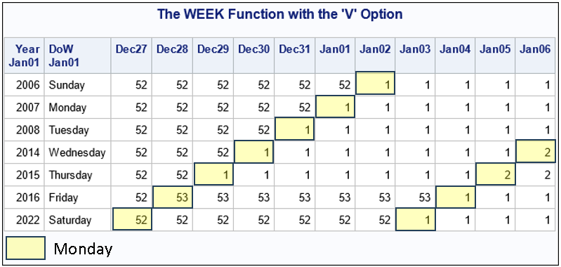
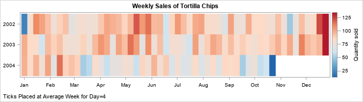
Suppose you measure data weekly. According to the ISO standard, weeks are measured in the range 1-53, where most years have 52 weeks, but occasionally there is a "leap week." (The WEEK function in SAS implements the ISO standard to find the week-of-the-year for any date.) The heat map to