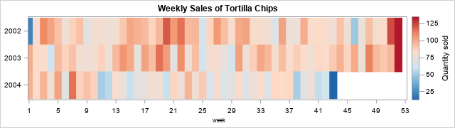
Suppose you measure data weekly. According to the ISO standard, weeks are measured in the range 1-53, where most years have 52 weeks, but occasionally there is a "leap week." (The WEEK function in SAS implements the ISO standard to find the week-of-the-year for any date.) The heat map to the right (sometimes called a "lasagna plot") shows an example of a snack (tortilla chips) sold at a convenience store for a three-year period. However, the tick marks on the horizontal axis show weeks of the year, which are not very intuitive. Most people would struggle to tell you what month and days correspond to "Week=25." Conversely, if you want to look at sales near 15MAY, what week should you look at?
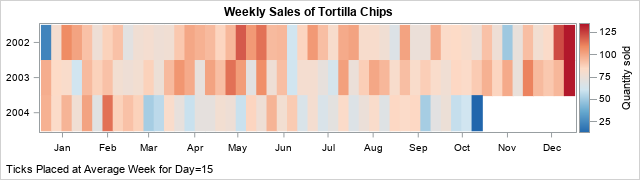
It would be nice if the graph overlaid tick marks for months on the horizontal axis, as in the second graph. This is not an easy task because calendar dates do not align with week numbers. For example, the first week of a new year (Week=1) can start as early as 29DEC and as late as 04JAN. In the second graph, it is easy to view sales data near 15MAY of each year.
This article examines this problem and writes SAS code that provides solutions. I first show how to position tick marks based on the historical average of the weeks for the 15th of each the month. The SAS code is written to support other days, such as the 4th of each month. In the Appendix, I introduce the concept of a "partial week," and show how this slightly shifts the positions of the tick marks.
The expected week for any date
Here's a trick question: What week of the year contains 15MAY? There is no right answer because sometimes 15MAY is in the 19th month and sometimes it is the 20th! So, let's change the question to consider historical averages. The new question is, what is the expected week for 15MAY? An expected value does not have to be an integer. Let's answer the question by looking at historical averages over the past 100 years. The following SAS DATA step creates 100 years of dates. For each date, it uses the DAY, MONTH, and WEEK functions in SAS to extract the day, month, and week of the year for that date.
/* Generate dates and weeks for last 100 years */ data WeekVals; format date DATE10.; do date = '01JAN1926'd to '31Dec2025'd; day = day(date); /* 1 - 31 */ month = month(date); /* 1 - 12 */ week = week(date, 'v'); /* 1 - 53 */ output; end; run; |
You can then use PROC FREQ to find which weeks contains 15MAY for these years:
/* What week contains the 15th of a month? Try 15MAY */ %let Month = 5; proc freq data=WeekVals; where month=&Month and day=15; tables Week / nocum; run; |
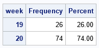
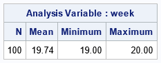
The table shows that 15MAY was in Week=19 for 26% of the years and was in Week=20 for 74% of the years. Thus, on average, 15MAY is located at Week=19.74, as shown by the following call to PROC MEANS.
proc means data=WeekVals N Mean Min Max ndec=2; where month=&Month and day=15; var Week; run; |
One way to interpret 19.74 is as "the Saturday of Week 19" because Saturday is 5/7th (≈ 0.74) of the way though a week that starts on Monday. But, in general, the number is merely a statistical average. A small decimal (for example, 19.1) indicates that the date is most often in the prior week (19) and rarely in the subsequent week (20). In contrast, a large decimal value (for example, 19.9) indicates the opposite.
What weeks contain the 15th of each month?
Now that we understand the expected value of the week for 15MAY, we can ask the same question for the 15th of other months. Let's introduce some macro variables so that we can re-run the code on other days and data sets. You can use the CLASS statement in PROC MEANS to get the expected value of Week in a data set:
/* find average week for 15th of each month */ %let TARGET_DAY = 15; %let DSName = WeekVals; %let VarName = Week; proc means data=&DSName Mean Min Max maxdec=1; where Day=&TARGET_DAY; class Month; var &VarName; output out=MeansOut(where=(_TYPE_=1)) mean=WeekTicks; /* output means to a data set */ run; |
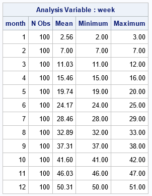
The Mean column of the table shows that 15FEB is always in Week=7. However, the 15th of other months are sometimes in one week (see the Minimum column) and sometimes in another week (see the Maximum column). From the table, we learn that
- 15MAR is almost always in Week=11, but can shift to Week=12 on occasion. On average, you expect 15MAR to be at Week=11.03
- 15APR and 14AUG frequently move between weeks. They are in one week (15 or 28, respectively) 46% of the time and in another week 53% of the time.
Use expected weeks as tick marks
The expected weeks are a good location for tick marks on a graph that visualizes data that is collected weekly. You can read the values in the 'Mean' column into a space-separated list and store it in a macro:
/* put all values into macro variable named TICKS */ proc sql noprint; select round(WeekTicks,0.1) into :TICKS separated by ' ' from MeansOut; quit; %put &=TARGET_DAY &=VarName; %put &=TICKS; /* display list in SAS log */ |
TARGET_DAY=15 VARNAME=Week TICKS=2.6 7 11 15.5 19.7 24.2 28.5 32.9 37.3 41.6 46 50.3 |
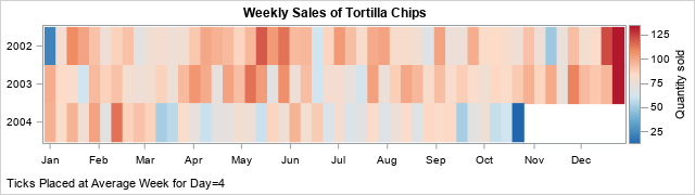
You can then use those values to place tick marks on a graph that shows data that are created weekly. You use the VALUES= option on the XAXIS statement to specify the location of the tick marks. You use the VALUESDISPLAY= option to specify the month names. The following example uses weekly sales of tortilla chips at a convenience store. The data are created in a previous article about visualizing weekly data.
/* display these values at the locations given by &TICKS */ %let month_vals= 'Jan' 'Feb' 'Mar' 'Apr' 'May' 'Jun' 'Jul' 'Aug' 'Sep' 'Oct' 'Nov' 'Dec'; %let DivRedBlueModel = (CX2166AC CX67A9CF CXD1E5F0 CXFDDBC7 CXEF8A62 CXB2182B); /* define three-color ramp */ ods graphics / height=180px width=640px; /* Snack data from https://blogs.sas.com/content/iml/2025/07/21/week-function-sas.html */ title "Weekly Sales of Tortilla Chips"; footnote J=L "Ticks Placed at Average Week for Day=&TARGET_DAY"; proc sgplot data=SnackOut; heatmapparm x=Week y=Year_of_week colorresponse=QtySold / colormodel=&DivRedBlueModel; yaxis display=(nolabel) integer labelattrs=(size=6pt) reverse fitpolicy=none; xaxis display=(nolabel) values=(&TICKS) valuesdisplay=(&month_vals) valueshint; /* use VALUES= and VALUESDISPLAY= options */ run; footnote; |
Ah, success! The graph displays the month names Jan, Feb, ..., Dec. These text strings are displayed at the locations given by the historical average of the week locations for the 15th day of each month.
You can change the value of the TARGET_DAY macro variable to get other tick locations. For example, if you want ticks near the beginning of the month (rather than in the middle), you can set TARGET_DAY to 4 and rerun the program:
%let TARGET_DAY = 4; |
After re-running the program, you obtain the following set of tick locations for months:
TARGET_DAY=4 VARNAME=Week TICKS=1 5.4 9.5 13.9 18.2 22.6 26.9 31.3 35.7 40 44.5 48.7 |
I used 4 as a starting day (rather than 1) because 04JAN is always in the first week of a year. If you use 1, then sometimes 01JAN is in Week=52 or Week=53, which messes up the averages reported by PROC MEANS. If you use the new tick locations, you get the following graph:
Summary
This article discusses how to place tick marks that represent months when you are graphing data that is collected weekly. By default, the weekly data will be plotted on an axis that ranges from Week=1 to Week=53. It is hard for most people to know how to convert week numbers to dates and vice versa. One solution is to overlay tick marks that represents to middle of months. You can use a statistical average to compute the expected value of, say, the 15th of each month. You can then place ticks at those locations and label the ticks with the strings Jan, Feb, Mar, ..., Dec. Alternatively, you can use a day earlier in the month (perhaps the 4th) to indicate the beginning of each month. These ideas are implemented by using calls to Base SAS.
Appendix: Partial weeks: An alternative average
I didn't want to make this article too long, so I've created this Appendix to discuss another average that you can use to find the best location for month-related tick marks. Remember when I said that a Saturday is 5/7 of the way through a week that starts on Monday? Well, you can use this idea to compute an alternative location for tick marks.
Define the "fractional week value" for a week as the week (by using the WEEK function in SAS) plus a fraction that indicates the date's position in the week. If the date is Monday, you add nothing. If the date is Tuesday, you add 1/7. If the date is Wednesday, you add 2/7, and so on.
You can use the WEEKDAY function in SAS to obtain a value 1-7 that indicates the day of the week. Unfortunately, the WEEKDAY function assumes that a week begins on Sunday, so it returns 1 for Sunday, 2 for Monday, and so forth. Thus, to compute the fractional week value, you must subtract 1 from the result of the WEEKDAY function, then modify the result for Sunday, as follows:
/* Create a new variable that shows the "fractional" day of the week. Mon = Week + 0 Tue = Week + 1/7 Wed = Week + 2/7 ... Sun = Week + 6/7 */ data FractWeekVals; set WeekVals; /* WEEKDAY uses Sunday as first day of week. ISO standard uses Monday */ weekday = weekday(date) - 1; /* 0 - 6 for Sun - Sat */ weekday = ifn(weekday=0, 7, weekday); /* 1 - 7 for Mon - Sun */ FractWeek = Week + (weekday-1)/7; run; |
The previous analysis in this article uses the Week variable in the WeekVals data set to find the average week value for any day of the month. The Week variable contains integer values. You can rerun the analysis by using the FactWeek variable (which contains decimal values) in the FractWeekVals data set. The PROC FREQ call is no longer useful, but the call to PROC MEANS works perfectly if you set up the macro variables to reflect the new data set and variable:
%let DSName = FractWeekVals; %let VarName = FractWeek; %let TARGET_DAY = 4; /* rerun PROC MEANS and PROC SQL */ proc means data=&DSName Mean Min Max maxdec=2; where Day=&TARGET_DAY; class Month; var &VarName; output out=MeansOut(where=(_TYPE_=1)) mean=WeekTicks; run; /* https://blogs.sas.com/content/iml/2016/01/18/create-macro-list-values.html */ /* put all values into macro variable named TICKS */ proc sql noprint; select round(WeekTicks,0.01) into :TICKS separated by ' ' from MeansOut; quit; %put &=TARGET_DAY &=VarName; %put &=TICKS; /* display list in SAS log */ |
TARGET_DAY=4 VARNAME=FractWeek TICKS=1.4 5.9 9.9 14.3 18.6 23 27.3 31.7 36.2 40.5 44.9 49.2 |
If you compare these tick locations to the locations in the previous section, you will see that the fractional week adds about 2/7 to the tick locations. I get the same result whether TARGET_DATE=4 or TARGET_DATE=15.
The fractional week method is more accurate, but if you are using it to add tick marks to a graph, it probably is not worth the extra effort. When the axis range is [1,53] a shift of 2/7 amounts to shifting the tick locations by 2-3 pixels. I don't think the difference will be noticeable, so you might as well use the simpler method. Or, use the simpler method and add 2/7, if you prefer.
