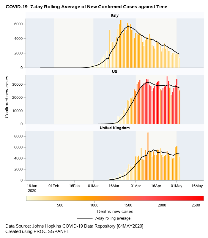
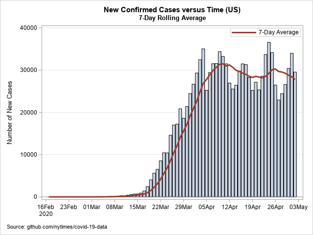
Get the right information, with visual impact, to the people who need it
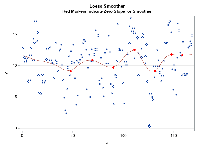
Find points where a regression curve has zero slope

This article shows how to find local maxima and maxima on a regression curve, which means finding points where the slope of the curve is zero. An example appears at the right, which shows locations where the loess smoother in a scatter plot has local minima and maxima. Except for