Data Visualization

Get the right information, with visual impact, to the people who need it
Data Visualization | Students & Educators
Katrina Miller 0
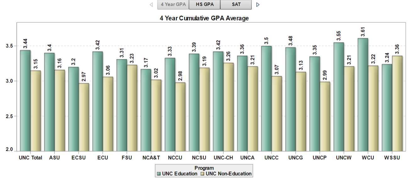
Dashboard vs. Scorecard: Measuring the Impact of Educator Preparation

With educator preparation programs (EPPs) under fire, states must make difficult decisions on how to hold EPPs accountable, provide information for program improvement, and offer consumer information to the public on EPP efficacy. In conversations I’ve had with state leaders grappling with this issue, I have seen a debate arise

Data Visualization
Sanjay Matange 0
Financial graphs

Browsing on the web, I ran into a simple but visually interesting graph of financial data.  Really, it could be any data, but this one showed up under "Financial Graphs".  I thought this would give me an opportunity to speak about an interesting new feature added to SERIES plot with

1 316 317 318 319 320 539