Data Visualization

Get the right information, with visual impact, to the people who need it

Analytics | Data Visualization | Learn SAS
SAS Korea 0
SAS 비주얼 애널리틱스로 사용자 정의 폴리곤 구축 및 시각화하기

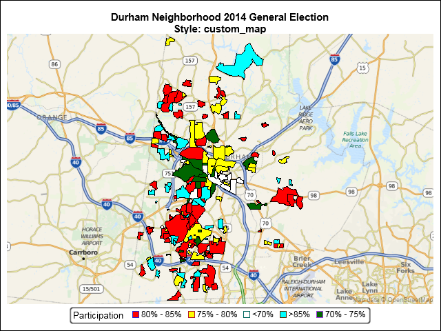
데이터 시각화 툴을 이용해 건물 지도, 층 설계, 기타 Esri 데이터를 디스플레이해야 한다면? 여기를 주목해주세요! 최근 ‘SAS 비주얼 애널리틱스 8.2(SAS Visual Analytics 8.2)’에 추가된 사용자 정의 폴리곤(polygon) 기능으로 여러 유형의 지역 오버레이를 렌더링할 수 있습니다. 일반적으로 보고서에 층 또는 건물 지도를 포함시킬 때 많이 사용되는데요. 오늘은 SAS 비주얼 애널리틱스로 실제 폴리곤을 등록하고,

Data Visualization
Ed Odom 0
SGMAP: Using MAPIMPORT for Polygon Maps

An earlier SGMAP blog used the BUBBLE statement to overlay point data on top of an Open Street Map. However, not all map features are points. Some are enclosed areas called polygons. Some map polygons share common borders such as states and counties. Others are separate, non-contiguous regions such as national parks

1 218 219 220 221 222 538