Get the right information, with visual impact, to the people who need it
Visualizing kernel density estimates in SAS Visual Analytics

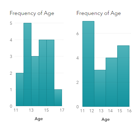
Visualization of data density estimation, which is often used in statistical analysis and machine learning, will show the data’s characteristics like distribution, skewness and modality, etc. Commonly-used data density visualizations include boxplot, histogram, kernel density estimates, and some other plots. This blog post visualizes the kernel density estimates superimposing on histogram using SAS Visual Analytics.