Get the right information, with visual impact, to the people who need it

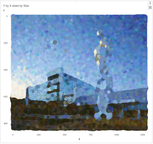
As a fun side project I recently looked into alternative visualization techniques in order to use computers to create art. An interesting approach is pointillism, which, according to Wikipedia is a "technique of painting in which small, distinct dots of color are applied in patterns to form an image." This


