As a fun side project I recently looked into alternative visualization techniques in order to use computers to create art. An interesting approach is pointillism, which, according to Wikipedia is a "technique of painting in which small, distinct dots of color are applied in patterns to form an image." This approach was developed back in 1886 by Georges Seurat and Paul Signac.
Pointillistic data
I wanted to see whether I could use visualization tools such as SAS Visual Analytics to do a pointillism rendering. So the first challenge was generating the correct data. While doing research I came across Matteo Ronchetti's excellent work about creating pointillist paintings using Python. He has written a very clever script that converts an ordinary image into pointillism.
So all I need now is a sample image. I decided to use a picture of the SAS World Headquarters in Cary showing one of the buildings on the campus:

 Matteo's original program did not actually produce any data besides the drawn image. So, after getting permission from Matteo, I made a few changes to store data into Cloud Analytics Server (CAS) and generated a handy color palette to import into SAS Visual Analytics. The entire Jupyter notebook I created is attached to the related SAS Visual Gallery entry. You may also have a look at the related developer guide for Python before you get started.
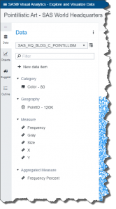
Executing the script loads a new CAS table into memory with columns such as X/Y available in SAS Visual Analytics.
Visualization trial and error
With data points available in tabular structure, I have to decide what visualization to use. The simplest option would be a scatter plot but even a geographical map, bubble plot or heat map would work and allow some interesting rendering options dependent on role assignments and projections selected. Additional display rules or data skins could produce interesting effects and simulate things like different stroke strengths.
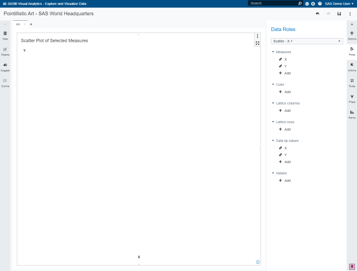
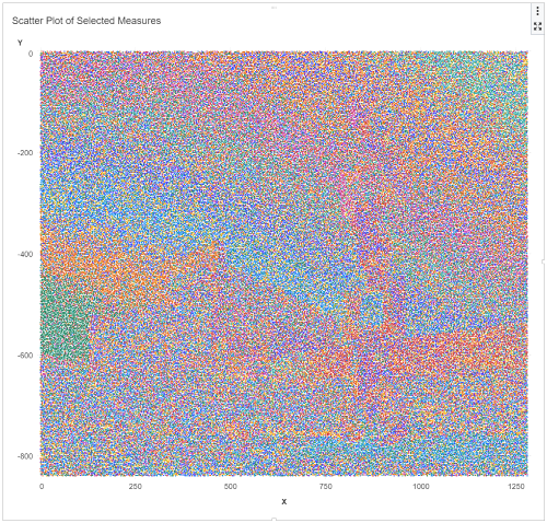
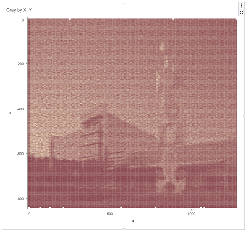
Assigning the X/Y roles to the scatter plot produces, however, a rather disappointing first result:
Given the number of data points, more than 150k in my example, we need to tweak a few options to allow such large number of data points to render. The options panel allows me to override the system defaults so I decided to increase the value accordingly. Note that higher numbers result in slower rendering performance. Dependent on your environment, the image used and thresholds for each visualization, values to use may vary. We now get the following rendering:
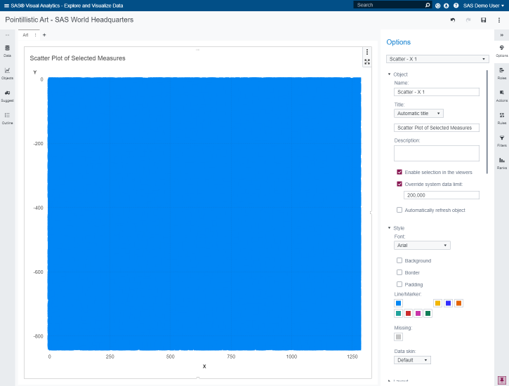
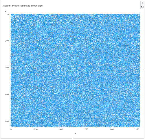
Better, well on the positive side, we got some first points! It seems the default marker size of 12 is too large, so let's try a value of 2:
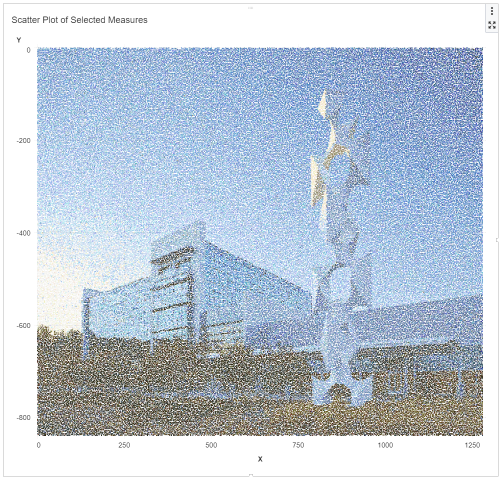
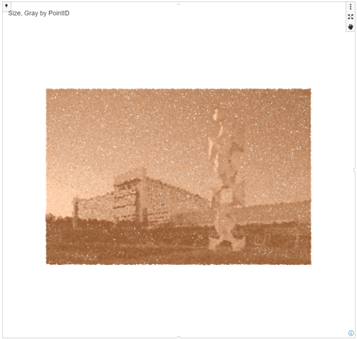
Still rather disappointing given all points have the same color. Let's assign a color value:
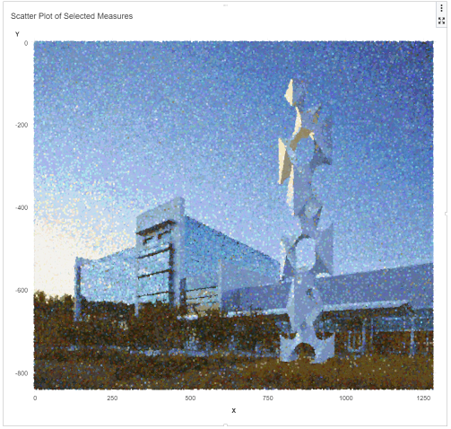
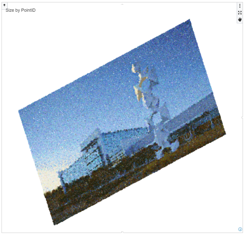
We are starting to see some first structure here. However, given the default color palette in VA, this isn't rendering too well. In the previous data section I also made changes to the program to create an attribute map to define related display rules. Loading these display rules finally shows the expected picture:
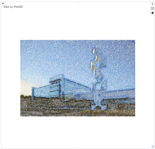
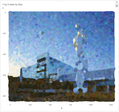
Now that we have the data in usable form, we can try a few more options to further tweak our piece of art and make it more dynamic and in a painting style. See a few different options below.
Conclusion
Amazing what can be done with data in today's world. Creating pointillistic art using SAS Visual Analytics is surprisingly simple and you get rewarded with some stunning visualizations. Try creating your own master piece and showcase your results in the SAS Visual Analytics Gallery!

1 Comment
Like the bubble plot one. Cool!