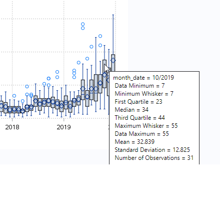
I saw an article that claimed Donald Trump recently tweeted 123 times in one day. This got me wondering how many times he typically tweets during a day, and whether this number has changed over the years. This seems like it might be a good topic to analyze with a
Tag: Trump
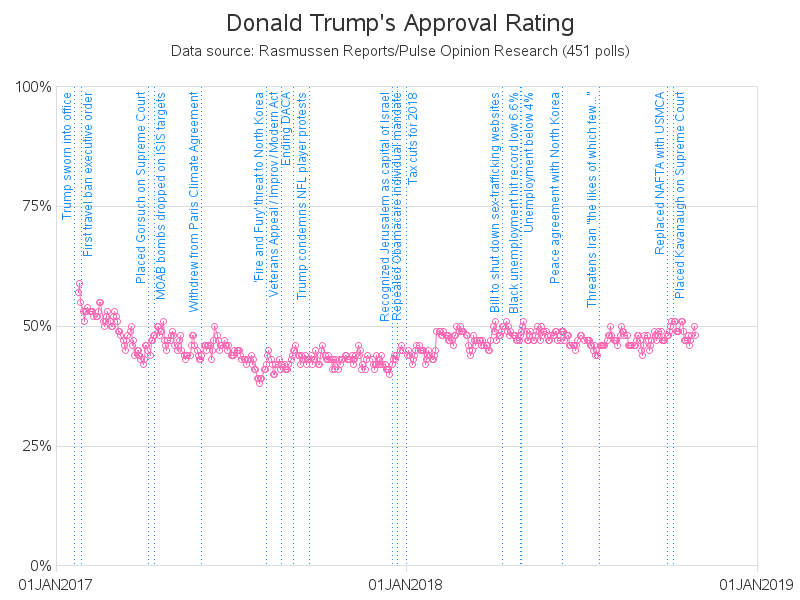
President Donald Trump - people seem to either love him or hate him. Which makes for an interesting data-analysis topic ... tracking Trump's approval rating. Follow along as I explore some data! I'll start with what I consider the 'best' approval-rating graph I've found so far. Here's a screen-capture of
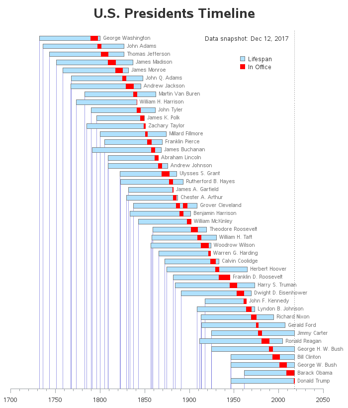
I was recently reading the Wikipedia page about the U.S. presidents. There was a table with a lot of interesting data, but I thought it would be much easier to get a handle on the information if there was also a timeline graph. So, of course, I set out to
Since Trump became the US president, many people have noticed that he posts a lot of tweets. While some people choose to analyze and critique the content of those tweets, I was more curious about something a little less controversial - the timing and frequency. Follow along as I dig into
The Obama administration made great strides in improving the government’s use of information technology over the past eight years, and now it's up to the Trump administration to expand upon it. Let’s look at five possible Trump administration initiatives that can take government’s use of information technology to the next
Parents are always proud of their kids, and think their kids are better than all the other kids. I guess it might be a little bit that way with mapping software ... but I really do think I've got a pretty compelling example to show that SAS maps are better
Recently, my fellow SAS blogger Rick Wicklin wrote a post showing how to graph the ages of all the US presidents. And Chris Hemedinger showed how to create a bar chart showing the number of presidents having each of the 12 zodiac signs. Both are interesting graphs, but I wanted to
How is it that 91% of the US didn't vote for either Hillary or Trump in the primary, but yet they're still the final two candidates in the presidential election? Let's break it down with a simple graph! I recently saw a really cool slideshow on the nytimes website, that answered