Importing about 4,400 messages worth of data into SAS Visual Text Analytics to exploring it and create an information extraction model.
Tag: Text
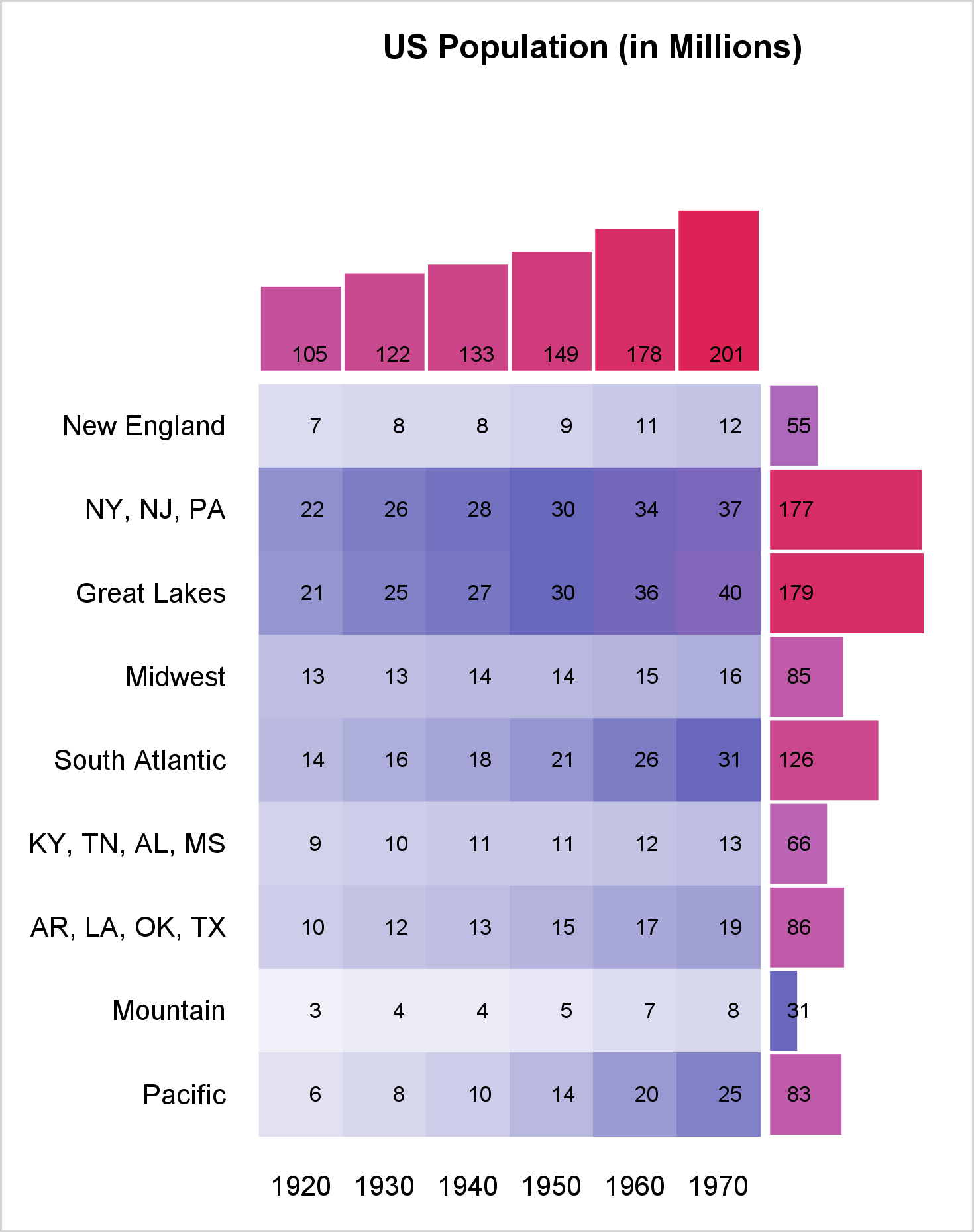
You can use a range attribute map to control the mapping of values in a continuous variable to colors. This post shows you how to use PROC SGPLOT to display multiple plots in the same graph and use range attribute maps.
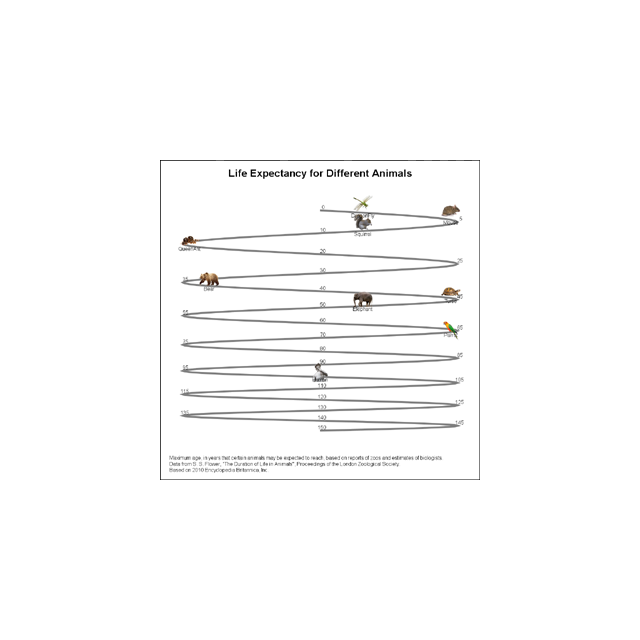
Last week I published an article on creating bar charts with visual category values. The idea was to use visual icons for the category values in a HBAR of age by animal. For the data, I referred to a visual from the 2010 Encyclopedia Britannica Inc. that I found on the
Last week a user asked about BY variable group processing for SGAnnotate with SGPLOT procedure. The user provided a simple use case for the question (always a good idea) using the sashelp.class data set. The graph included a display of reference lines for the mean value of height using annotation. The
Sankey Diagrams have found increasing favor for visualization of data. This visualization tool has been around for a long time, traditionally used to visualize the flow of energy, or materials. . Now to be sure, GTL does have a statement design for a Sankey Diagram which was implemented only in Flex for use
Significant progress in reduction of Cancer mortality is shown in a graph that I noticed recently on the Cancer Network web site. This graph showed the actual and projected cancer mortality by year for males. The graph is shown on the right. The graph plots the projected and actual numbers
As Sheldon Cooper would say, this is the first episode of "Fun with Charts". I did not find a cool term like "Vexillology" and "Cartography" is taken by map making, so let us go with "Chartology". Yesterday, I saw a couple of interesting bar charts as shown on the right. I thought