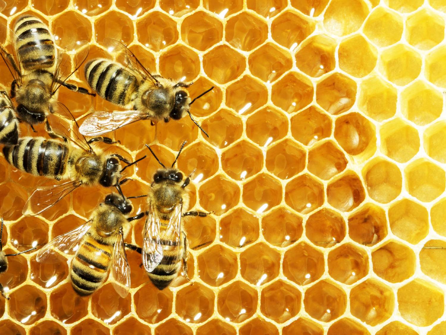
SAS Visual Analytics filters in 7.4 and 8.2 enable you to improve the appearance of reports based on calculations that use periodic operators. Parameter settings also enable you to provide users with a prompt for choosing the data to display in a report, without having any effect on the calculations themselves.
Tag: SAS Visual Analytics
‘스포츠 분석’이라고 하면 아마 많은 분들이 브래드 피트 주연의 영화 ‘머니볼(Moneyball)’을 떠올리실 텐데요. 이 영화는 2002년 분석을 활용해 오클랜드 애슬레틱스(Oakland Athletics) 야구팀을 승리로 이끈 빌리 빈(Billy Beane) 단장의 이야기를 다룹니다. 빈 단장은 스포츠 분석의 기반을 세웠지만, 오늘날 그 활용 범위는 훨씬 더 넓어졌죠! 몇 가지 예만 봐도 스포츠 분야에서 분석이 얼마나
Gradient boosting is one of the most widely used machine learning models in practice. See how to use gradient boosting model for classification in SAS Visual Data Mining and Machine Learning.
At SAS we use data to accomplish many of our everyday tasks. At SAS Books, we have now even used data to create a data-driven book, An Introduction to SAS Visual Analytics.
みなさんご存知の通り、SAS Visual AnalyticsはセルフサービスBI&Analyticsツールで、ビジネスユーザー自身で簡単にレポートやダッシュボードを作成することができます。その際、標準で備わっている数多くのチャートオブジェクトを使用することができますが、お客様要件によっては、標準のチャートタイプだけでは表現できないものもあります。それに答えるためにSAS Visual Analytics 8.2(以下VA)には大きく2つの機能が用意されています。 データドリブンコンテンツ 地図上のカスタム境界線描画 1番目の「データドリブンコンテンツ」とは、サードパーティのビジュアライゼーション・ライブラリ(D3.js, C3, Google Chart Toolsなど)と連携することで、チャートタイプやビジュアルのバリエーションを大幅に拡張可能な機能ですが、 今回は、2番目の「地図上のカスタム境界線描画」機能に関してご紹介します。 VAに標準搭載のチャートオブジェクトには地図描画のための「ジオマップ」オブジェクトが含まれています。この機能を活用することで、例えば、地図上で隕石落下地点と被害の度合いを分析(図1.参照)したり、都道府県別の売上や店舗別の顧客数などをビジュアライズし、分析(図2.参照)することができます。 図1.隕石落下地点と被害の度合い分析ダッシュボード 図2.店舗別の売上と利益をバブルのサイズと色で表示 地図描画のタイプとしては、図1の「座標」、図2の「バブル」以外に「領域」を選択可能です。 「座標」とは、地図上の該当ポイントに円形や星形などのアイコンを表示するものです。 そして、「領域」では、基本的に地図上の国の境界線や、その一つ下のレベルである州や都道府県の境界線領域を描画します。例えばアメリカの州や日本の都道府県の領域を指定した値に基づき色分けして表示するものです。(図3.参照) 図3.都道府県ごとの売上分析 さらに、地図上に表示するこの「領域」をカスタムで描画することが可能で、これを「カスタム境界線(領域)」描画機能と呼んでいます。 この機能を活用することで、例えば、特定施設内の人や物の動線を描画したり、家屋ごとのソーラー発電量を実際の地図上に描画することなども可能になります。 その基本的な手順を、アメリカにあるコロラド・コンベンション・センター(以下CCC)内のミーティングフロアにある各種の会議室領域の描画を例に、以下に示します。 図4. VAレポート上に表示された完成版(部屋ごとの面積などを色分けして描画することができます) CCCのフロアレイアウト画像を入手し、市販ツールあるいはオープンソース製品を使用し、Esri shapeファイルを作成 Esri ShapeファイルをVA環境にインポート インポートしたデータに基づきカスタム境界線(領域)をレポート上に描画 1. CCCのフロアレイアウト画像を入手し、市販ツールあるいはオープンソース製品を使用し、Esri Shapeファイルを作成 この例では市販のEsri Desktopツールを使用し、CCCのサイトから入手したフロアレイアウトの画像をEsri地図上に重ね(図5.参照)、部屋の輪郭をなぞって描き(図6.参照)、結果をEsri Shapeファイルとして保存(図7.参照)します。(詳細に関しては、使用するツールのマニュアルを御覧ください。) 図5. Esri地図上のCCCのある地点の上に、CCCのフロアレイアウト画像を重ねる 図6. 部屋の輪郭をなぞって描く(描いた領域ごとにIDを設定しておきます。この例ではRoomID) 図7. 結果をEsri Shapeファイルとして保存 2. Esri ShapeファイルをVA環境にインポート VA環境に実装されているマクロ%SHPIMPRTを使用し、Esri ShapeファイルをSAS Datasetに変換(以降Shapeデータ)し、VA環境(インメモリー)にロードします。 詳細は、以下サポートサイトにあるSAS Viya管理者(Administration)マニュアルを御覧ください。 https://support.sas.com/documentation/onlinedoc/viya/index.html
In meiner Funktion als Academic Program Manager unterstütze ich Hochschulen in den Themengebieten künstliche Intelligenz (KI), Data Science und Business Analytics. Einer der am häufigsten geäußerten Wünsche ist, dass seitens SAS, Use-Cases zur Verfügung gestellt werden. Keine theoretischen Gebilde, sondern echte, reale Daten von Firmen mit einem handfesten Business-Problem, das
El 25 de mayo de 2018 entrará en vigor el Reglamento General de Protección de Datos (GDPR, por sus siglas en inglés). ¿Su objetivo? Robustecer la protección de los datos personales de la gente que vive en los países que conforman la Unión Europea (UE). Si bien regional, los efectos
SAS Data Studio is a new application in SAS Viya 3.3 that provides a mechanism for performing simple, self-service data preparation tasks to prepare data for use in SAS Visual Analytics or other applications. It is accessed via the Prepare Data menu item or tile on SAS Home. Note: A
SAS Visual Analytics 8.2 introduces the Hidden Data Role. This role can accept one or more category or date data items which will be included in the query results but will not be displayed with the object. You can use this Hidden Data Role in: Mapping Data Sources. Color-Mapped Display
Report data shared by educational institutions, government agencies, healthcare organizations, and human resource departments can contain sensitive or confidential data. Data in such reports are suppressed selectively to protect the identities of individuals or to prevent the report’s audience from easily inferring individual values. The Data Suppression feature in SAS
데이터 시각화 툴을 이용해 건물 지도, 층 설계, 기타 Esri 데이터를 디스플레이해야 한다면? 여기를 주목해주세요! 최근 ‘SAS 비주얼 애널리틱스 8.2(SAS Visual Analytics 8.2)’에 추가된 사용자 정의 폴리곤(polygon) 기능으로 여러 유형의 지역 오버레이를 렌더링할 수 있습니다. 일반적으로 보고서에 층 또는 건물 지도를 포함시킬 때 많이 사용되는데요. 오늘은 SAS 비주얼 애널리틱스로 실제 폴리곤을 등록하고,
Con el fin de establecer el rumbo que tomaron sus compañías para seguir siendo competitivas y rentables, los líderes empresariales están atentos a una gran cantidad de factores internos como externos. El ambiente socioeconómico y político, los cambios en los patrones de consumo, el uso de nuevas tecnologías, e incluso
전 세계가 눈 한 번 깜짝할 사이도 안 되는 찰나의 순간에 울고 웃습니다. 바로 냉혹해서 더 감동적인 스포츠 경기 때문인데요. 스포츠에서 정밀하게 시간을 측정하는 전문가 ‘타임 키퍼’의 역할은 매우 중요합니다. 덕분에 동계 스포츠의 꽃인 스피드 스케이팅은 1000분의 1초까지 시간을 측정할 수 있을 정도로 관련 기술이 빠르게 발전하고 있죠. 전 세계
In my last article, I worked with an example of using custom polygon data to create a regional geo map in SAS Visual Analytics 7.4. In this article, I will use almost the same example to illustrate the ease of implementing custom polygons to produce the same regional map in
By default, SAS Visual Analytics 7.4 supports country and state level polygons for regional geomaps. In SAS Visual Analytics 7.4, custom shape files are now supported, as well. This means that if a site has their own custom polygon data that defines custom regions, it’s possible to create a region
Jazz up your Geo Map or Network Analysis graph by applying icon-based display rule markers instead of color markers on the map. With SAS Visual Analytics, you may have already used display rules by populating intervals or adding color-mapped values for report objects. Now, you can jazz up your Geo
Can you use a data visualization tool to display building maps, floor designs and other Esri data? With the recent addition of custom polygon support in SAS Visual Analytics 8.2, customers wondered if this feature can be utilized to render different types of regional overlays. A common request is to
Are you interested in using SAS Visual Analytics 8.2 to visualize a state by regions, but all you have is a county shapefile? As long as you can cross-walk counties to regions, this is easier to do than you might think. Here are the steps involved: Step 1 Obtain a
Seit einigen Tagen ist das brandneue Release von SAS Visual Analytics verfügbar. Ich habe mich natürlich gleich drangemacht, die neue Ausgabe auf Herz und Nieren zu prüfen. Herausgekommen sind neben vielen neuen Funktionen auch die Top-10-Gründe, warum Sie für Ihre Big-Data-Strategie mit SAS Visual Analytics, kurz SAS VA, die besten
2017年12月にSAS Viyaの最新版3.3がリリースされました。 これに伴い、皆様には、大幅に拡張されたSAS Viyaの機能を存分に体感いただくために今版から、皆様がお持ちの「実データ」でSAS Viyaベースのすべての製品を自由に触っていただけるようになりました。 ぜひ、ご利用ください! 利用手順に関しては、以下のブログをご覧ください。 SAS Viyaを体感してみよう! ~SAS Viya無償試用版利用ガイド~
Another report requirement came my way and I wanted to share how to use our Visual Analytics’ out-of-the-box relative period calculations to solve it. Essentially, we had a customer who wanted to see a metric for every month, the previous month’s value next to it, and lastly the difference between
In my last article, Managing SAS Configuration Directory Security, we stepped through the process for granting specific users more access without opening up access to everyone. One example addressed how to modify security for autoload. There are several other aspects of SAS Visual Analytics that can benefit from a similar
Are you struggling to kick start your organization’s analytics journey, especially when it comes to leveraging advanced analytics and machine learning techniques? If the answer is yes then you’re definitely not alone. Whilst most organisations today recognise the benefit of analytics and data science, many are still struggling to kick
100년만의 최악의 허리케인, 푸에르토리코를 덮치다 지난 9월 20일, 북대서양과 카리브해 사이에 있는 미국 자치령 푸에르토리코(Puerto Rico)에 초강력 허리케인 마리아(Maria)가 상륙했습니다. 마리아는 시속 185마일(295㎞) 이상의 최고 단계인 5등급 허리케인으로 100년만의 최악의 피해를 남겼습니다. 더욱이 일명 괴물 허리케인이라고 불린 5등급 허리케인 어마(Irma)에 이어 단 2주만에 불어 닥친 재해로 340만 주민들은 엄청난 충격에
In this education analytics series of blog posts, we have been on a journey to learn how education customers are turning their data into insights to be a more data-informed and analytical organizations. In my first five posts in the education analytics blog series, we learned how education customers are using SAS,
노벨상의 유래 매년 10월 초, 전 세계의 이목이 스웨덴과 노르웨이로 쏠립니다. 바로 세계에서 가장 권위 있는 시상식 '노벨상(The Nobel Prize)'이 열리기 때문인데요. 노벨상은 다이너마이트를 발명해 거대 재벌이 된 스웨덴 화학자 알프레드 노벨(Alfred Nobel)의 유언에 따라 그가 남긴 재산으로 노벨 재단을 설립하며 시작됐습니다. 최초의 노벨상은 1901년 물리학, 화학, 생리학 및 의학, 세계
Frau Beck, was spuckt denn http://www.paradies-konfigurator.de/ als Ihr „analytisches Paradies“ aus? Bei mir kommt Paddington in Australien heraus. Und was sagen Sie dazu? Waren Sie vielleicht schon mal da? Lustigerweise habe ich nach meinem Studium 11 Monate in Australien gelebt und gearbeitet. Eine der schönsten Zeiten in meinem bisherigen Leben.
SAS Applied Business Analytics - Im Rahmen ihrer Ausbildung zum Bachelor Wirtschaftsinformatik erhielten dieses Jahr weitere 51 Studenten an der SML der ZHAW (Zürcher Hochschule für Angewandte Wissenschaften) das begehrte Zertifikat SAS Applied Business Analytics. Dieses wird von SAS an Studenten vergeben, welche einen umfassenden Anforderungskatalog an Aufgaben – unter anderem
SAS Visual Analytics 7.4 has added the support for date parameters. Recall from my first post, Using parameters in SAS Visual Analytics, a parameter is a variable whose value can be changed at any time by the report viewer and referenced by other report objects. These objects can be a
그래비티(2013), 인터스텔라(2014), 마션(2015), 컨택트(2016), 패신저스(2017)까지, 여러분은 이중 몇 편의 영화를 보았나요? 최근 우주에 대한 공상과학(SF) 영화가 한해도 빼놓지 않고 박스 오피스를 기록해왔습니다. 컴퓨터 그래픽(CG) 기술 발전의 공이 크겠지만, 1969년 아폴로 11호의 인류 최초 달 착륙을 시작으로 혁신을 거듭해온 항공•우주 과학 기술 역시 큰 영향을 미쳤을 텐데요. 과학 기술의 진보와 함께