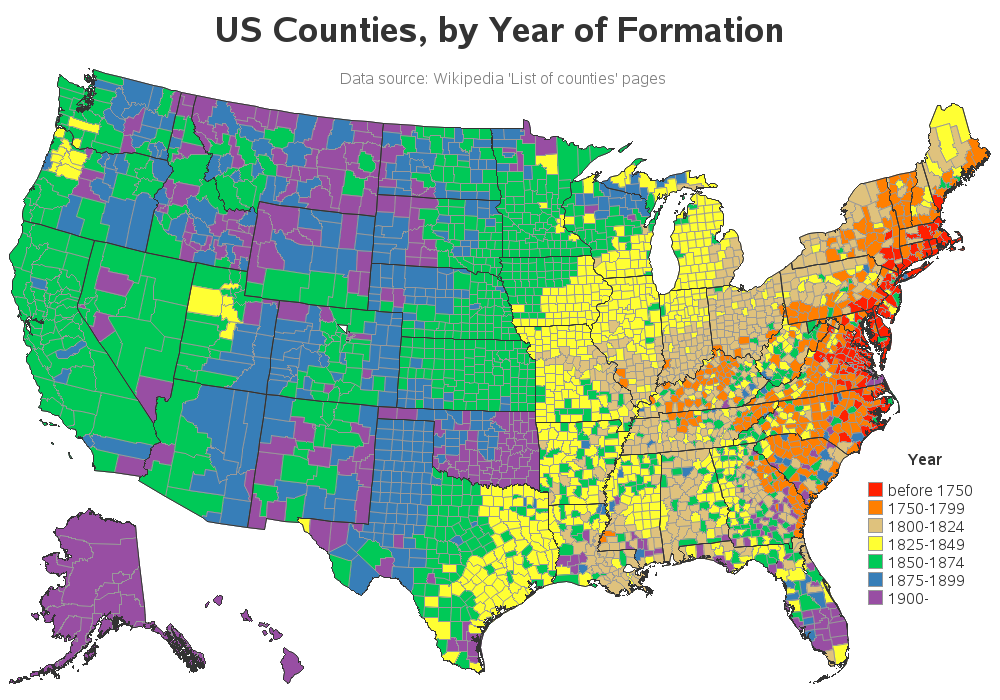
MicroMaps are a powerful way to display data where the display includes small, lightweight maps to provide geographical information regarding the data. This geographical information gives clues to the relationship between the data that could lead to more insight. The SAS SG Procedures and GTL do not currently have built-in
Tag: maps
Data about the monthly wait times at VA facilities in the US are now available, but it's a bit overwhelming to try to analyze them in tabular form - plotting the data on a map made it a lot easier!... Here in the US, when our soldiers finish their commitment in
Has this year's flu been better or worse than you thought it would be? There are a lot of factors that help determine whether or not you're likely to get the flu. Is there a bad strain going around? Did the flu vaccine target the right strain? Did you get
How simple is too simple, when it comes to analyzing data on a map? The KISS principle can be applied to many things, including graphs and maps. What is the KISS principle, you might ask? Well, it's not the rock band that my friend Patricia (pictured below) has been known
Would you rather see a list of the world's 50 best roller coasters, or an interactive map? (... how about both!) Before we get started on this ride, here's a picture of my friend Jennifer's daughter, getting an early/young start on riding roller coasters (she's in the back, with her
Which is more important - having beautiful graphs, or accurate graphs? Let's explore this question using the locations of the world's richest billionaires... I recently saw a beautiful map on dadaviz.com that purported to show the cities with the most billionaires. Here's a screen-capture of that map: I decided to
I just found out that Girl Scout cookies haven't changed from when I was a kid. I just moved to a different area, serviced by a different cookie maker! That's what I found out from the cool map in an article on latimes.com! The article explains that there are two different
When I saw Robert Kosoro's cool ZIPScribble map, I knew I had to create a SAS version - and of course I had to add a few enhancements along the way.... I was perusing some of the examples on dadaviz.com, and Kosoro's ZIPScribble map caught my attention. It wasn't a particularly useful
I'm ramping up my visualization skills in preparation for the next big election, and I invite you to do the same! Let's start by plotting some county-level election data on a map... To get you into the spirit of elections, here's a picture of my friend Sara's dad, when he was
Google recently announced that they will be adding Google Fiber high speed network and TV to my area. This was great news, because it will give us more choices ... and a little competition among providers tends to make them all 'try harder' to please the customer. :-) I was curious what other
Have you ever thought about retiring in another country, where your money might go further? Well here's some quantitative data to help you make an informed decision! ... First, to get you in the mood, here's a picture of my friend Erik checking out the prices at a pedal-powered food
Have you ever wondered whether the area where you live is a good location for producing solar power? Let's create a SAS map to help find out! To get you in the right frame of mind, here is an awesome picture of some Arizona sunshine, that my good friend Eva
Is this blog post about techniques to use on difficult graph legends, or is it about goats? The answer is both! But first, to get you into the proper mood, here is a picture my friend, Mark, took of some cute goats. And some links to YouTube videos about goats
I recently read an article that listed the 100 best restaurants in the US - but the article didn't have a map. I decided to use my SAS skills to change that! When it comes to restaurants, I eat out a lot (and by 'a lot' I mean I never
"Over the river and through the woods, to grandmother's house we go" ... and how much should we expect to pay for gasoline during the trip? Read this blog to find out! I recently wrote a blog post about some of the factors that impact the price of gasoline. The blog had
I recently found some very interesting data - a numeric Corruption Perceptions Index for each country. And of course I just had to try and create my own SAS version... First, here's the original map on the transparency.org site. They mapped all the values using a yellow-orange-red gradient, the map
There's recently been a "States I've Visited" application going around on Facebook, where users create a map showing all the US states they've visited, and then post it on their page for their friends to see. I wondered if SAS could do a better job?... Here's a screen-capture of one
In sports these days, there's a lot more data to keep track of than just the score! How can you make sense of it all? Being the Graph Guy, of course I recommend graphing it! Here's an example that's up close and personal for me - dragon boat racing... Below
In a previous blog post, I showed how to layer colored areas on a SAS map to show both countries, and the areas within countries that had cases of Ebola. But as the Ebola epidemic has spread, more data has become available, and in this blog I show how to
With Amazon Prime's 2-day shipping, I seldom go to physical stores any more. How do they deliver items so quickly? Let's analyze some data to find out... There are very few services/memberships that I truly feel like I'm getting "a good deal" for my money - and Amazon Prime is
Do you order things online, to avoid paying sales tax? Those "good old days" might be coming to an end soon... Here's a snapshot of my latest purchase from Amazon.com (a little something for the Talk Like a Pirate party I had on Sept 19): In the US, each of
Did you know that different states charge different $$ rates for electricity? The graphs in this blog will let you easily compare your rate to the rates in other states ... Did you have a portable radio (aka "boombox") back in the 1980s? Do you remember how much it cost
There's been a lot of debate lately about whether it's good or bad for the local law enforcement agencies to receive military surplus items. The data has recently become available, but it is just a big long text list of almost a quarter million items (see below). Therefore I thought
When the recent earthquake hit California, one of my friends commented that "California is so dry right now, I'm surprised it didn't just break off and fall into the ocean!" It got me wondering, just how bad and widespread is California's drought? I did a few Web searches and found lots
If you're a really big company, with many locations around the country, how do you keep track of all that? ... With a great map, of course! I recently read a CNN article about the Community Health Systems network being hacked - exposing the names, Social Security numbers, physical addresses, birthdays
"Trending" is one of those words that's trending these days, as we verbify everything. And if you understood that, then you'll probably love this blog! :-) For those of you not hip to the lingo ('hip' meaning 'knowing about and following the newest styles, fashions, etc.'), dictionary.com defines trending as "to emerge
Find out which state you'll live in, if the US state borders are redrawn so we have 50 states with equal population! (Don't worry! - This is just a fun/hypothetical "what if" blog!) To get you in the mood for this topic, here's a picture of one of the many
There are many ways to use SAS in Health & Life Sciences, and one of my favorite is using it to track the spread of diseases. This post demonstrates how to layer several customized maps to track the recent Ebola outbreak in Africa. In this blog post, I describe how I
I bet a lot of SAS users know where the phrase "Live Long and Prosper" comes from ... but can we use SAS software to also help analyze 'how long'? This blog posting shows several different kinds of SAS graphs that can help answer such a question! Let's start with
SAS software can be used for many things - here's how you could use it to help save endangered sea turtles! You've seen SAS used to track endangered wildlife by the shape of their footprints, and help run Texas Parks & Wildlife. Now, how about tracking the movements of (and thereby helping