In FiveThirtyEight's Significant Digits section, they recently mentioned that nine states could potentially have 50% or more females in their legislature after the upcoming election. My first thought - I need to see some graphs!
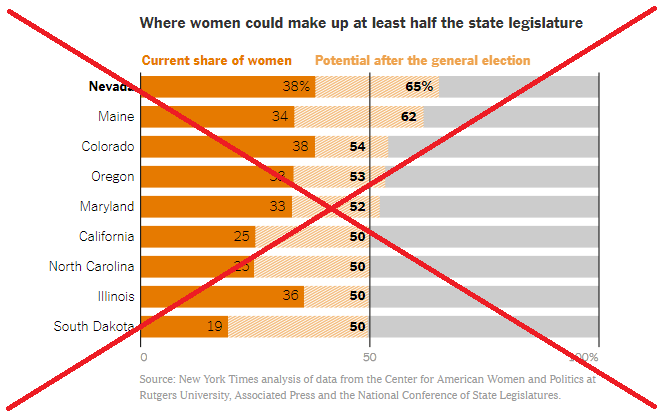
They linked to a New York Times article that had some interesting graphs. There was a bar chart that focused on the % female, and the % of seats open in the upcoming election. It showed the nine states with a chance of having at least 50% female legislators.
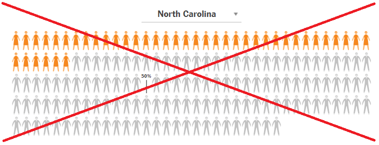
They also had a chart where you could select a single state, and see a representation of the total number of legislators, represented by male/female stick-figures.
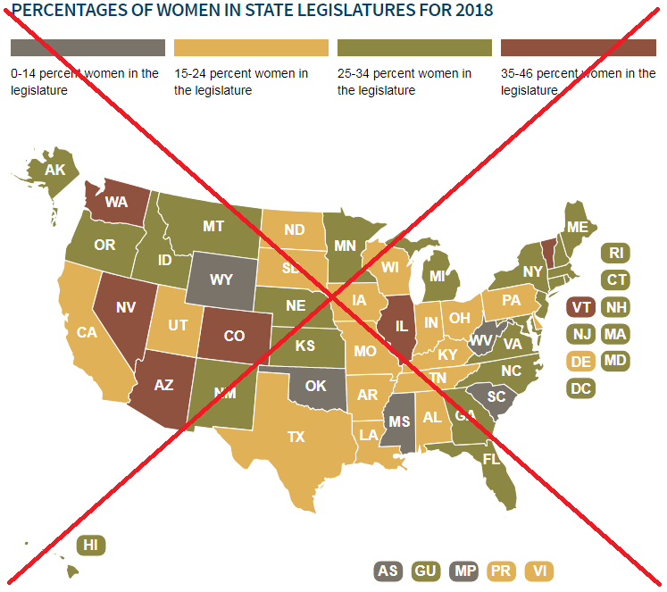
But neither of those charts let me see the overall trend, nor the geographical distribution. So I did a bit more web searching, and found the National Conference of State Legislatures website, with a map showing the % women legislators in each state. This let me see the geographical distribution by %, but not the number of legislators in each state.
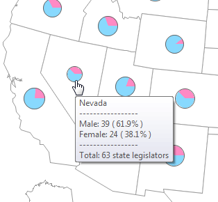
So I tried to create something better... I downloaded the data from the NCSL website, and made a bubble map where the size (area) of the bubble represents the total number of legislators in each state. The bubble is divided into two pie slices - one for female, and one for male. I think this lets you see much more at once, and provides additional insight you could not get from the other graphs. For example, I was a bit surprised that California has such a small number of legislators, and such a small percent of females.
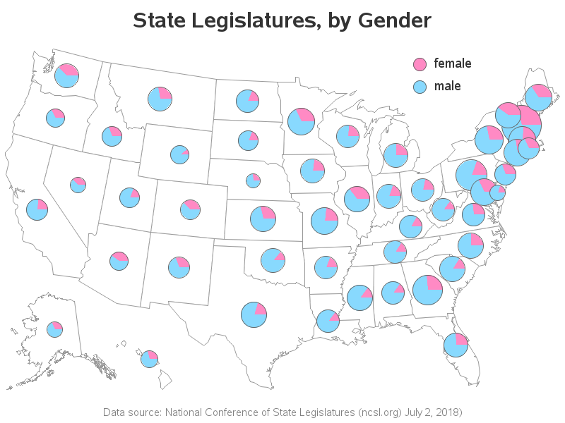
If you click on the image above, you can see the interactive version with HTML mouse-over text. Here's a screen-capture of the mouse-over text for Nevada's - the state with the highest % of female legislators:
Armed with this new visual, do you see any trends in the data? What changes or additions might improve the map? Will the % female legislators increase during the upcoming election? What are your predictions? (Feel free to discuss in the comments section!)

8 Comments
A question that I think is interesting as well is what does it mean for the percent of female legislators to increase? How would we measure that? Would we want to do a total #females divided by total # legistlators for the whole country, or is it more appropriate that each state is weighted equally? or should there be some other weighting scheme? Or should we think of percentage of states vs. percentage of female legislators? Something as simple as that question seems to on further thought not be that simple.
Exactly - calculating a % female legislators for the whole country could be a bit tricky. I think you would have to use the population (or number of registered voters) of each state as a "weighting factor" for the legislators for each state.
My only challenge with the map that is that it is hard to tell which pie chart goes with each state in the North East. I wondered if you could add the two character labels on sticks over there so it was more evident. I know you can tell with mouseover but it would be nice to see that information in the static graph.
Hmm ... I might give that a try to see how it looks.
(My first thought is that it will probably be too visually 'crowded'.)
What about putting the pies on sticks, like lollipops? Would that be too crowded too? I know more work and probably, "fussy" to get right but then no labels.
Maybe. But if they're on sticks (or lines connecting them to the states), then it might lose the visual geographic cues of having them centered on the states(?) I think the real solution might be to have they re-draw all the state boundaries, such that each state has approximately the same area! :)
Awesome graphs as always. This gets to a point that I worked on years ago when I worked for Congressional Research Service and was referred to as the "cost of attainment" in legislative bodies where as having more people or more land area for each person that "will potentially" vote, the cost to attain that vote is higher for the person trying to beat an incumbent seat and thus making it harder for gender or party affiliations to change. So while having the size of the pie chart is extremely helpful in understanding this, it would be even better if you could show those seats were the potential seat was not opposed by an incumbent because of primary defeat, term limits, or retirement. Or to show something similar to what we produced years ago, with an ordering of seats with large populations or geographical distance being more expensive for new candidates than small populations and small geographies. Once you see that data you begin to understand the call for term-limits.
Interesting inside-info!