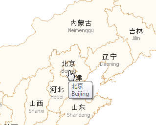
Doing business in a global economy, have you ever found yourself wanting to show Chinese (or Korean, or Japanese) labels on a map? If so, then this blog is for you! Before we get started, here is a photo of some Chinese characters to get you into the mood. This
Tag: how to
If you consider yourself as a visualization expert, you strive to create graphs that set you apart from the data analysts and statisticians. Graphs that merely plot the data in a clear/concise manner aren't enough for you. You want your graphs to also be intuitive, easy to read, and provide
Are you the lone-wolf SAS programmer in your company - managing the data, performing the analyses, and graphing the output for everyone else? And what's the only format they all know how to work with, and wish they had your output in? Let's face it ... that's probably an Excel
You've seen the QR codes that you can just scan in with your smartphone's camera, rather than writing down a web URL or other information, right? But do you know how to create your own QR code? Here's an easy way to create them, using SAS... You're probably familiar with
What information should you make easily available from the top page of your website? This Venn diagram might help you decide! Have you ever gone to a website to try to find some information, and had a (expletive) difficult time trying to find that info? I think there is often a
I was answering questions about SAS in a forum the other day, and it struck me how much easier it is to help folks if they can provide a snippet of data to go along with their program when asking others to help troubleshoot. This makes it easy to run
I guess most of us have a morbid curiosity about how we're going to die ... which is probably why Francis Boscoe's Causes of Death map went viral (no pun intended, of course!). This blog post shows how to create such a map... But first, to lighten up the mood a bit
Teacher pay, and the possibility of a raise, has been a hot topic in North Carolina lately. So I decided to look around and see if I could find any good data related to teacher salary, and then try to determine the best way to present that data graphically. I found that
In a previous post, I showed you how to send graphs with charttips & drilldowns in an email ... but what if you also need to send the graphs that you're drilling-down to? You guessed it - SAS also has a slick trick for doing that! When you create SAS graphs
The farther you try to forecast into the future, the less certain you are -- how can you represent that graphically? One way is to draw a shaded/colored "confidence interval" around your forecast line, but this is something a lot of SAS users have trouble with. That's why I decided to create