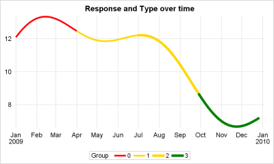
This article is motivated by a recent question on the SAS Communities board. This user wants to create a series or spline plot where the attributes of the line (color, thickness) can be changed based on another variable. In this case it may be a binary variable with "0" and
Tag: Group
The series plot is a popular way to visualize response data over a continuous axis like date with a group variable like treatment. Here is some data I made up of a response value by date, treatment, classification and company that makes the drug. The data is simulated as shown in the attached program
A Bar Line graph is commonly used in many domains. The SGPLOT procedure makes it easy to create bar line graphs where the user can customize it in many different ways. This post is prompted by a recent question on the communities page on creating such a graph, with one bar and
A recent question by a user lead led me to experiment with what is often referred to as conditional highlighting. The user wanted to display a bar chart of response by year, where each bar is colored by year, and show a cross hatch pattern on the bars where the