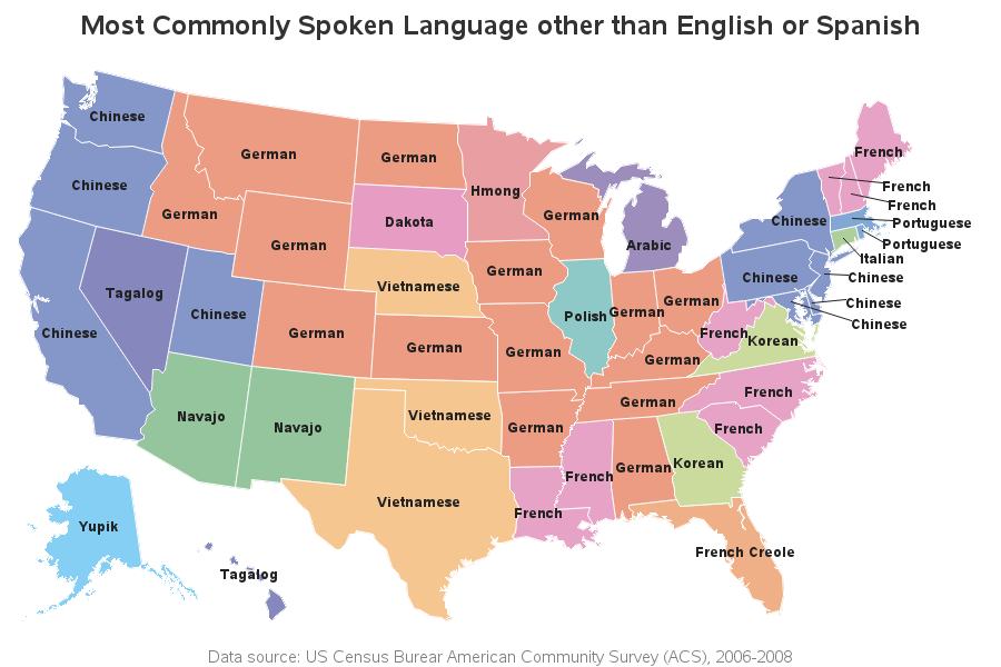
This blog post is mostly just a bunch of fun maps ... maps that are labeled (or mislabeled) in various ways, using fun/interesting data. I focus on the 'fun' part, but if you're not careful you might also learn a little about the various ways to add labels to maps
Tag: annotate
Yesterday we had a 'special election' here in NC, to elect new members to the House of Representatives for Congressional Districts 3 and 9. The election got a lot of national news coverage, therefore I thought people might like seeing the results plotted on a map. Before I decided to
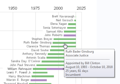
Here in the US, we recently had a new Supreme Court Justice appointed. This is a very important position, and judges usually serve until they retire or die. My buddy Rick gave me a heads-up that there was a table of all the past & present justices on Wikipedia, and
Have you been using the SAS/Graph Gmap procedure to plot your data on maps for years, but never knew you could add roads to your maps?!? Follow along in this blog post, and I'll teach you how... But before we get started, here's a picture of a nice aerial view
PharmaSUG 2015 in Orlando was held at the Renaissance had a record breaking attendance of over 650. Weather was great, except for a huge downpour on the evening of the last day. All the popular presenters were in attendance including Art Carpenter, Kirk Lafler, Arthur Li and many others. Presentations
It's easy to plot events that happened at a certain time, but what about events that extended over a range of dates, such as recessions? ... This blog post teaches you a nice trick to use for that! Let's say you have a plot of the labor force participation rate