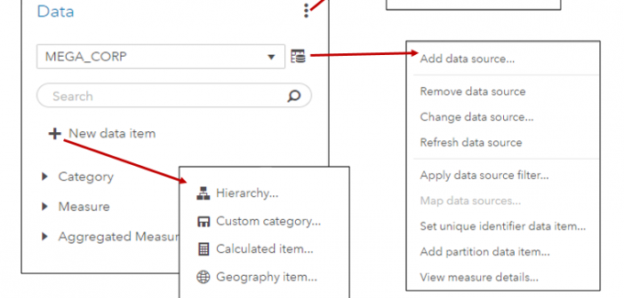
In SAS Visual Analytics 8.2 on Viya 3.3, there are a number of new data features available. I’ll cover a few of these new features including the new data plan and data item features in SAS Visual Analytics in this blog.

In SAS Visual Analytics 8.2 on Viya 3.3, there are a number of new data features available. I’ll cover a few of these new features including the new data plan and data item features in SAS Visual Analytics in this blog.
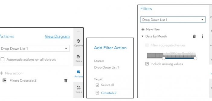
SAS Visual Analytics filters in 7.4 and 8.2 enable you to improve the appearance of reports based on calculations that use periodic operators. Parameter settings also enable you to provide users with a prompt for choosing the data to display in a report, without having any effect on the calculations themselves.
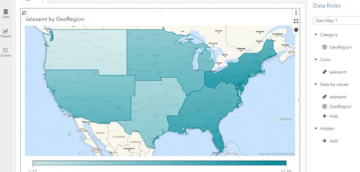
In my last article, I worked with an example of using custom polygon data to create a regional geo map in SAS Visual Analytics 7.4. In this article, I will use almost the same example to illustrate the ease of implementing custom polygons to produce the same regional map in
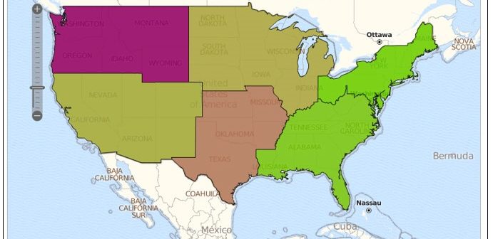
By default, SAS Visual Analytics 7.4 supports country and state level polygons for regional geomaps. In SAS Visual Analytics 7.4, custom shape files are now supported, as well. This means that if a site has their own custom polygon data that defines custom regions, it’s possible to create a region
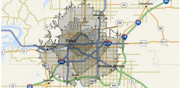
In SAS Visual Analytics 8.1, report creators have the ability to include drive-distance and drive-time in their geographical maps, but only if their site has an Esri ArcGIS Online account and they have valid credentials for the account. In the user Settings for SAS Visual Analytics Geographic Mapping 8.1 release,
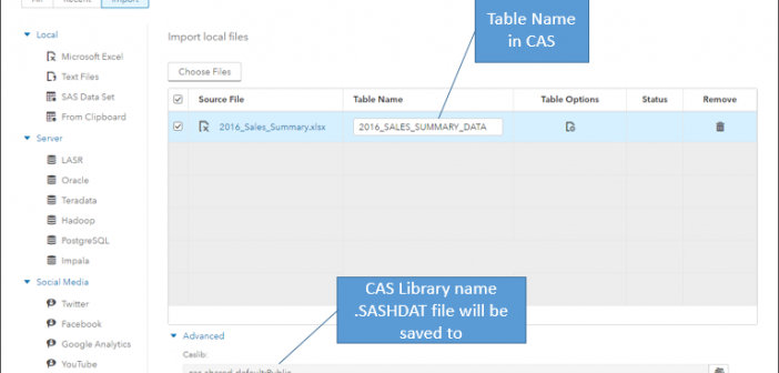
In my last blog, we examined the data pane in SAS Visual Analytics 8.1. That blog discussed how to have the data pane display the data items of your active data source, and how to perform tasks such as viewing measure details, changing data item properties, and creating geographic data items,
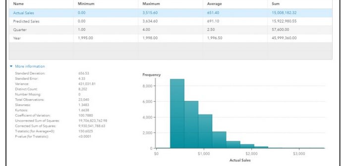
Refining your data for effective reports is even easier in the 8.1 release of SAS Visual Analytics. In this blog post, I’ll take a look at the data pane, how it displays data from your active data source, and a few tasks that you might want to perform, such as
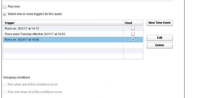
You can expand on the functionality of SAS Visual Data Builder in SAS Visual Analytics by editing the query code, adding code for pre- and post-processing, or even writing your own query. You can process single tables or join multiple tables, writing the output to a LASR library, a SAS library, or a
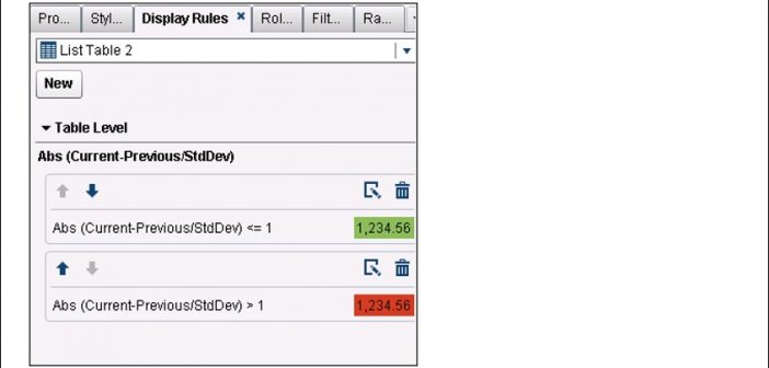
Several months ago, I posted a blog about calculating moving averages for a measure in the Visual Analytics Designer. Soon after that, I was asked about calculating not only the average, but also the standard deviation over a period of months, when the data might consist of one or more

Analysts often use a simple moving average to get an idea of the trends in data. This is simply an average of a subset of time periods, and the size of the subset can differ depending on the application. The technique can be used with data based on time periods,