Get the right information, with visual impact, to the people who need it

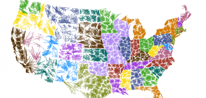
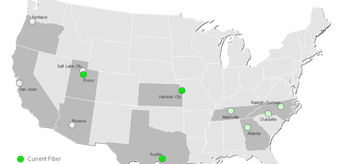
I just found out that Girl Scout cookies haven't changed from when I was a kid. I just moved to a different area, serviced by a different cookie maker! That's what I found out from the cool map in an article on latimes.com! The article explains that there are two different

