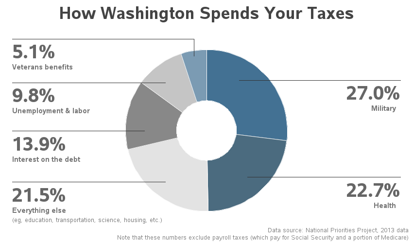
As I was doing my taxes, I wondered where the government is spending my tax dollars. And being a SAS user, I decided to find out using a graph ... I did a few Google searches on "tax graphs" and found one on the CNN web site that I liked - it

As I was doing my taxes, I wondered where the government is spending my tax dollars. And being a SAS user, I decided to find out using a graph ... I did a few Google searches on "tax graphs" and found one on the CNN web site that I liked - it

In writing the second edition of SAS Programming in the Pharmaceutical Industry, I knew that I wanted to replace the device-driven SAS/GRAPH figures with the new ODS template-driven graphics procedures. The latest developments in SAS graphics involve the template-driven procedures and tools found in SAS ODS graphics (i.e., ODS Graphics
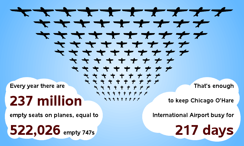
Here's an example that shows SAS is more than just a tool to create analytic graphics - it can also be used to create 'cute' infographics! :) An infographic that recently caught my eye had a fleet of airplanes stretching from overhead out to the horizon, along with some interesting
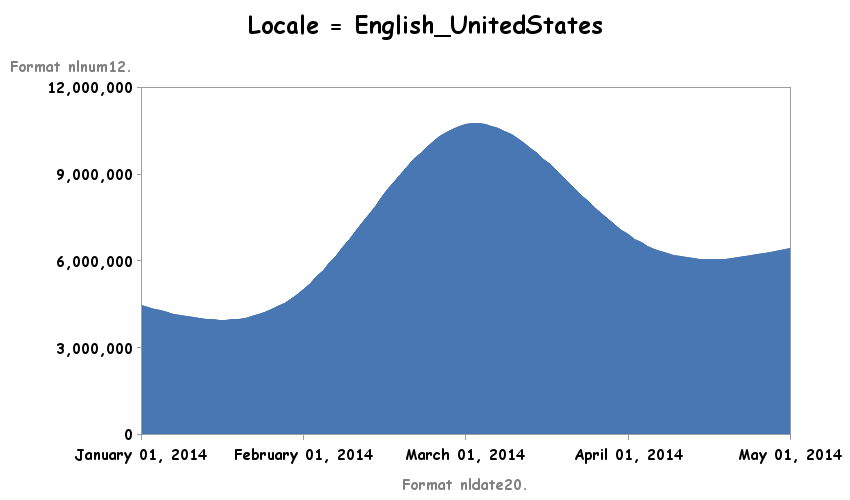
Have you ever eaten a biscuit, and thought to yourself "well, it ain't like momma fixed it"? (Alan Jackson fans will get that one!) ... So it is with food, and so it is with numbers and dates in graphs! Back in college, when I lived in the Alexander International Dorm
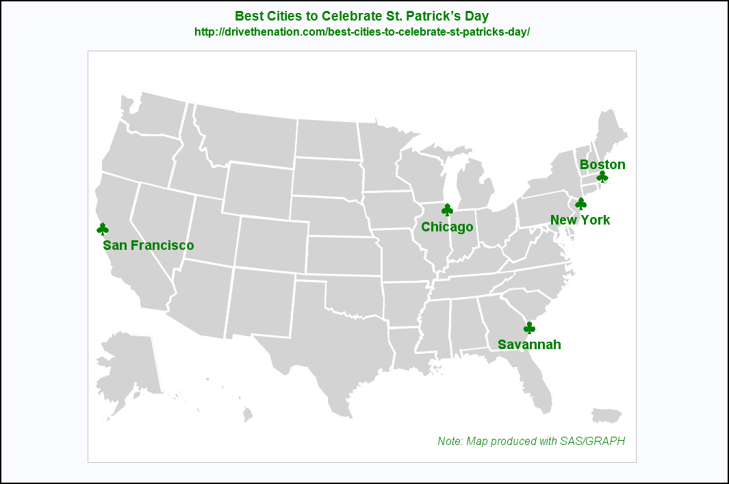
In my younger years, I enjoyed celebrating St. Patrick’s Day in Savannah, GA. Did you know the city dyes the fountain water green and has a parade that attracts over 400,000 people? It is now time for me to find additional cities to celebrate the holiday. Based on the DriveTheNation
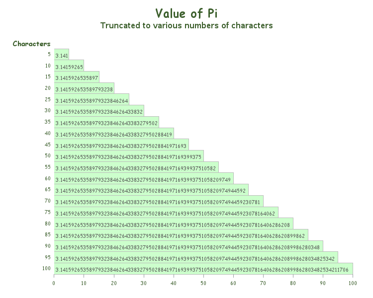
Did you know that this Friday is Pi Day? How are you planning to commemorate this special day? :) Next year's Pi Day might even be more special than usual, being that it will contain: March 14, 2015 - 9:26:53. And if you realize the coolness of that (3.141592653), you might be
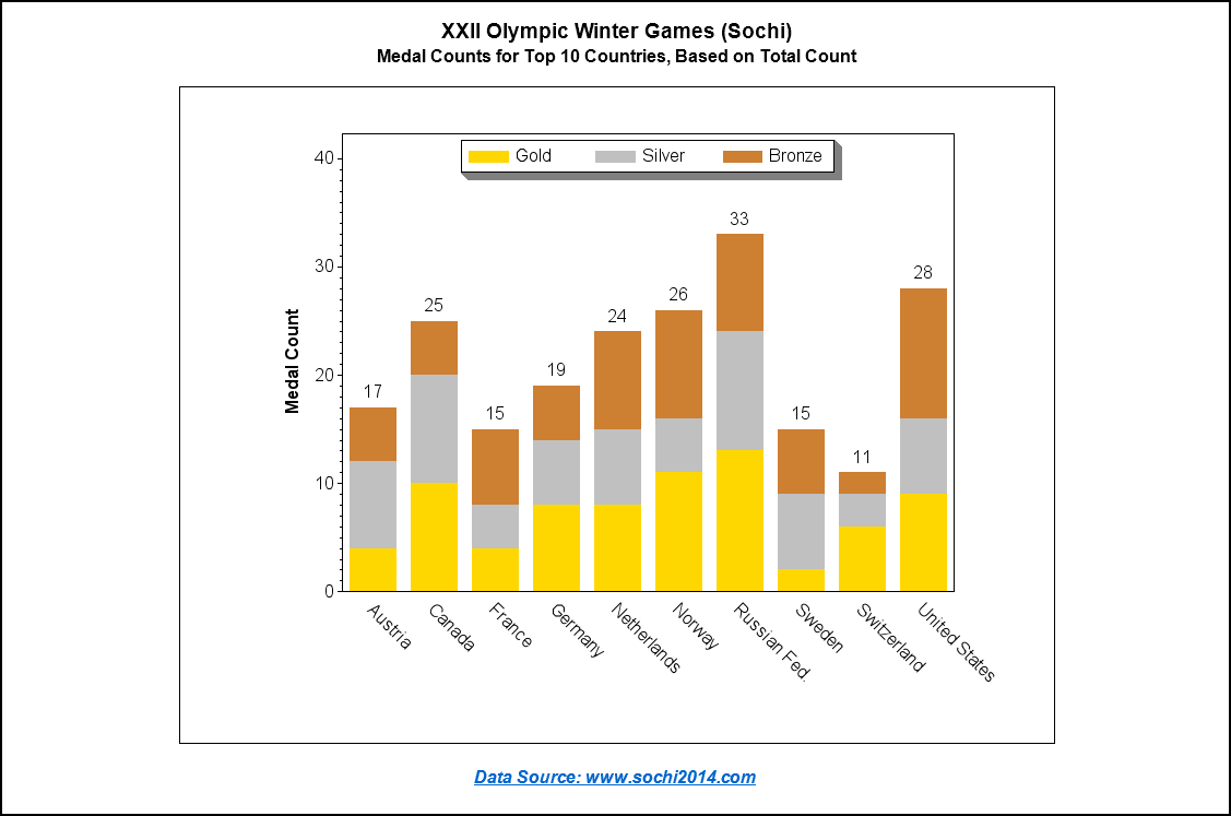
Michele Ensor recently posted a wonderful blog with a graph of the 2014 Winter Olympics medal count. I'm going to further refine that graph, making it an Olympic graph ... on steroids! :) Here is Michele's graph: First, let's give it a few simple cosmetic changes. I always like to have
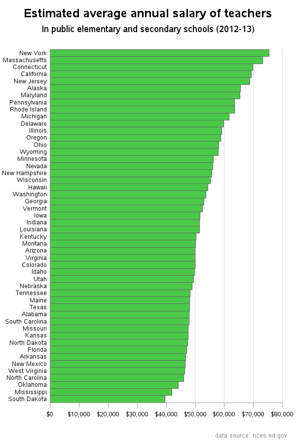
Teacher pay, and the possibility of a raise, has been a hot topic in North Carolina lately. So I decided to look around and see if I could find any good data related to teacher salary, and then try to determine the best way to present that data graphically. I found that

In a previous post, I showed you how to send graphs with charttips & drilldowns in an email ... but what if you also need to send the graphs that you're drilling-down to? You guessed it - SAS also has a slick trick for doing that! When you create SAS graphs
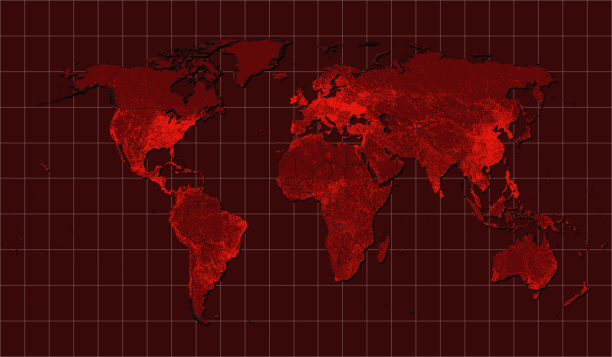
When you create maps, you are typically plotting data for analytics -- but you can also use SAS to create 'pretty' maps for background decorations (for posters, slides, presentations, etc). This blog shows you a few examples... A few years ago I noticed that the CNN Situation Room had a decorative