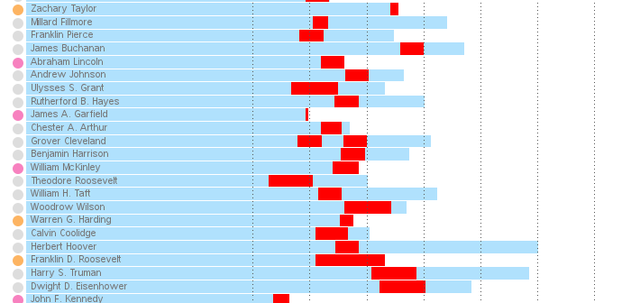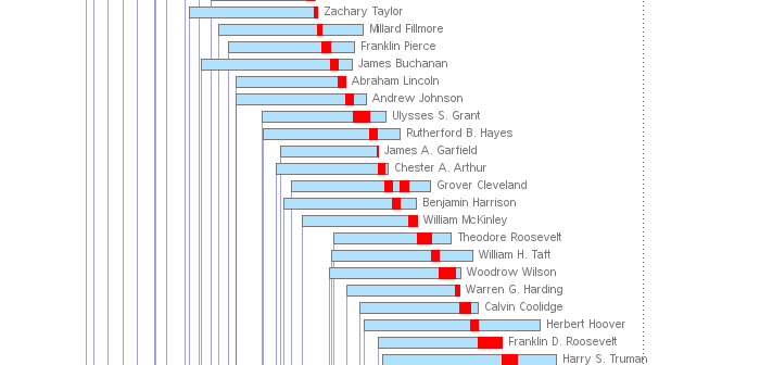
I was recently reading the Wikipedia page about the U.S. presidents. There was a table with a lot of interesting data, but I thought it would be much easier to get a handle on the information if there was also a timeline graph. So, of course, I set out to
Tag: presidents
Donald Trump is pretty spry and energetic for an old guy - he's currently 71 years old, and seems to have more energy than I do (and I'm about 20 years his junior). But is he the oldest US president? Well, as with many questions ... it depends. Follow along
A topic that's been in the news a lot lately is the presidential power to grant pardons, commutations, and such. But all the articles I've seen just quoted numeric totals - I haven't seen a graph of the data anywhere! So I set out to find the data and graph
If you consider yourself as a visualization expert, you strive to create graphs that set you apart from the data analysts and statisticians. Graphs that merely plot the data in a clear/concise manner aren't enough for you. You want your graphs to also be intuitive, easy to read, and provide
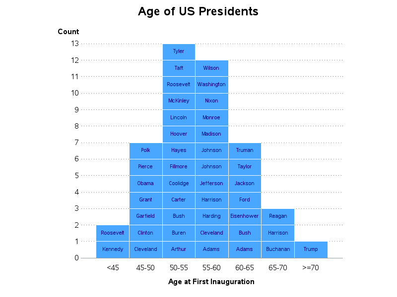
Recently, my fellow SAS blogger Rick Wicklin wrote a post showing how to graph the ages of all the US presidents. And Chris Hemedinger showed how to create a bar chart showing the number of presidents having each of the 12 zodiac signs. Both are interesting graphs, but I wanted to
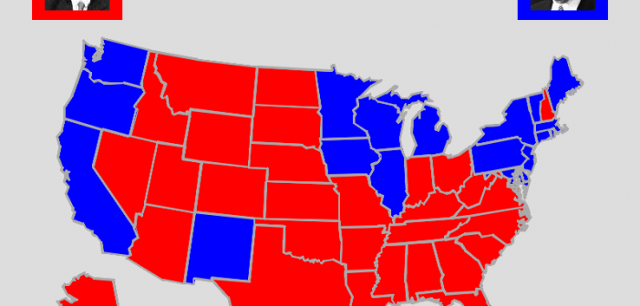
In the U.S. we have a presidential election every 4 years - and as luck would have it, 2012 is an election year! I see a lot of election maps & graphs in the news, and I'm always subconsciously critiquing them in my mind and thinking to myself, "How would I graph this