In a previous post, I showed you how to send graphs with charttips & drilldowns in an email ... but what if you also need to send the graphs that you're drilling-down to? You guessed it - SAS also has a slick trick for doing that! When you create SAS graphs
English
Every day of the year is an official 'national day' for something - here's a SAS chart to help you find which bizarre 'national day' falls on your birthday! I recently read an article that lists weird and unconventional national days. It was very interesting, but I found the data
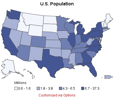
When you create maps, you are typically plotting data for analytics -- but you can also use SAS to create 'pretty' maps for background decorations (for posters, slides, presentations, etc). This blog shows you a few examples... A few years ago I noticed that the CNN Situation Room had a decorative
Sure, you have a great looking table and you produce it with PROC TABULATE. And then, bam! Your boss comes along and decides that since your output looks so good in Word, that he’d like that boilerplate paragraph inserted automatically. Currently, you produce the tables and then pass the RTF
The farther you try to forecast into the future, the less certain you are -- how can you represent that graphically? One way is to draw a shaded/colored "confidence interval" around your forecast line, but this is something a lot of SAS users have trouble with. That's why I decided to create
Data on punched-cards, SAS software delivered on tape, jobs in the queue on the mainframe, printouts on green-bar paper ... we really appreciate all our SAS users, but if any of the above are part of your "SAS memories" we especially appreciate you! I guess I'm a computer geek, because
There are 2 kinds of people in the world -- those who dread change, and those who look forward to it. Which kind of person are you, when it comes to upgrading your SAS software?!? With most software (such as Windows OS, Facebook, Gmail, etc) I tend to fall into
“Dear Cat, In a repeated measures drug study, I am unsure what to do with the baseline measurement. Since it is one of the time points in my study, I feel like I should use it as one of the dependent variable measurements. But I have seen analyses where baseline
I'm always trying to find new uses for SAS - this time I've written a proof-of-concept that shows how you might use SAS to create charts that test for color blindness. If nothing else, I think it's a fun example :) First, I did a Google search, and looked at several
SAS 9.4 allows you to create html5 output with your graph inline (as part of the html), providing a great way to email your SAS/Graph output! Previously, if you used ods html and dev=png to create graphs, you had to deal with two files -- a png file (containing the graph)