Are you heading to the ENAR 2015 Spring Meeting in Miami this week? SAS author and Program Chair Mithat Gönen, of Memorial Sloan-Kettering Cancer Center, and Associate Chair Brisa Sánchez, of the University of Michigan School of Public Health have created an outstanding scientific program this year. The sessions cover
English
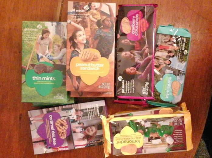
I just found out that Girl Scout cookies haven't changed from when I was a kid. I just moved to a different area, serviced by a different cookie maker! That's what I found out from the cool map in an article on latimes.com! The article explains that there are two different
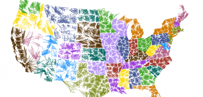
When I saw Robert Kosoro's cool ZIPScribble map, I knew I had to create a SAS version - and of course I had to add a few enhancements along the way.... I was perusing some of the examples on dadaviz.com, and Kosoro's ZIPScribble map caught my attention. It wasn't a particularly useful

You might be surprised at how many movies and TV shows are made in North Carolina - especially within the last few years. This blog provides a SAS graph that will make the list of films even easier to read! A recent story by the Tar Heel Traveler, and an exhibit
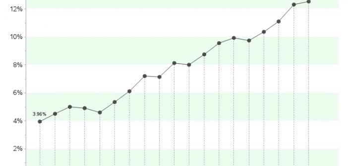
After the legalization of recreational marijuana use in Colorado in 2012, it has been a much more frequent news topic than before - even from a data analysis perspective... I was recently looking for 'interesting' data to analyze with SAS, and I noticed some articles about the increasing potency of marijuana in
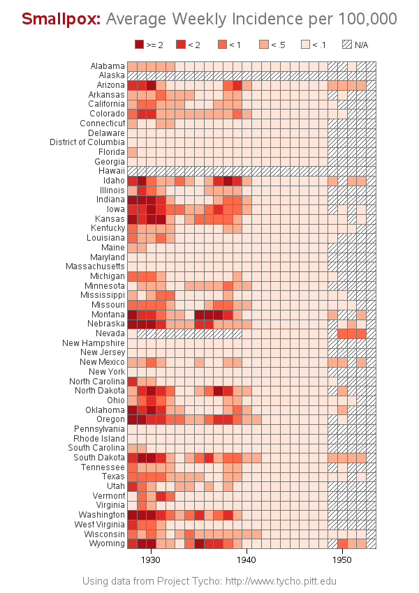
Smallpox was declared eradicated in 1979, after an extensive vaccination campaign in the 19th and 20th centuries. This blog post contains a visual analysis of the final years of this disease in the US ... In my previous blog post, I imitated and improved infectious disease graphs from a recent Wall
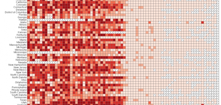
The Wall Street Journal recently published some graphs about seven infectious diseases, and I tried using SAS to improve the graphs ... it's a veritable infectious disease (graph) bake-off! Let's start with Measles ... here's a screen-capture of WSJ's measles graph: In general, their graph is eye-catching, and I learned a lot
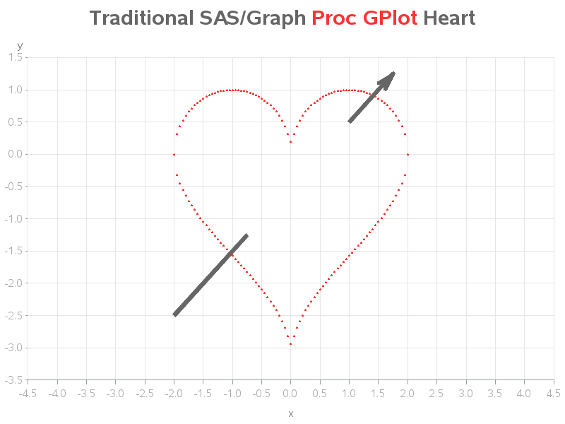
Nobody puts an arrow through a heart any better than Sam Cooke & Cupid ... but SAS/Graph comes close! If you've been following my blog, you know that my favorite of all the SAS Procedures are the traditional SAS/Graph Procs, such as GPlot and GMap. They're rock-solid reliable, and flexible

SAS Global Forum brings together the most die-hard SAS users, both veteran and novice, once a year. It’s one of those can’t-miss events, and each year it just gets better. 2015 will bring us all together in Dallas, Texas for several days of active learning and excitement from SAS users

We’re all about numbers here at SAS. So when the Global Certification program hit its 75,000th credential – we had to make it a big deal. We tracked down the 75,000th credential holder to Susan Langan, a research analyst in Maryland, and what’s even more special than Langan holding the


