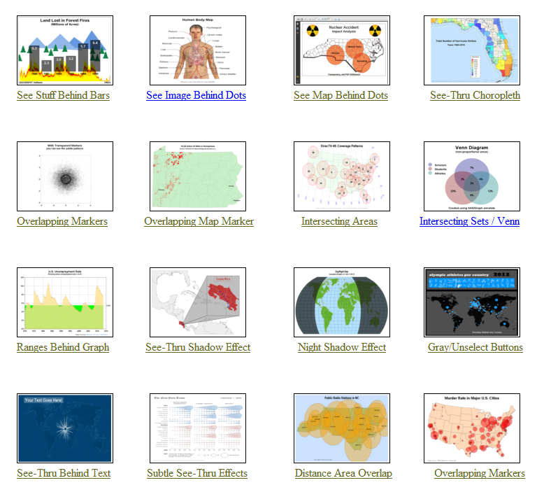
This graph certainly makes it clear! I can see right through your lies! Clearly, you know what you're talking about! We need more transparency in our organization! What was that all about, you might ask?!? ... I was just getting all the obvious puns out of the way, so I
Uncategorized
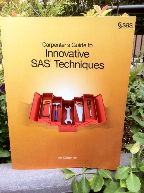
This week's SAS tip is from Art Carpenter and his latest book Carpenter's Guide to Innovative SAS Techniques. A SAS user since 1977, Art is an integral and highly respected member of the user community. He's also the author of several outstanding SAS books--and you can explore them here. The following excerpt is from SAS
As you've probably guessed, I'm a "visual" person - I like to see things (in a chart/graph/map) rather than just reading about them (in a data table and summary statistic). Don't get me wrong - I'm a big fan of statistics and analytics -- but I'm an even bigger fan of
"It slices, it dices ... it helps test laboratory mices!" In a joking way, this is a perfect description of SAS software, don't you think!?! :) And to prove it, this blog contains a collection of 32 examples, showing a variety of ways SAS can be used to graph data
"It's a floor wax, and a dessert topping" - this pretty much describes SAS/Graph! (bonus points if you know where this quote came from!) Some people think of SAS as just a quality control tool. Others think of it as just a sales & marketing tool. And yet others think
Businesses need to know who their customers are, and how much money they should invest in marketing to them. It’s an obvious idea, but it also served as pretty much the sum of my knowledge of Customer Lifetime Value (CLV). That is, until Edward Malthouse came into my life. Ed’s
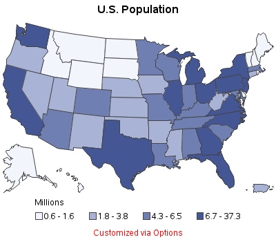
Your biggest problem with maps used to be learning how to fold a paper road map. Today, with the advent of GPS, Google Maps, and location-specific data, the bar has been raised! ... you now need to know how to plot your data on a map! Below are several examples of different kinds
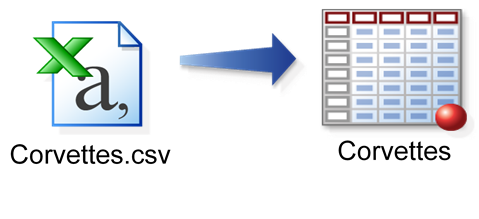
Sometimes, your first impulse may not be correct, like trading in your practical sedan for a hot 2-seater. Other times, your first impulse is perfect, as in the examples below. Suppose the automobile data you wish to analyze resides in a CSV file. Naturally, your first impulse is to import
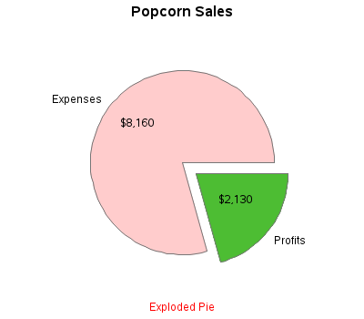
There's an old expression "easy as pie." Have you ever tried to bake a pie??? ... It's not so easy, LOL! And neither is using pie charts correctly! :) Below are several examples of different kinds of pie charts you can create with SAS/GRAPH. And at the bottom of this
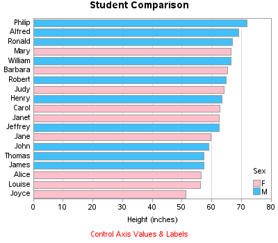
Do you know how to create a bar chart using SAS, and when to use what kind of bar chart?!? If the answer doesn't come to you "easy as pie" then this blog is for you! Below are several examples of different kinds of bar charts you can create with SAS/GRAPH.