
My previous blog was about popular first names ... now for a blog about popular surnames (ie, last/family names)! But before we get started, here's a little pop-quiz - what country is my friend Mr. Foley's surname from?

My previous blog was about popular first names ... now for a blog about popular surnames (ie, last/family names)! But before we get started, here's a little pop-quiz - what country is my friend Mr. Foley's surname from?

A couple of years ago, I blogged about the most popular baby names in the US over the past 100 years. This time, I focus on the most recent year, and take it to the state level! But before we get started, here's a picture of my friend Jennifer's daughter,

I guess most of us have a morbid curiosity about how we're going to die ... which is probably why Francis Boscoe's Causes of Death map went viral (no pun intended, of course!). This blog post shows how to create such a map... But first, to lighten up the mood a bit

A recent news report shows an unexpected spike in traffic fatalities here in the US in 2015. This got me wondering what the data shows ... for the past 100 years or so... Driving was a lot more dangerous in the early days. If you were in a wreck, you

I saw an interesting graph on dadaviz.com that claimed Italians had gone from drinking twice as much as Americans in 1970, to less than Americans in recent years. The data analyst in me just had to "independently verify" this factoid ... But before I get into the technical part of this
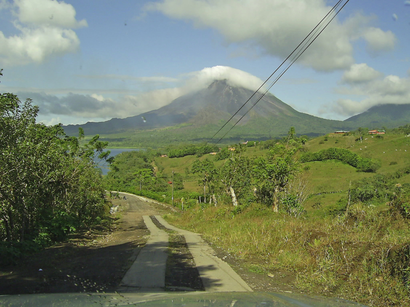
Mount St. Helens volcano here in the US had a big eruption 35 years ago this week! Do you know exactly where it is located? Perhaps this SAS map can help... As you might have guessed, I'm a big fan of the awesome power of nature (hurricanes, tornadoes, lightning, earthquakes, and

As a kid, I was always intrigued with UFO sightings and I guess I'm still a little that way ... therefore how could I not jump at the opportunity to explore some UFO sightings data! I guess "UFO" doesn't necessarily imply that something is an alien space ship - just
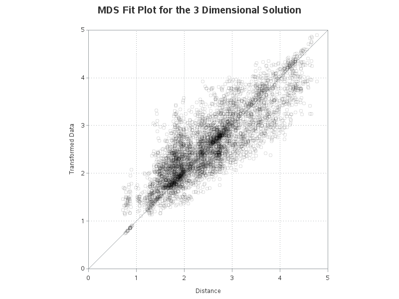
In recent releases of SAS, you can use Output Delivery System graphics or 'ODS graphics on' to produce nice graphical output for most of the analytic procedures. These default graphs are nice, but when you want your graphs to look "a certain way" SAS also lets you create your own custom graphs!
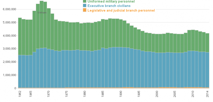
I was surprised to find that the size of the U.S. federal government is smaller today, than in the past many decades - let's graph it out, so it's easy to analyze... The way I got started on this little adventure was via Jishai's graph on dadaviz.com. Here's a snapshot
Did you ever wish you could master SAS/GRAPH, and create graphs and maps that were customized exactly like you wanted them? Then this free eBook is for you! Probably the most memorable book for me was the Necronomicon in the Army of Darkness movie. How many of you liked that