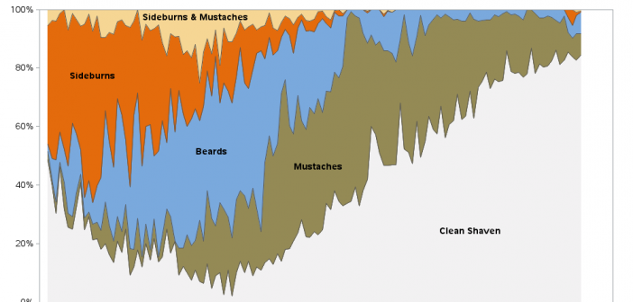
The #1 rule of any self-respecting hipster is to not claim to be a hipster. Therefore, can there even be such a thing as a hipster beard, or hipster beard data? I contemplated this perplexing question, as I stroked my pirate beard. Since fashion trends tend to be cyclical, perhaps
Author
I remember being intrigued by the movie In Search of Noah's Ark, when I was a kid back in the 1970s. They claimed to have definitively found the ark ... but of course, since then several other people claim to have found it in other locations. Therefore I don't feel too
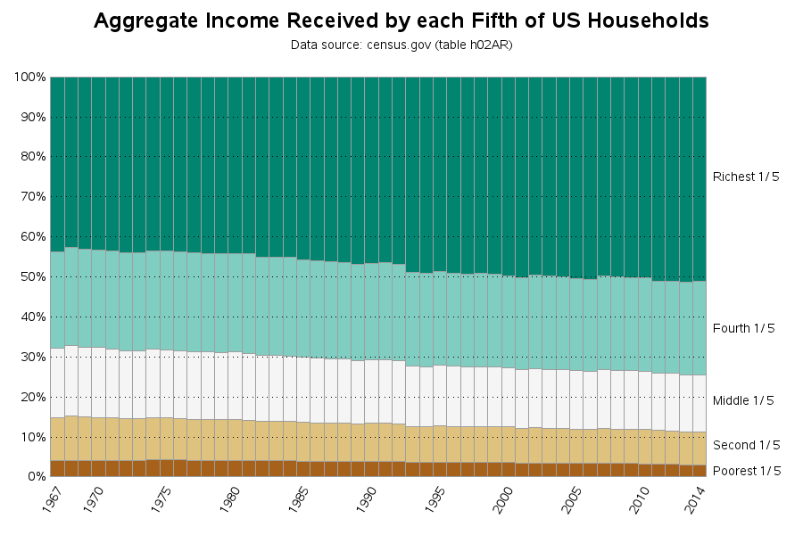
I hear a lot of talk about income inequality in the US ("the rich get richer..." and such) - especially as elections approach. I also see a lot of graphs, and they all seem to define their numbers slightly differently. I'm not in a position to improve the way income
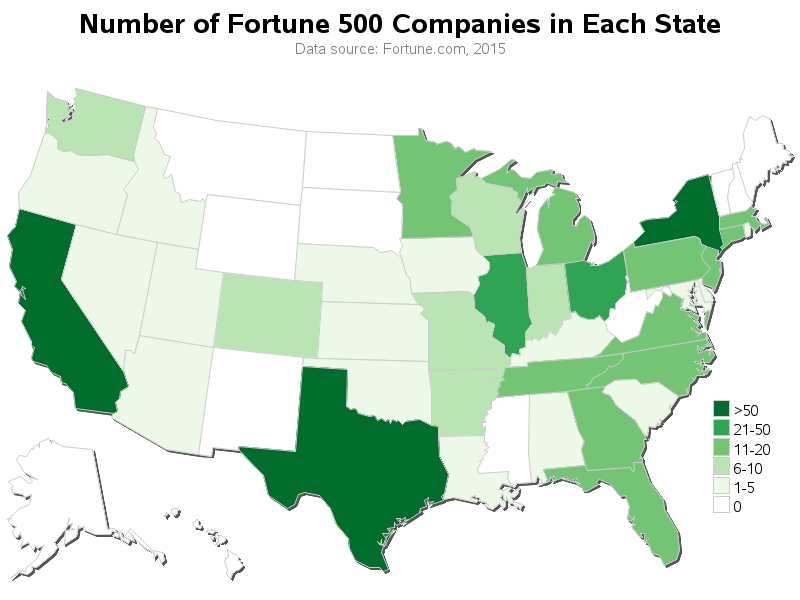
Every year, Fortune magazine compiles a list of the 500 largest US corporations - called the Fortune 500. Their list was a bit difficult to digest in text-form, so I thought I'd try using some maps & graphs on the data ... For a map analysis, I thought it would
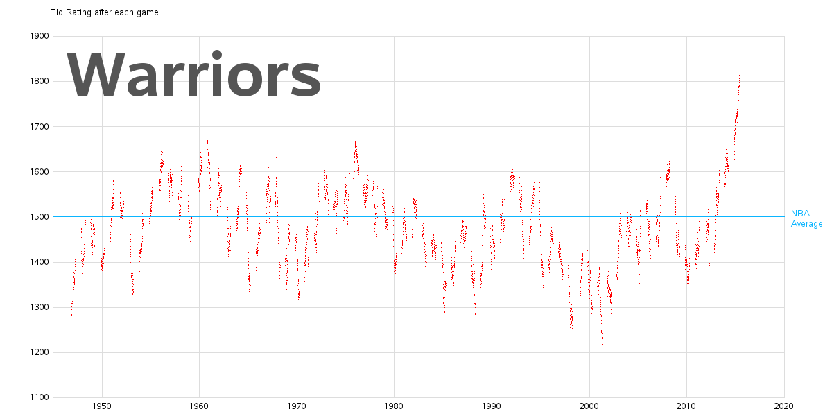
I get several requests and recommendations for analyzing sports data. I'm not a big sports fan ... but when did I ever let that stop me! When I find interesting data, I like to graph it! Before we get into the nitty-gritty data analysis, here is a picture of my friend Jennifer's daughter
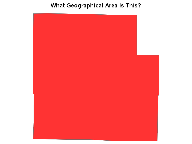
My blog posts focus on visual data analysis, and many of them use geographical maps. Therefore I hope you will have fun with a quick geography quiz, which I created using SAS/Graph ... And what, you might
These days many devices (such as smart phone apps, Fitbits, Apple watches, dog tracking collars, car gps, hiking gps, teen/car trackers, etc) can track your location, and provide you with standard/canned ways to analyze the data. This blog post shows how I created a custom SAS map of the tracking
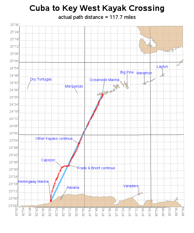
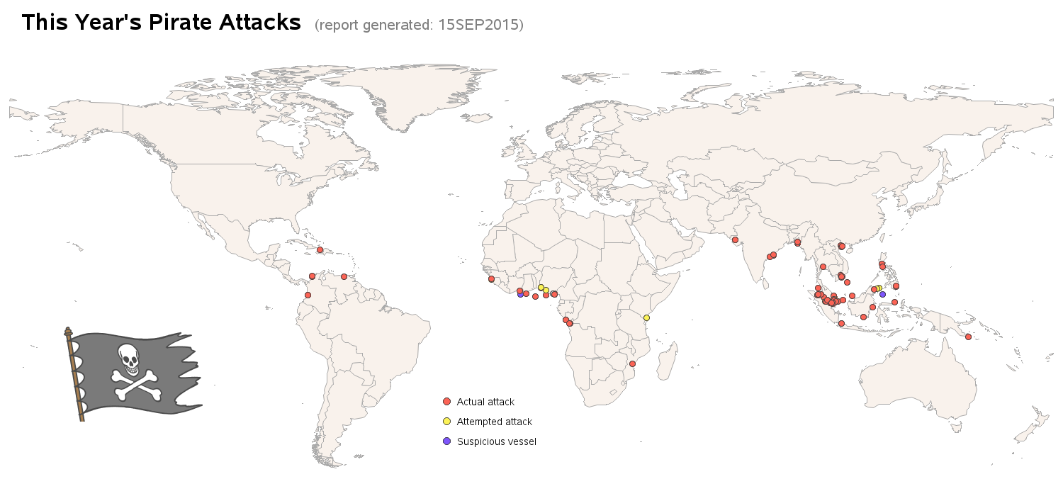
I just returned home from an expedition/adventure boat trip to Cuba, and Talk Like a Pirate day is coming up this Saturday - what a combination for an interesting blog! I hope you enjoy a few pictures, and a bit of data analysis on these topics! A couple of weeks ago,
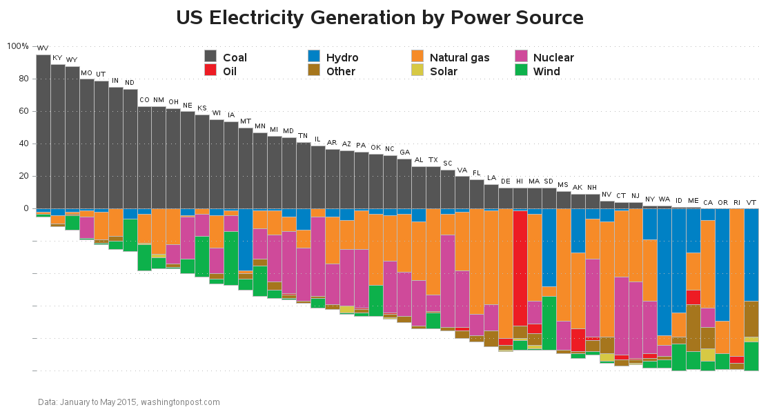
I recently saw an article on washingtonpost.com showing what methods are used to generate electricity in each state. The data was interesting enough that I decided to try my hand at graphing and mapping it with our SAS software. Read along to see what I kept the same, and what
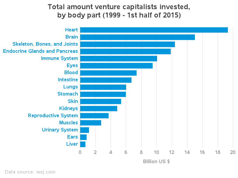
The Wall Street Journal recently published a study of the top 17 medical areas (or body parts) that venture capitalist investments are likely to benefit. They used graphs to summarize the results, but "the graph guy" in me just couldn't resist trying to improve them. Did my improvements help? -