Unless you live under a rock, you've probably seen news reports that Russian trolls have been posting on social media to allegedly conduct "what they called information warfare against the United States, with the stated goal of spreading distrust toward the candidates and the political system in general," according to US Deputy Attorney General Rod Rosenstein. NBC recently made available 200,000+ tweets from troll accounts linked to the Russian Internet Research Association, and I thought it might be interesting to analyze that data with some graphs!
First, I went to the NBC article and followed the link to download the raw data (in the form of a CSV file). The text file has several fields in each line, and the text of the tweets makes the lines somewhat long ... making it difficult to study the 200,000+ lines of data in its raw form.
Therefore, I imported the data into SAS®, where it is much easier to manage. Note that the data was a little tricky, because in addition to the line feed at the end of each data line, the text field could also contain one or more line feeds. So instead of using just the traditional PROC IMPORT, I enlisted the help of Rick Langston, who wrote some custom code in a DATA step to convert the line feeds in the text field to a "/" character before importing the data. Here's a link to the SAS code, if you'd like to see it.
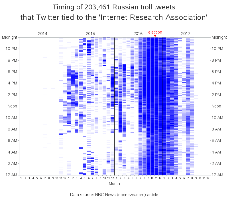
Timing of Troll Tweets
For my first graph, I wanted to see when the tweets were posted. I recycled some custom code I had used to plot President Trump's tweets in a previous blog post, and quickly had a nice timeline of the Russian trolls' tweets, showing what year and month they were posted (horizontal axis) and the time of day (vertical axis). It looks like most of them were posted mid-2016 to early 2017, and during that time the trolls were posting 24 hours a day.
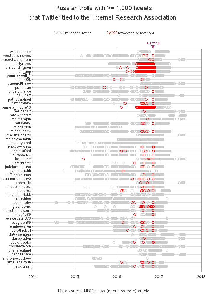
Most Active Trolls
200,000+ tweets is a lot of data to try to wrap your head around. Therefore I decided to subset the data for my next graph, and just focus on the troll accounts that had posted at least 1,000 tweets. I used PROC SQL to create some summary counts, and came up with a more manageable subset. Each circle marker represents one tweet, and I colored the circles red for tweets that had been marked as retweeted or favorited (liked).
Most Popular Tweets
For my final graphs, I drilled down to the individual tweet level. These next two graphs show how many times the most popular tweets were retweeted or liked. I know, I know ... these two graphs aren't the most visually pleasing (too many colors, and the tweet ID numbers are a bit overbearing), but I couldn't think of another way to show this information (maybe you've got an idea or two you can share with me in the comments?).
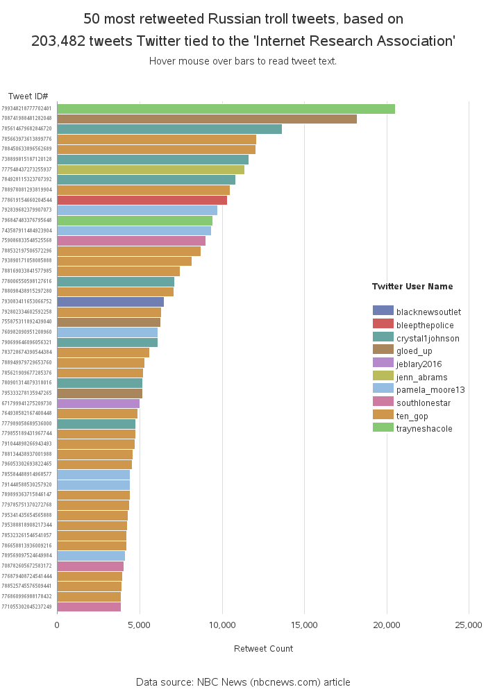
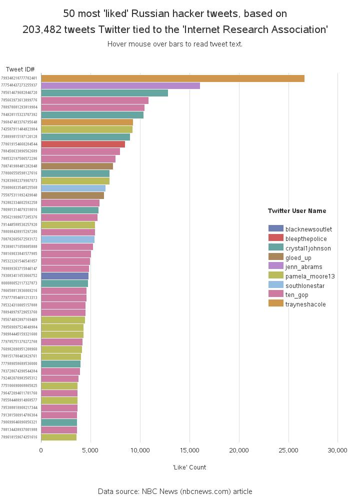
The graphs above are just static images, but if you click them you can see the interactive versions with HTML mouse-over text. The second and third graphs even allow you to drill down to the archived pages for these Twitter users. (Twitter has deleted their accounts, but the Wayback Machine saved some snapshots of some of the users' Twitter pages.)
Warning: Drill down to the individual tweets (in the two bar charts) at your own risk! If you're like me, you are curious to see exactly what kind of stuff the Russian trolls were posting in their tweets. But keep in mind that their goal is to "spread distrust."
Note: These 200,000+ tweets are probably just a small subset of the social media posts made by Russian trolls, but hopefully it gives a good snapshot into what they were up to, and what to be on the lookout for.
Finally, I think the following quote sums things up quite nicely:
"Don't believe everything you read on the internet." - Abraham Lincoln


4 Comments
Very cool, Robert! Timely and I loved to see data behind some of the latest news, like the influence of the TEN_GOP account (retweeted by Don Jr. multiple times!)
One suggestion: synchronize color assignment between graphs with categorical by-groups like the last two. That makes it easier to find relationships across graphs. For example, TEN_GOP appears on both but is assigned different colors - requiring a lot of mental translation to remap the assigned colors back to the same entity.
That would probably be a good idea, but I'd probably have to narrow it down to the top 10 (or maybe 5). With the top 20, and many of the accounts not being in both graphs, we would need 20+ colors (and it's really hard to pick that many colors that are discernible!)
great work Robert, i wonder what it would look like if you used proc network to see if they retweeted each other's posts.
Interesting idea! - Hopefully many SAS users will use my code to import the data, and do all sorts of interesting analyses! :)