What do people have in common who have used analog clocks, vinyl records, and payphones? They were all probably born before 1980! Now, let's focus on those payphones!...
A lot of young kids these days can't imagine a world where everyone doesn't have a wireless phone. My buddy Ed likes to show his grandkids old TV shows, and they were asking him why Maxwell Smart carries his cellphone in his shoe. And when it comes to payphones and movies, who could forget the Blues Brothers getting blown up in a phone booth (and then finding 'at least $7 worth of change'), or Clark Kent trying to find a phone booth to change into his superman outfit!
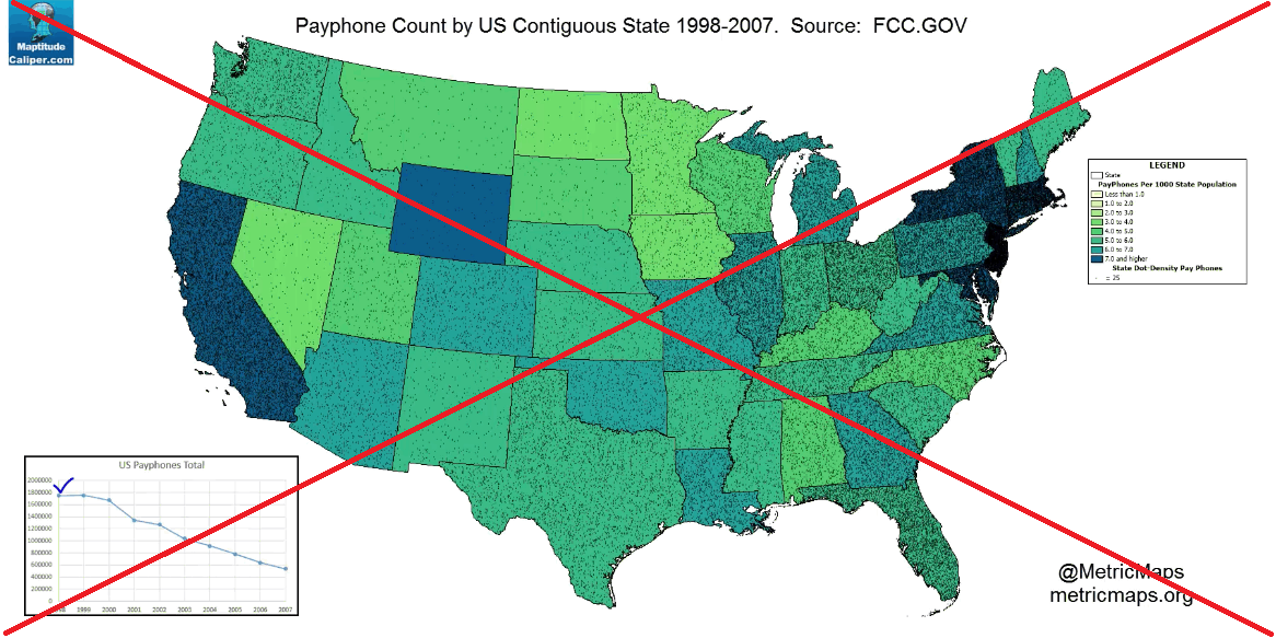
Call me nostalgic, but when I saw an example on the metricmaps website showing the decline in the number of payphones over time, I couldn't help but take a peek. Their map is an animation over years 1998-2007. I screen-captured a single year's map to include below.
When I first saw their map I was very excited, thinking that they had plotted the locations of all the payphones as dots. Upon closer examination, the dots seemed to be evenly distributed across each state, and I'm pretty sure a dot-fill was used rather than the dots showing the actual phone locations (the actual locations would be more dense around the big cities). So the dots seem a bit misleading, which is not a desirable feature of a good visualization.
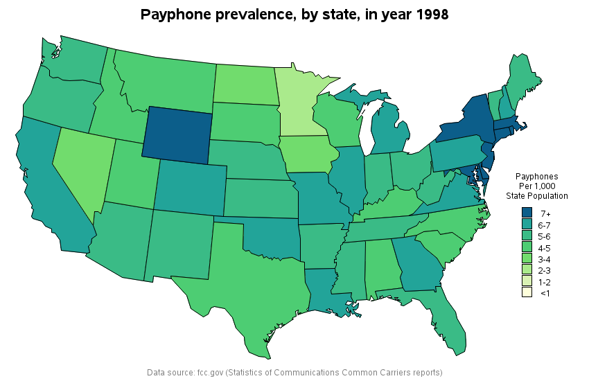
I decided to create my own version of the map - without dots, and without the animation (with the map constantly animating, I didn't have time to see the data). I found the links to the data reports on an fcc page, but many of the links were old/dead. Fortunately I was able to use the urls from the dead links, and look up archived versions of those pages on the wayback machine website. I manually scraped the data from each report, pasted them into a text file, and wrote some code to read the text values into a SAS dataset.
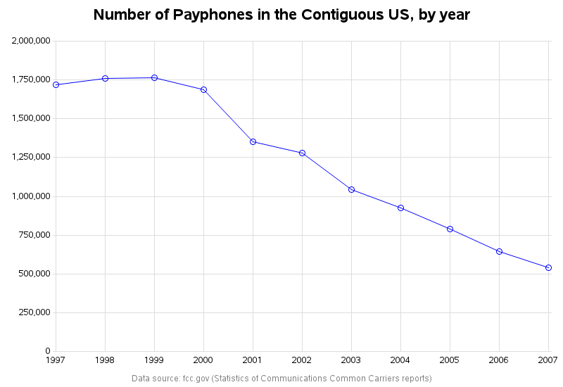
I created the overall trend line graph on a separate page, rather than trying to squeeze it onto the same page as the map. This allows it to be larger, and also allows me to use it as my drill-down interface to the maps. Click the image below to see the interactive version of the graph. The number of payphones certainly did start dropping, about the time cellphones became commonplace!
When you click the markers in the plot, it will drill-down to the map for that year. Here's a snapshot of the 1998 map (same year as shown in the metricmaps example above). Note that Wyoming looks darker than California in my map, whereas it was the other way around in the metricmaps version. This is because the dots in the metricmaps version were so dense that California looked 'dark'. So now we've determined that the dots actually compromised the data integrity (I am so glad I decided not to use dots in my map!) I invite you to look at the map for each year, and see how things have changed over time.
Does your state have fewer, or more, payphones than you thought? How do you think the numbers have changed since 2007? (When was the last time you used a payphone?)
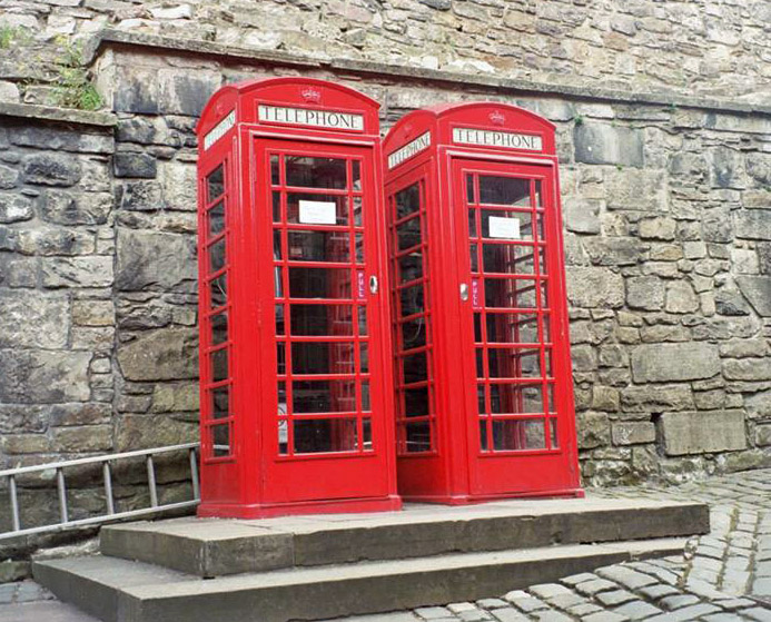
I will leave you with a picture of some payphones my friend Margie saw on one of her trips - can you guess where these are located?





10 Comments
Your map colors also look attractive. Thanks for sharing.
Thanks! - One of the websites that helps me pick good colors is:
http://colorbrewer2.org/#type=qualitative&scheme=Accent&n=3
And in Australia, I've seen pay phones be modernized. https://twitter.com/homesatmetacoda/status/490098790682988544
They are making a comeback by being re-purposed into coffee shops, libraries, and charging stations!
http://www.bloomberg.com/news/features/2016-08-16/britain-s-iconic-red-phone-booths-find-their-second-calling
Left out Alaska and Hawaii again?
Yeah - I was disappointed about that too!
It would be really interesting to see if the number of payphones has gone down (or maybe up?!?) in Alaska, but this data source didn't list any data for the number of payphones in Alaska. They had data for Hawaii for a few of the years, but not all of them, so I had to leave it out too. :\
I don't recognize those particular red phone booths, but we have some of their cousins at UC Davis. http://www.waymarking.com/waymarks/WM3B25_UC_Davis_Red_Phone_Box_Davis_CA
More surprisingly we have some vintage red double-decker buses that were retired from service in London almost 50 years ago. Davis is likely the only place in the world where these vintage buses are still in service. These buses still display their original routes such as "Piccadilly Circus." https://localwiki.org/davis/Double-Decker_Buses
Wow - nice!!!
I recently watched Bill and Ted's Excellent Adventure with my kids. The payphone (and booth) was the time machine that transported the duo through history. Couldn't make that movie in the same way today!
Interesting observation! - I wonder if (10, 20, or 30) years from now, the payphone will make the movie "dated" or make it "retro/nostalgic"?!? :)