Although I’m not particularly excited about football (I admit, I don’t completely understand what offside means), I did follow the last World Cup with more than average attention. Not only for the handsome players, but especially for all the fascinating statistics that appeared. It struck me that heat maps popped up everywhere: on Twitter, in newspaper articles, in talk shows, … so I tried to find out why heat maps have become so popular.
What are the origins of a heat map?
 A heat map is any data visualization which uses color to represent data values in a two-dimensional image.
The term "Heat map" was originally coined and trademarked by software designer Cormac Kinney in 1991, to describe a 2D display depicting real time financial market information. Heat maps actually originated already in the seventies as 2D displays of the values in a data matrix. Larger values were represented by small dark gray or black squares (pixels) and smaller values by lighter squares. Nowadays we’re no longer stuck to those fifty shades of grey as there are many different color schemes that can be used to illustrate the heat map.
Heat maps have gained importance in the new era of big data. While in the past scatter plots were used on smaller datasets to discover trends and outliers that remain hidden on traditional charts and spreadsheets, heat maps have taken over. By applying color, numerous observations can be visualized together as the color is indicating the frequency of the pattern.
Different heat maps for different purposes
There are many different types of heat maps used in different disciplines, each referred to by the term “heat map”, even though they use different visualization techniques.
In PC gaming, heat maps can be used for testing game maps, to measure the feasibility of a map, which areas are being used more by the players, are there areas which are being overused or underused. This will help the developers to create a spatially optimized map.
In Web analytics, heat maps are used to see where the users of the websites are actually pointing their cursors and which part of the website are they spending most of their time.
In Biology, heat maps are typically used in molecular biology to represent the level of expression of many genes across a number of comparable samples (e.g. cells in different states, samples from different patients) as they are obtained from DNA microarrays.
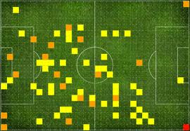
Heat maps in football or any other sport are used to identify the frequency of events spread in a given particular area. Specifically for football, heat maps are an indicator of effectiveness of a player in different parts of the pitch.
Heat maps of the World Cup
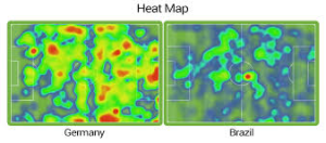
A very appealing heat map from last World Cup, was the one of the match between Germany and Brazil. The visualization can help in explaining the 7-1 result. This view visualizes the on-ball actions of the teams. The color indicates the volume of events, with few events being highlighted by blue, and lots of events by red.
The map gets heated up in areas where the player has had more control of the ball and does most of his work, it turns redder as the player's presence in a particular area increases.
What can business users learn from this?
Heat maps can be produced very easily with SAS Visual Analytics. SAS customer Orlando Magic, an NBA team, is using heat maps for price and packaging planning of their ticket sales. Heat maps are also very popular in the banking sector. According to Michael Bryan, CIO of Bank of North Carolina, senior executives and board members particularly like heat maps when analyzing loan data. "You can draw 300 fields, and the heat map can tell you in different colors what components of that data are strong and which are weak," he says. "If you wanted to look at a pool of delinquent loans, you could see what they have in common."
If you want to learn more about heat maps, have a look at these posts by SAS colleague Rick Wicklin, statistical graph expert.