"It slices, it dices ... it helps test laboratory mices!" In a joking way, this is a perfect description of SAS software, don't you think!?! :)
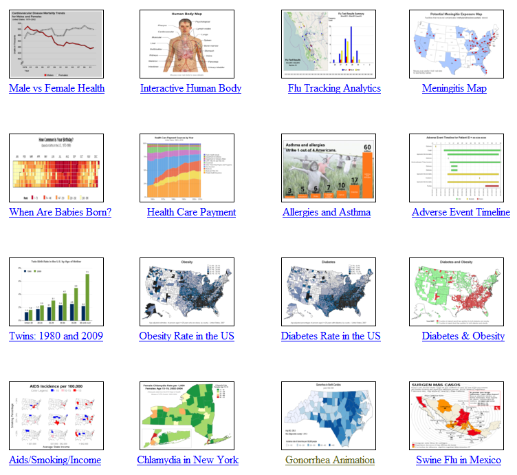
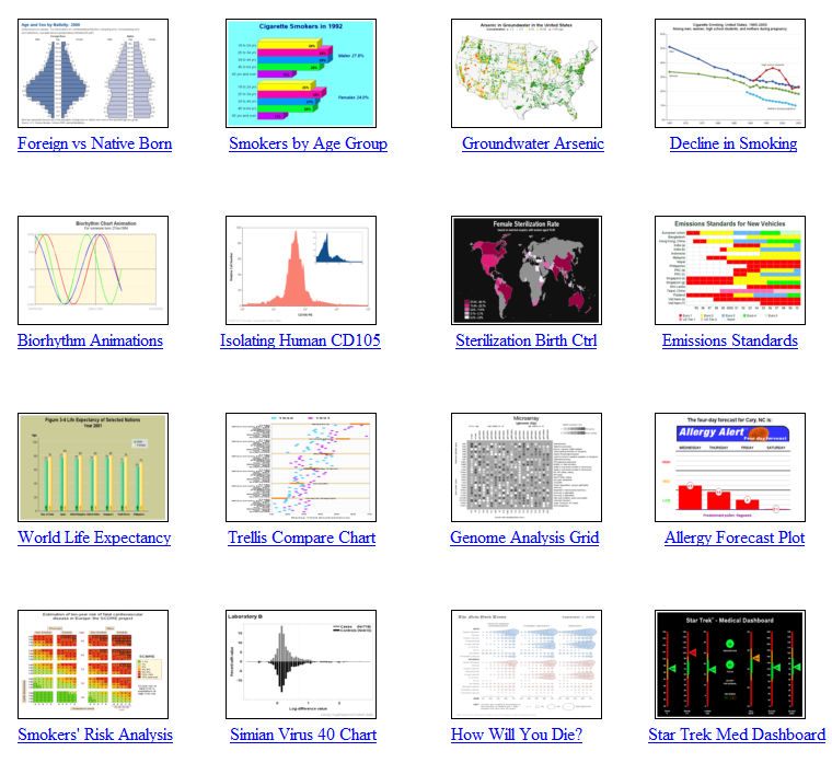
And to prove it, this blog contains a collection of 32 examples, showing a variety of ways SAS can be used to graph data related to health & life sciences (HLS). Hopefully you can use these examples as the starting point, to create similar custom graphs of your own data.
It would be difficult for you to view the detailed full-size graphs in the blog, therefore I show thumbnails here, and you can click to drill down to the samples page to view them in full size (and download the SAS code).
Here is a text list of topics covered in these graphs, followed by the thumbnails:
- Male vs Female Health
- Interactive Human Body
- Flu Tracking Analytics
- Meningitis Map
- When Are Babies Born?
- Health Care Payment
- Allergies and Asthma
- Adverse Event Timeline
- Twins: 1980 and 2009
- Obesity Rate in the US
- Diabetes Rate in the US
- Diabetes & Obesity
- Aids/Smoking/Income
- Chlamydia in New York
- Gonorrhea Animation
- Swine Flu in Mexico
- Foreign vs Native Born
- Smokers by Age Group
- Groundwater Arsenic
- Decline in Smoking
- Biorhythm Animations
- Isolating Human CD105
- Sterilization Birth Control
- Emissions Standards
- World Life Expectancy
- Trellis Comparison Chart
- Genome Analysis Grid
- Allergy Forecast Plot
- Smokers' Risk Analysis
- Simian Virus 40
- How Will You Die?
- Star Trek Med Dashboard
What's your favorite of these graphs?
Do you think you can reuse any of them?
Post a comment and let us know! :)


5 Comments
I did a find and replace of the words "Star Trek" in both sets of code for the Star Trek Medical Dashboard and I still am getting Star Trek in the title. I would like to use the provided code as a template but no matter what changes I make I still get the original dashboard. Any help would be greatly appreciated. Thanks.
Try exiting out of the SAS session, and then starting a fresh one (that's the quickest/easiest thing to try). I suspect that when you're running the sas job a 2nd time, and trying to use the same grseg names again, SAS is appending a number onto the names ... and greplay is still trying to use the original/first names.
You can either exit out of SAS each time, or you can delete all the grsegs so the same names can be re-used.
Thanks for your help!
Personally, I like the map based graphs as it adds another dimension to the analysis. These examples will certainly be useful to reuse, in combination with Chris' blog post on Australia maps and references/links at http://blogs.sas.com/content/sasdummy/2011/08/30/using-3rd-party-shape-files-to-build-map-charts-in-sas/
Thanks for sharing!
I'd say maps are probably my favorite too. I always like to view my data in several different ways, to get the "complete picture" :)