Scatter plots are probably the simplest kind of graph, and provide a great way to visually look for relationships between two variables. But, do you know (right off the top of your head) the simple SAS/GRAPH code you would use to create them? ...
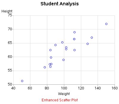
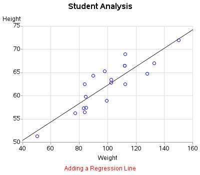
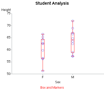
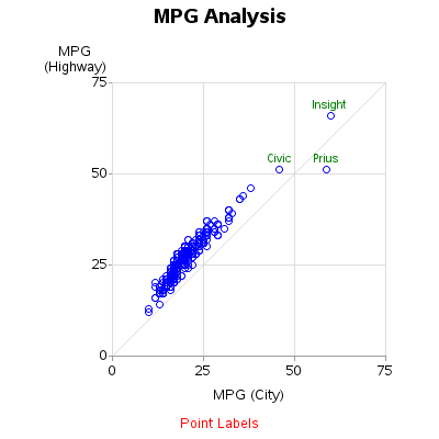
This tutorial leads you step-by-step through the process of creating the following six variations of scatter plots, using the simplest and most minimal code possible. Below are examples of the graphs covered in this tutorial, and a link to the tutorial is at the bottom of the blog:
Basic Scatter Plot
Regression Line
Box Plot
Proportional Axes Plot
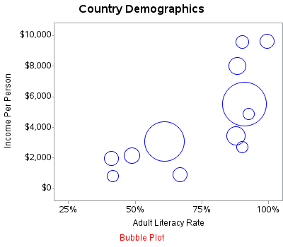
Bubble Plot
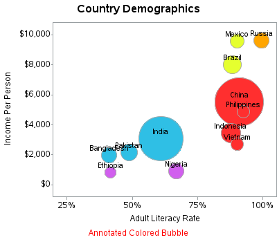
Filled Bubble Plot
And, as promised, here are links to the pdf files for the tutorial:
I'd love to hear your feedback and suggestions, and whether this kind of tutorial would be useful to you for other types of plots as well (maybe bar charts, maps, etc?) Feel free to leave a comment!
Click here to see my other tutorials on creating basic graphs!





4 Comments
Fantastic blog post and tutorials. I agree with the quote in the Introduction chapter, “A motivated SAS/GRAPH programmer can create just about any graph.”
I like the way you have stepped through the various scatter plots enhancing and describing the code. Love the power of annotate too!
With regards to your question about thoughts for future tutorials, I think maps would be useful. I'm often referring people to Chris' blog post he wrote to sasusers in Australia,
http://blogs.sas.com/content/sasdummy/2011/08/30/using-3rd-party-shape-files-to-build-map-charts-in-sas/
Thanks for the feedback!
I'll definitely put maps on the list! :)
Thanks, Robert, this is a great resource. I plan to use these examples to mentor junior SAS programmers with.
Excellent!