You've all heard about the recent meningitis outbreak, right?
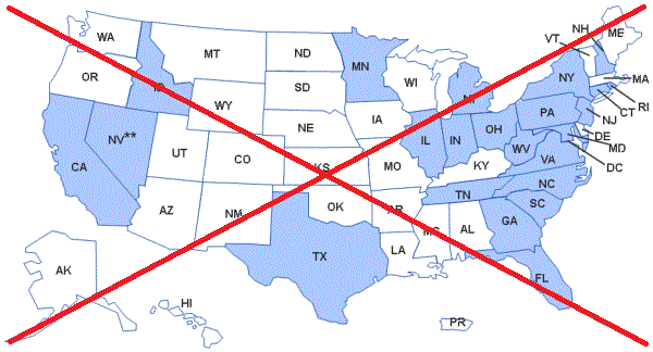
Being a data-guy and a map-guy, I went looking for maps related to the outbreak. I found the following map on the Centers for Disease Control (CDC) website. It shows the states that received the recalled drug used in epidurals (for back pain, etc) that are suspected of causing the meningitis:
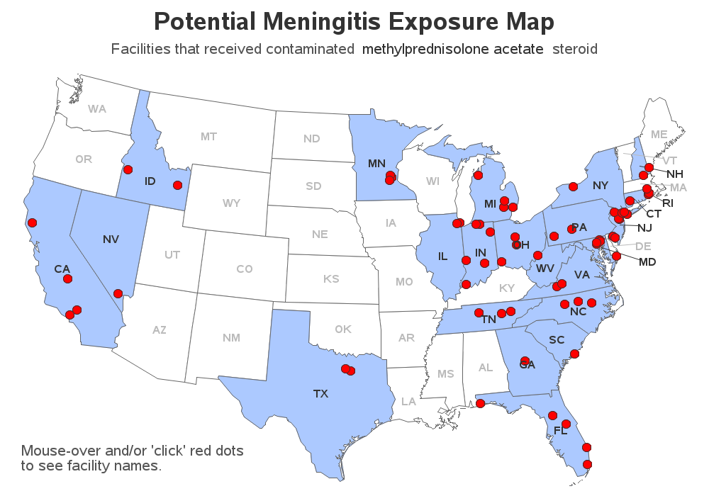
The CDC map was kind of ~OK, but I was wanting to see more detail. Below their map, they listed the individual facilities (name & address) that received the recalled drug -- it was a long list (76 facilities), and beyond the scope of me being able to visualize all the locations in my head.
If you've taken the SAS/GRAPH Mapping course, you know that there's so much more you can do with a SAS map.
So I decided to create my own map of the CDC data, and came up with the following. Click the map below to see the interactive version. In the interactive version, you can hover your mouse over the red dots to see the names of all the facilities in that city, and click the red dots to jump to a table of the facilities from that state. In the tables, you can click the facility names to launch a Google search for that facility. To me, this interactive map is just so much more useful and engaging!
How did I do it, you might ask?
Here are the technical details...
I copied and pasted the data from their HTML table into an Excel spreadsheet, and then used Proc Import to import that into a SAS data set.
I used Proc Geocode to estimate the latitude and longitude of each city in the addresses.
I used Proc Gmap to draw the map, and an Annotate data set to draw the red markers on the map.
The 'HTML' variable in the Annotate data set contains the HTML HREF tags to drilldown to the table for each state. I used Proc Report to generate these tables, with HTML anchors names for each state. I embedded HREF tags for the Google drilldowns in the text used in the tables, and when that is viewed in a browser they show up as text with a link.
I think it's a great example that demonstrates lots of interactive capabilities of SAS! If you'd like to see the actual code, here's a link.


4 Comments
Great way to compile the information. This type of graph with charts could be very helpful to healthcare professionals and consumers.
Thanks! Hopefully so! :)
While non code writers may ask "Why" or may say "Wow! You have too much time on your hands", I, my friend, am inspired, impressed, and will be looking at the code on Monday when I have my laptop.
Thanks Melissa! - That's the best compliment I could hope for! :)