Editor's note: This blog post is the first in a series of posts, originally published here by our partner News Literacy Project, exploring the role of data in understanding our world.
Charts and graphs are useful tools for communicating complex information. They allow consumers to see — rather than read or calculate — differences and trends. Charts and graphs provide readers the ability to visually consume information, answer their own questions and draw novel conclusions. Yet, these types of data visualizations are often designed to communicate the purpose of the creator. Those creators make decisions while designing charts and graphs to potentially emphasize characteristics of the data that lead users to draw specific conclusions.
Need an example? Let’s start with this chart showing life expectancy for males and females in different countries.
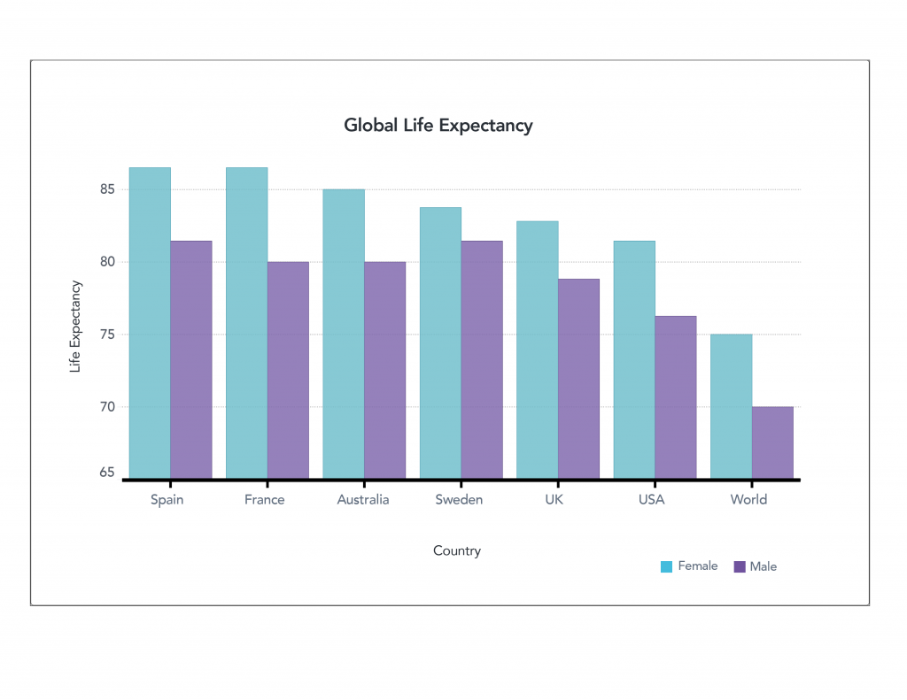
This chart was specifically designed to highlight the differences among groups. It’s very clear that in all the countries selected, women outlive men by several years. We see that the high-income countries selected in this chart have greater life expectancy compared to the rest of the world, but people in the US have a lower life expectancy than those in other industrialized nations.
If we examine the chart more carefully, we see that it violates the principle of proportional ink. This principle of data visualization recommends that the amount of ink used to represent values be proportional to the value it represents. This chart violates this principle with a truncated — or shortened — vertical axis that starts at age 65. When you look at the difference between male and female life expectancy across the world, twice as much ink is used for the female bar as for the male bar. If viewers don’t double–check the labels on the axis, this may inadvertently lead them to think that women are living twice as long as men. More likely, readers notice the labels but still perceive the difference as being very significant.
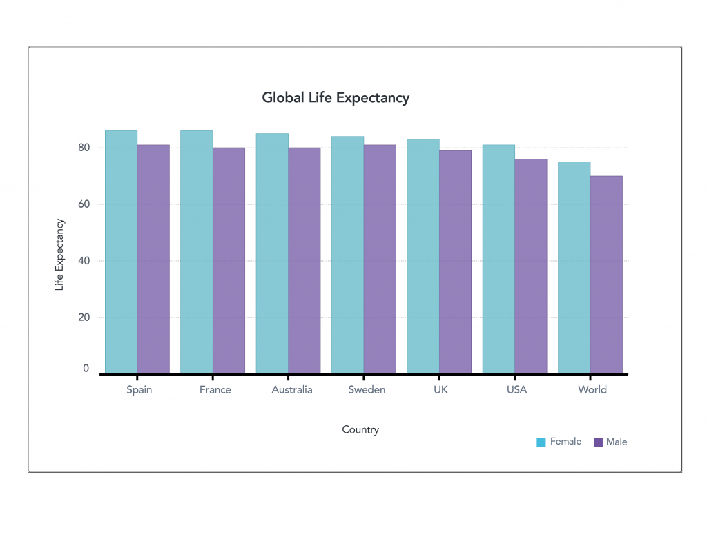
Alternatively, the above chart represents the same data but follows the principle of proportional ink. The height of each bar is proportional to the value it represents. Here, the significance of the trends is visible but much less stark. We can again see that women outlive men and that the U.S. is a bit behind the rest of the industrialized nations, but this chart highlights that the differences are a matter of a few years and not a much higher order of magnitude.
If an author were trying to discuss the differences, you could imagine that this chart would be less compelling than the first. Neither is inaccurate; they just use visual cues to highlight different aspects of the data, which can lead readers to draw different conclusions.
Looking at a line chart
Let’s explore a different approach using a line chart. The chart below shows changes in the U.S. birth rate (births per 1,000 people in the population) over time. This line appears to be moving slowly and steadily downward, representing a decline in births over time.
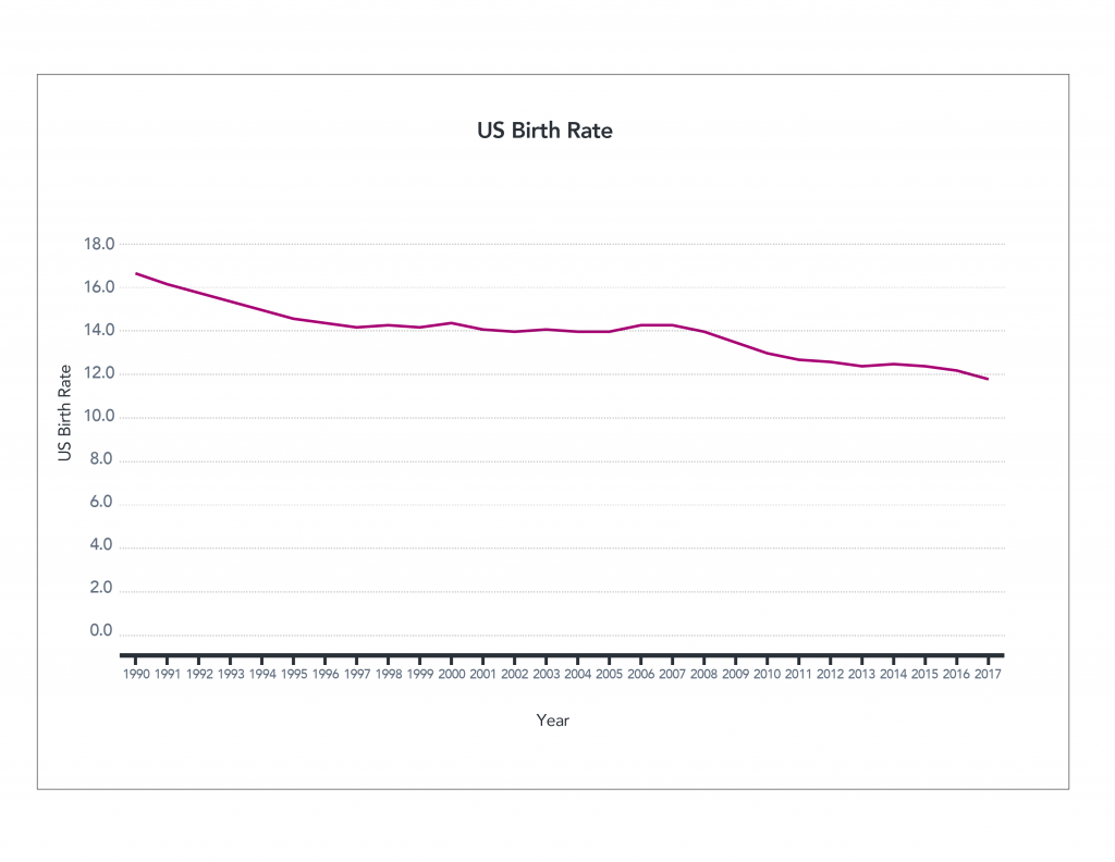
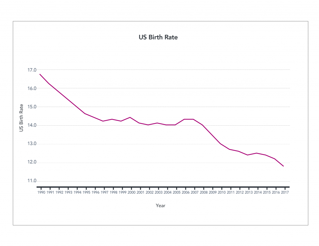
The information is correct, but what happens if we truncate the axis again?
The declining birth rates begin to look much more significant in the following chart. This visualization also highlights that the steady decline seen above wasn’t actually so steady. From 1997 to 2008, the birth rate stayed more or less the same. So which graph is accurate? Again, technically both.
Both highlight different aspects of the story using the same data. If an author wanted to highlight the pattern of steadiness from 1997 to 2008, they might use the second graph. If they wanted to highlight the slow and steady decline, they might choose the first. An author may even further manipulate the information by focusing on a specific time frame.
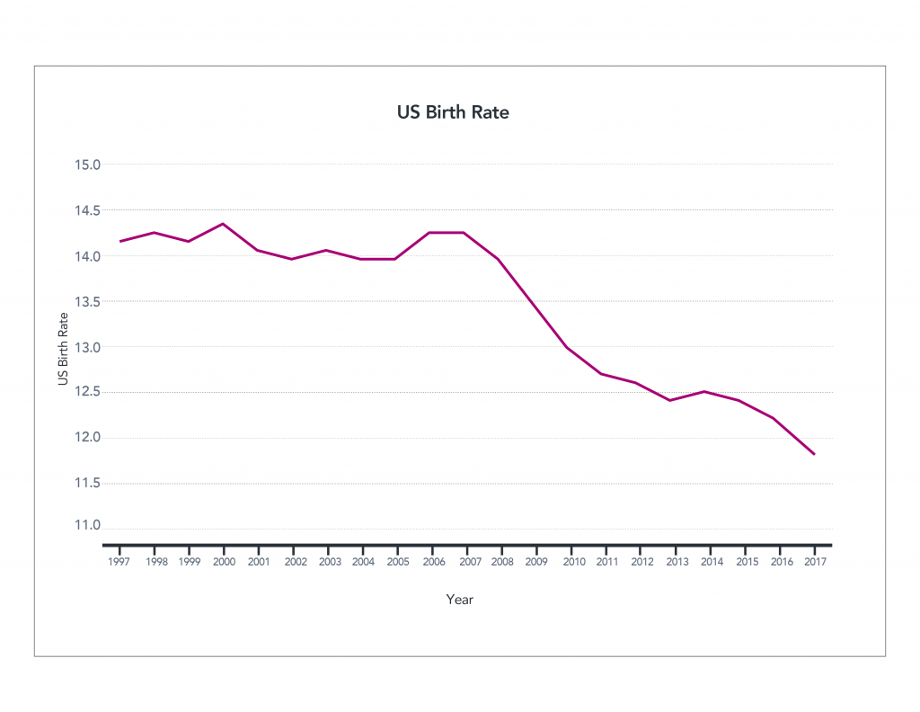
Now take a look at a graph depicting birth rates that starts in 1997, below. This data visualization makes it look like something happened in 2008 that caused a sudden, unprecedented downturn in birth rates. When we have access to the larger historical perspective, we can see that declining rates occur over the last 30 years, but the context is lost in this presentation. This could be a case of intentionally misleading the reader. The author may choose not to give the reader the full picture in order to reinforce a specific point.
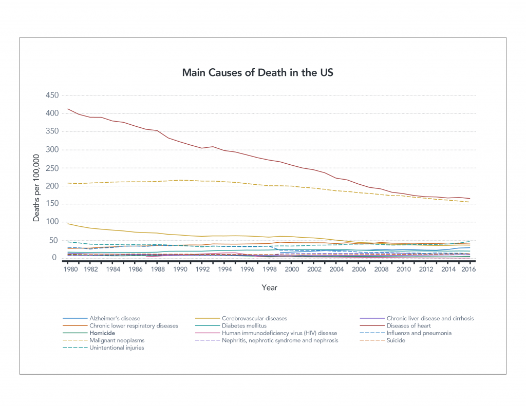
Here’s another example that may be particularly hard to interpret. Sometimes authors wish to present data that occurs on very different scales. The chart below shows the leading causes of death in the U.S. over time. Heart disease, the number one cause of death, killed around 400 people per 100,000 in 1980. The fourth most common cause of death, unintentional injuries, killed approximately 40 people per 100,000. What’s harder to see are the rates of the lowest–ranked causes of death. They’re all clustered at the bottom because of the scale of the vertical axis, making them hard to read.
Understanding a logarithmic scale
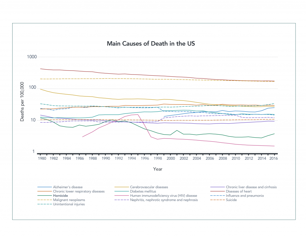
One way to fix this is by using a logarithmic scale. This means that values from 1-10 are given the same vertical real estate as values 10-100, and 100-1,000. Using a logarithmic scale can help spread out data that have significant differences in values. You then can see individual trends in each line much better. By spreading out the data in the chart below, you can see the drop in deaths from HIV much more clearly than in the first graph.
However, logarithmic scales are not necessarily something most people are familiar with, and they can be challenging to read properly. You might look at this chart and note that there has been a slight decrease in the number of deaths caused by heart disease from 1980 until now, but in reality the number has been reduced by more than half, from about 400 to 160 people per 100,000.
Both graphs have their value. One allows you to see the lower values more clearly; the other is easier for most people to interpret. Which is the appropriate one to use? Unfortunately, the answer is “it depends.”
As with all other forms of information, authors will choose the one that most accurately communicates their purpose. That purpose might be to persuade you or simply present a particular piece of information more prominently. What matters most is how you, the reader, respond to the data.
You can be a better consumer of data visualizations by examining the charts and graphs you see more carefully. Take note of whether a vertical axis has been shortened or distorted in some way, for example. Consider what the data might look like if presented differently. Examine the data that’s been chosen, what’s been left out, and if the graph tells the whole story. Could you gather more information to give the graph better context?
Asking and answering these types of questions will make you a smarter and more responsible consumer of data. You’ll be able to find the true answers behind the data and distinguish those from the information the author was specifically trying to draw attention to.
Ready to test yourself? Take our data quiz here!

1 Comment
Looking forward to seeing all the examples in this series of blog posts! - Keep up the good work!