In the early days and weeks of any widespread global health concern, particularly in a fast-moving outbreak like the coronavirus, there are many unknowns. Data visualization can be a good starting point to understand trends and piece data points together into a meaningful story. The ability to visualize the spread of the virus can help raise awareness, understand its impact -- and ultimately assist in prevention efforts.
On December 31, 2019, the World Health Organization’s China Country Office was informed of cases of pneumonia with unknown cause detected in Wuhan City, Hubei Province of China. Since its initial reporting, the new coronavirus (SARS-CoV-2) has spread in a global outbreak, infecting tens of thousands in more than 30 countries and causing the COVID-19 acute respiratory disease.
SAS has created a report that depicts the status, location, spread and trend analysis of the coronavirus.
EXPLORE THE CORONAVIRUS DASHBOARD
The underlying data is updated daily, so check back regularly to see how it’s progressing and to view the worldwide spread animated over time. Use this interactive report to:
- Find out the number of new coronavirus cases within the last 10 days and see how the virus’ infection rates, recovery rates, and fatality rates are trending.
- Discover where the virus has migrated and compare the epicenter China with the rest of the world.
- Analyze the confirmed cases to understand how the recovery rate is changing over time.
SAS Visual Analytics was used to create this report with data from WHO, CDC, ECDC, NHC and DXY compiled by JHU CSSE.
Explore the SAS Visual Analytics coronavirus report
For a rapid glance of summary information that’s refreshed daily with global statistics on the COVID-19 outbreak, start here.
Key insights from various reports are embedded in this web page, letting you view and interact with the data and keeping you updated with the latest numbers.
If you want to see more details by geography and explore the interactive report, just click on the “Full report” button at the top of the page to launch the full dashboard.
Using a dashboard view, you can easily see an overview of the COVID-19 disease outbreak based on data updated daily, including the number of confirmed new cases, recovered cases and deaths from the virus filtered by geographic location.
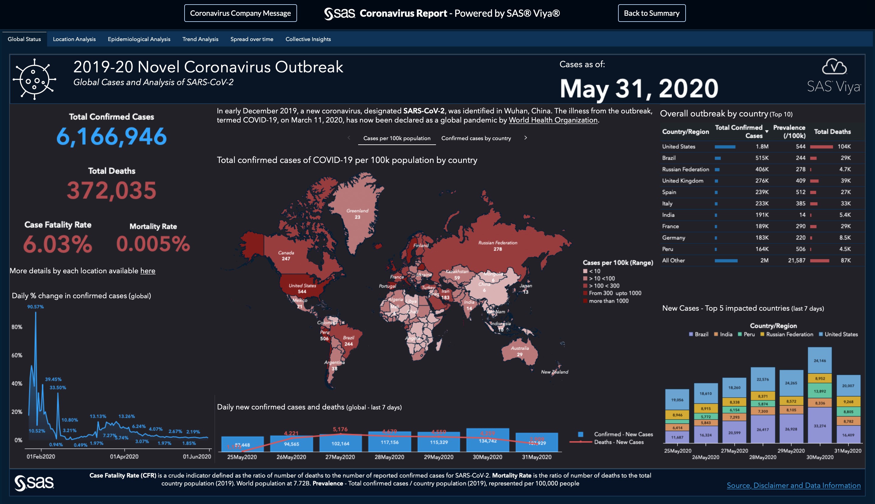
The Location Analysis Tab of the report reveals global and country-specific coronavirus data (Figure 2 below).
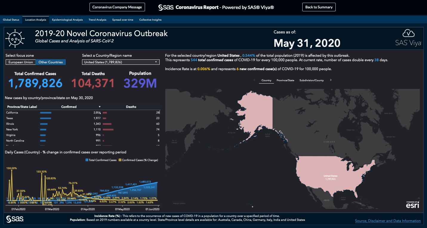
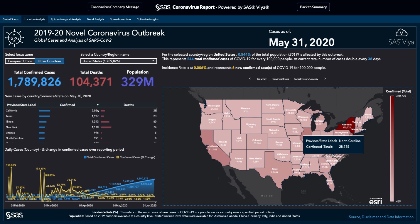
It’s been many weeks since the first case of the new coronavirus was reported in China and the outbreak has spread across the globe. By adding a layer of geospatial data from Esri’s GIS mapping software, we’re able to explore an interactive view of the spread of coronavirus across China and into other countries.
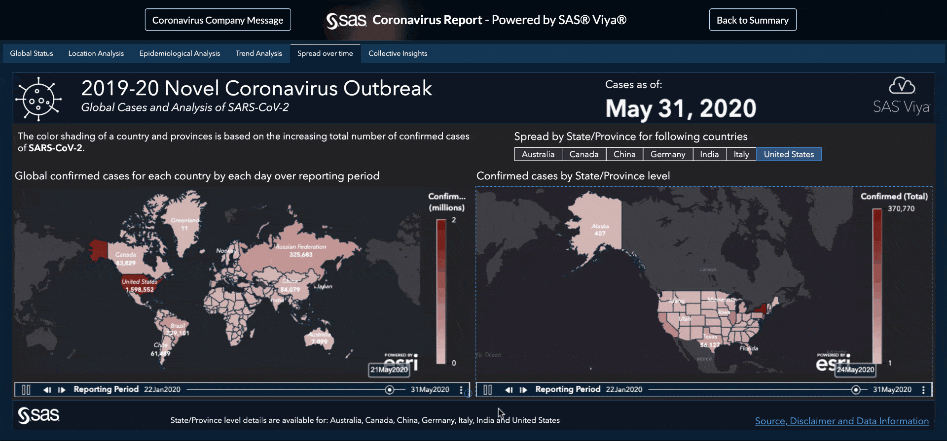
With SAS Visual Analytics, we can see a time-series animation (Figure 4 below) that demonstrates the spread of the virus across the globe and by geographic region. Play the animation to see the spread within China, as well as spread and severity across the globe.
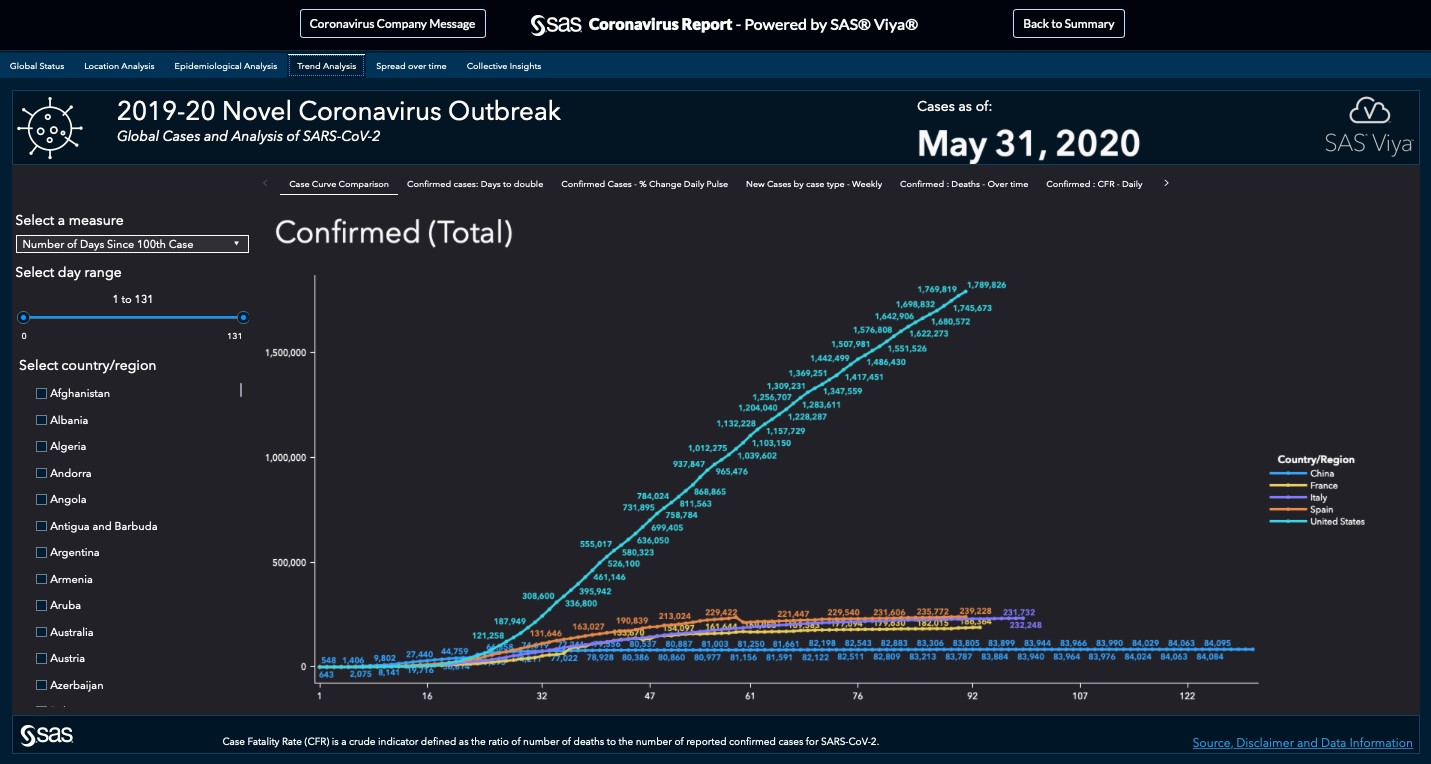
On the Trend Analysis tab, flip through the visualizations to see additional data trends related to the COVID-19 outbreak (Figures 5 below).
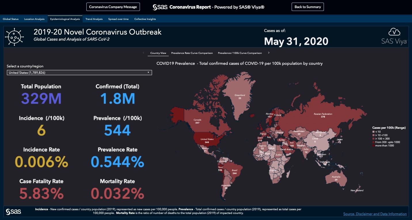
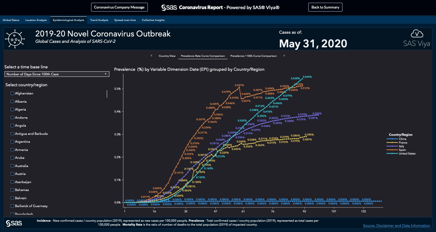
The Epidemiological Analysis tab, shows incidence and prevalence rates and compares curves by country. (Figures 6 and 7 below)
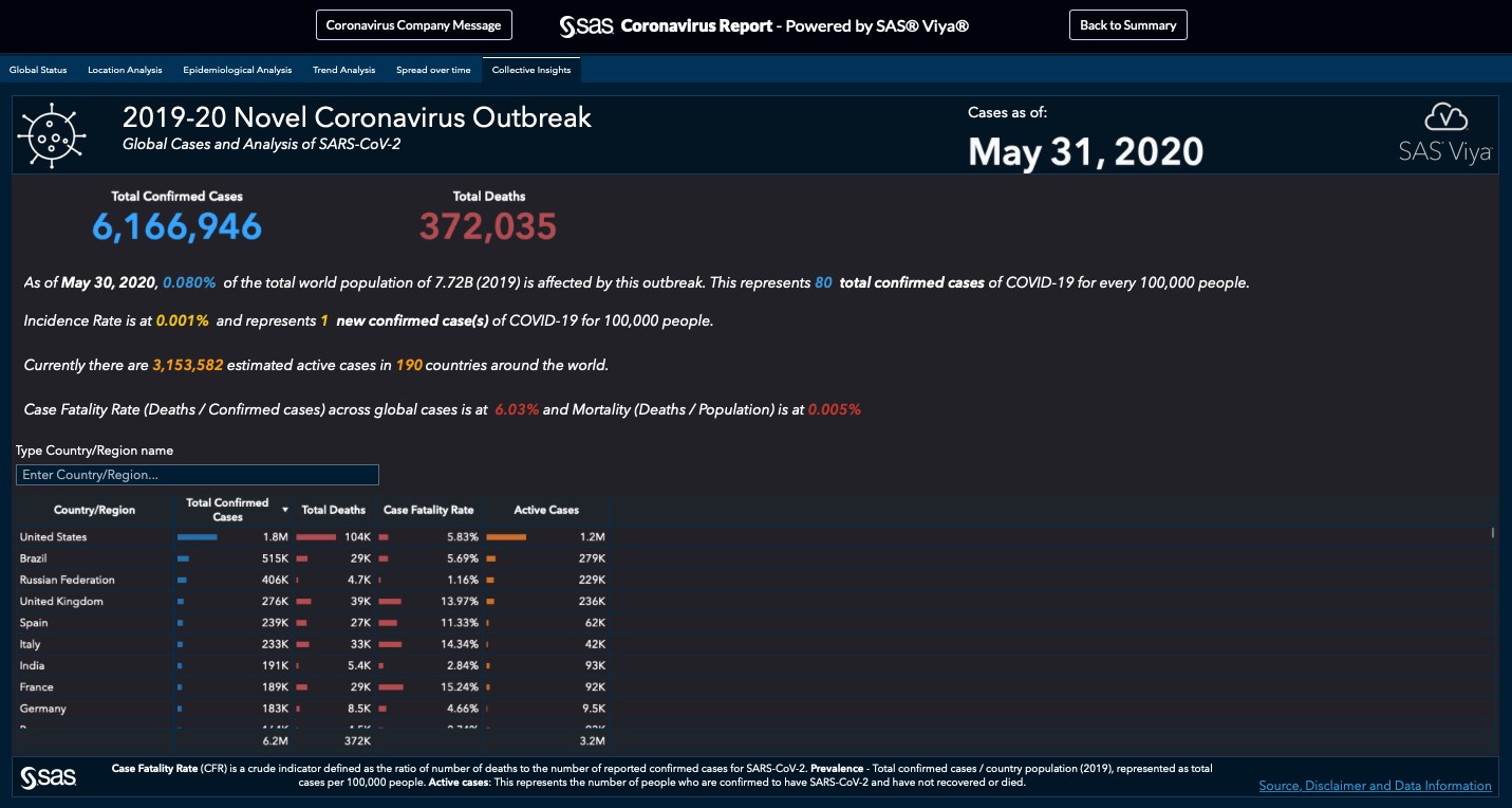
The Collective Insights tab, captures global and country-level outbreak data in one table (Figure 8 below).
What’s next
This information, presented in new ways on maps and animated timelines, is just the tip of the iceberg as public health officials and life sciences companies work to contain the COVID-19 outbreak and develop antiviral medicines to combat the disease. Data-driven techniques such as analytics and AI released on a diverse set of data points such as clinical patient records, social media streams and public health records among others can all help to refine the surveillance approaches as long as regulatory and citizen privacy laws are respected.
Further development of data science projects and collaboration within the health and life sciences industry is needed. Those interested in a code-based approach may want to check out these tips from graph expert Robert Allison.
LEARN MORE | See all Coronavirus dashboard blog posts
As the data and this outbreak evolve, so will our analytics and reports evolve to be even more meaningful to the global health community. Stay healthy and let us hear from you about ways that SAS Visual Analytics and other SAS analytical technologies can help (or are helping) shed light on the current coronavirus epidemic.
Note: Report visuals updated to reflect dashboard updates on May 31, 2020.

21 Comments
Awesome Mark ! well done. Coronavirus is not good news but at least you show how the power of SAS can be used to track and help visualizing what's going on today...
This dashboard is really beautiful and shows off SAS' functionality for data visualizations. That said, I believe the CFR you report is misleading...and just not correct.There is nowhere with a CFR of >=60% or even close. Currently Italy sits around 6% and that is significantly higher than other places. Please review and adjust so the information is either understood based on your intention or lines up with the rest of the reporting. Thanks for putting this together--
Hi Rhonda,
Thank you for all the excellent and useful feedback. We are continuously working to improve the report with your feedback and that of others. We plan to bring the Mortality Rate Change chart under the Trends page so we have more space for text/legends ; and will add a legend to remove the confusion. Please keep sending this input so we can make the dashboard even more useful.
Mark
Good catch!
Good job, Mark! it's very impressive...thank you for sharing.
Great visualisation Mark !! I am wondering is there an interactive dashboard available via SAS website?
Hi Peter, have you seen this interactive dashboard ?
Thank you for the feedback !
Mark
Beautiful Graphics! An idea to extend this functionality would be to fit the existing data points for each country and then fit these first 30 days or so to a characteristic S-curve and then project out (expected cases and margin of error) the next 30 days or so.
Hi Mark,
This is a brilliant visualization! I shared this with my data team last week and they are all impressed. But when I came back to check the latest data today, I surprisingly found that you combined Taiwan and China as the same region and they were separated late week. Taiwan has its Disease control center set up even before the first case showed up in Taiwan to coordinate efforts against the coronavirus. Health experts and media outlets all over the world recognize Taiwan’s successes in containing COVID-19. Taiwan also builds a partnership with the United States not only on exchanging medical supplies but also on sharing research information about rapid tests and vaccine development. We should know that Taiwan is a totally different country from China. I hope you can switch the region split back on the dashboard. Again, I love your dashboard so much so I hope this feedback can help it become better. Thank you!
Hi Eileen,
Thank you for the great feedback. My sincere apologies on the map error. This is due to a technical problem and our teams are working on right now. We are constantly updating and improving the report ; unfortunately that has resulted in an issue like this. Keep sending the feedback and let us know if you need any further help !
Best wishes,
Mark
Hi, I have two suggestions. (1) We may also show usefulness of preventive measures based on past data using visualizations. (2) We should also show treatments and its results using visualization so that this information may be useful to medical professionals. We may also show usefulness of preventive measures based on past data.
For the first idea we do get guidelines as preventive measures such as washing hands frequently. However, if there is any past data that provides additional guidance to general public. It will increase people's acceptance of the guidelines. Getting data related to preventive measures could be huge task.
Second idea would be useful to medical professionals worldwide. Thanks for reading this.
I think this is an informative post and it is very useful and knowledgeable.
Thank You for this great Dashboard and Graphs. Data for "recovered cases" is no longer showing, will this be reintroduced?
I like a lot of this, but I'm hating the stacked bar graph of the Top 5 Countries. No interpretations or take-aways are intuitive without a lot of mental work. Why Top 5, instead of Top 8 (to pick another arbitrary number)? What happens when "was number 7" leaps up in the charts to become #4 with a bullet? Are we not interested in the trend of the world-wide totals?
Digging into my Tufte collection to see if he has an opinion of stacked bar charts.
But IMO the information this visualization is trying to present would be better served by a different format.
Great visualization!!!, but because of very different testing rates in contries the mortality rate you show is a bit misleading. You should rather show a mortality rate compared to population, so the number for USA is about 12 dead pr million citizen.
Hi Jacob. Thanks for the feedback ! The mortality proportion is a statistically crude indicator defined by confirmed deaths (tested positively for SARS-COV-2) from COVID-19 divided by known cases - the real CFR will only be known when this pandemic is over. You are right that we don't know the outcome of many cases just yet and these are censored. The crude CFR has been recognized as a useful way of reporting during the pandemic even though other metrics are equally important.
If you hover over the mortality rate, it explains exactly as you say. In addition, have you seen the epidemiological tab in the report with incidence and prevelance calculations ?
I don't see a link to the SAS code. Is that not public yet?
Hello - some of the SAS code is being made publicly available through the covid-19 sas github.
It is good report. My question how to make the report public view ? without login page in SAS Viya?
Hi Subhash, the report is currently using SAS Visual Analytics on Viya technology and is indeed available for public consumption.
"Thank you for sharing such great information.
It has help me in finding out more detail about managing spread of coronavirus"