 March Madness is in full swing. And the success of the Dance Card formula powered by SAS -- along with stories about teams like the New York Mets, the Boston Bruins, the Orlando Magic and more, all using analytics -- demonstrates how sports and analytics are becoming more and more entwined.
Every year our Research & Development division participates in March Madness by filling out a bracket to crown the winner with the most correct picks. As our newest product, SAS® Visual Investigator, rolls around to its next release, I thought this would be a good opportunity to use the product to help make sense of the NCAA tournament bracket -- and hopefully help me win in the process. Coming from a quality assessment perspective, it would also allow me to test the application end-to-end in a new avenue.
First a disclaimer: While many sites already do a similar analysis, I wanted to see how our latest offering of SAS Visual Investigator would go about performing the same analytics. Obviously, this model can be as complex or simple as you want to make it. I decided to take a simple approach that would resonate with many others and that they could easily apply. In addition, stats can help predict future outcomes (often with startling accuracy), but they can't account for unforeseen circumstances such as injuries or bad officiating.
My data consists of:
- Tables for teams and their stats for the year, with added information for seeding and site information.
- Table of all players in the tournament and their stats.
- Table of the venues and their locations.
For some nice visual association, SVGs of each school in the tournament were loaded into icon management. Through the use of the icon decoration feature, we added these to each team icon in the network visualization. The icons were also decorated with the seeding information for those teams in the tournament.
{
"team": {"src": "{{team}}", "position": "S"},
"seed": {"text": "{{seed}}"}
}
This json generates these type of icons for each of our tournament team entities:![]()
Relationships were then created to link the players to their associated teams. As an added bonus, conferences were resolved for all the teams to provide additional relationships. That gives us a network like the one below to explore:
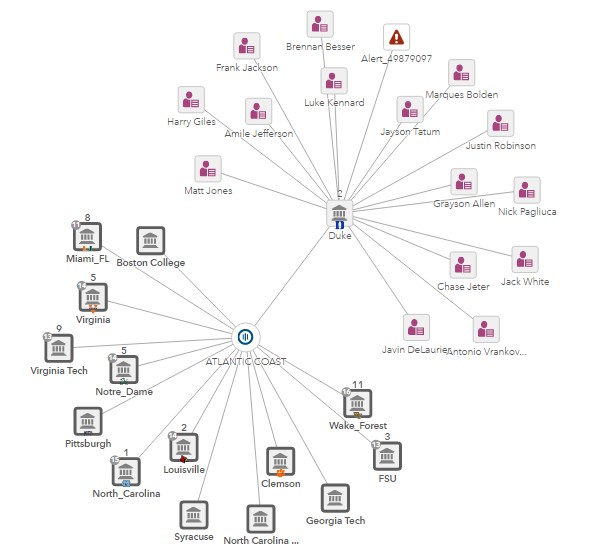
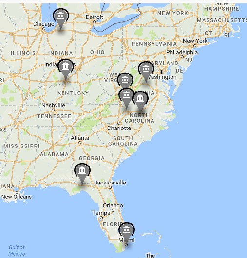
Using a Google API to pull in geo coordinates, we are able to switch this view with teams expanded from the ACC conference on to a map.
With the data loaded, I turned my attention to Alerting. When creating scenarios for Alerting, a certain amount of domain knowledge is needed, much like an AML expert crafting fraud scenarios. I'm no domain expert, but have spent many hours (maybe too many....) watching ESPN. I designed my scenarios this way based off the history of NCAA and basketball.
In the case of alerts, we tend to box alerts in as a negative action, but I wanted to highlight that alerts can also be a positive notification in that I want to be notified of teams playing particularly well. With that in mind, I could accomplish this in many ways with Visual Investigator, either with the use of a Scorecard Scenario or the use of Alerting Domains. I chose the latter because it provided a clearer separation of the teams through the use of queues and allows me to have more than one alert on a particular team. Two strategies were created from this:
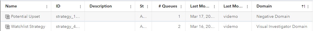
With two queues for the Watchlist Strategy:
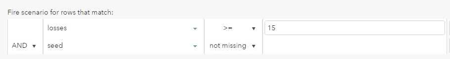
 With the queues set up, it was time to send through some alerts using the Scenario Administrator. These scenarios were based off general NCAA history success knowledge. Obviously the more scenarios you write, the better accuracy of the score. Some example scenarios include:
Teams with more than 15 losses usually never win a game in the tournament:
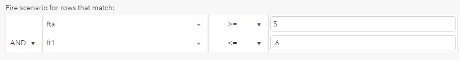
Teams with high frequency poor free throw shooters can be bad in close games:
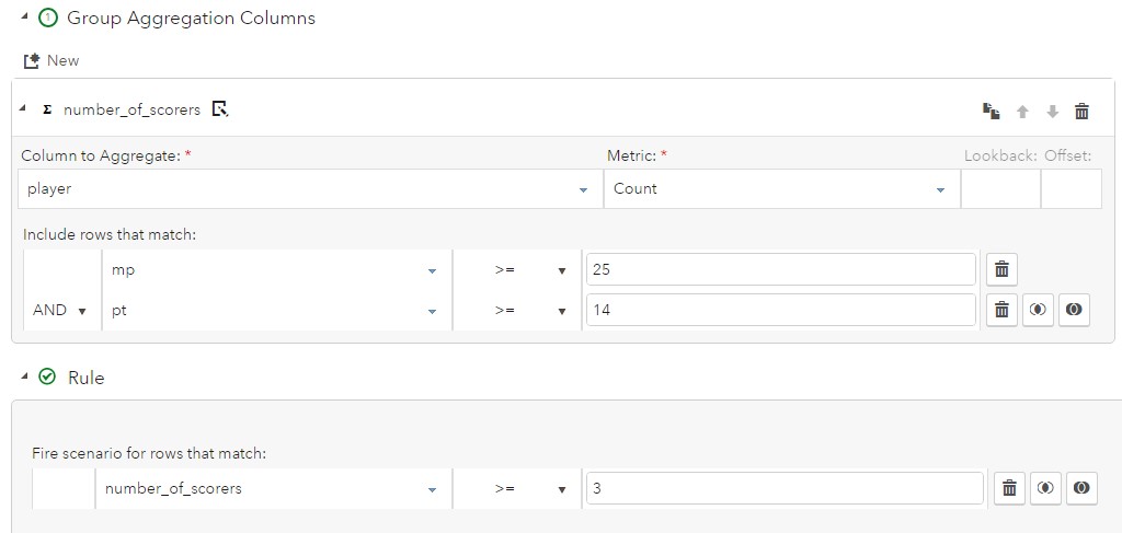
On the positive side, a grouping scenario for a team with multiple scoring threats:
 Other quantifiable factors play into team performance as well, such as time zones or travel distances. With the geo location for each venue loaded, we can generate scenarios around this data as well. The hardest part around this scenario is calculating distance using only latitude and longitude, which can be done through using the haversine formula after converting degrees to radians:
| Haversine formula: |
a = sin²(Δφ/2) + cos φ1 ⋅ cos φ2 ⋅ sin²(Δλ/2) |
| c = 2 ⋅ atan2( √a, √(1−a) ) | |
| d = R ⋅ c | |
| φ is latitude, λ is longitude, R is earth’s radius (mean radius = 6,371km); |
With the alert generation process kicked off, alerts start landing in our queues and as you can see in our network diagram above as well.
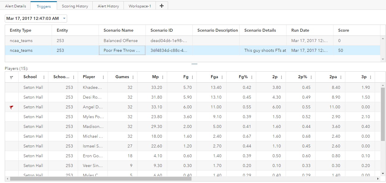
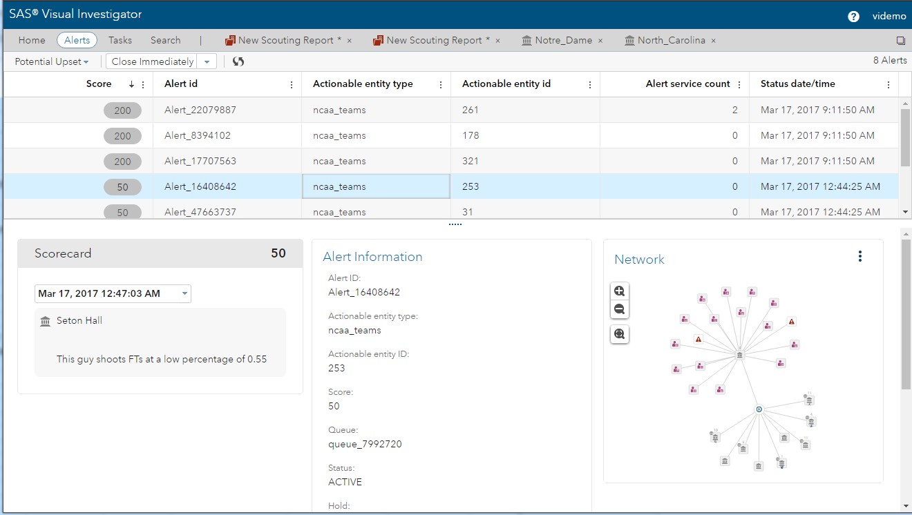 Further exploration allows us to look at the alert and see which pieces of data, or contributing documents, triggered the alert: For example, the poor free throw shooter on the alerted team:
 To build a case and disposition alerts on teams as they come in, I configured a scouting report as an internal entity type. This entity could be used to store investigation information as images, networks and insights. Even if a team did not have an automatic alert associated with it, an investigator could still enable a manual alert on the team as a result of such investigation.
With all the visual and investigative features that SAS Visual Investigator provides, it helps bring a little more clarity and hopefully eases some stress in bracket selection. In the end, though, they call it madness for a reason that even the most rigorous analysis cannot take into account!
See what you can do with SAS Visual Investigator -- try it for free for 14 days.

1 Comment
what a great way to analyze march Madness! Go Heels!