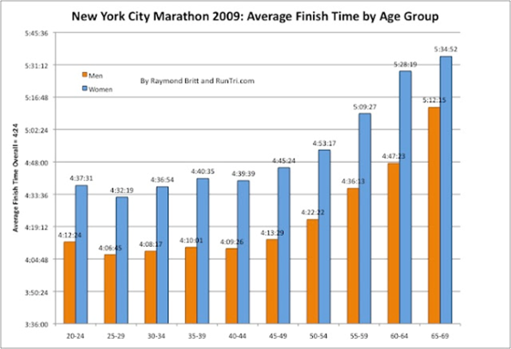
I read an article recently discussing how runners inevitably slow down with age, particularly after 50. Data from the New York Marathon and Boston Marathon back this up with generally flat average finishing times for ages 20-49 followed by a steady, almost exponential, increase after 50.
I haven’t reached the big 5-0 yet, but it made me wonder: Have I started to slow down already? I decided to use SAS Visual Analytics and my training data from my Garmin GPS watch to try to answer that question.
I started by downloading all of my running data, all 11 years, into a CSV file which I then imported into SAS Visual Analytics Explorer. A quick look at the full range of my pace let me know that my data needed some cleaning up. I’ve run some fast races, but a sub-6 min/mi isn’t really where I’m at. It turns out there was some biking data mixed in with my running data which accounted for those speedy times. On the other hand, it’s pretty rare that I would go above a 9 min/mi either. Those turned out to be some runs that I did with my then nine-year-old daughter who was training for ‘Girls on the Run’.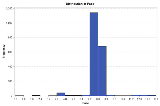
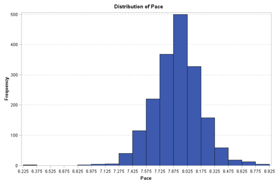
With some Data Source filters in place, my data was looking much more like I expected.
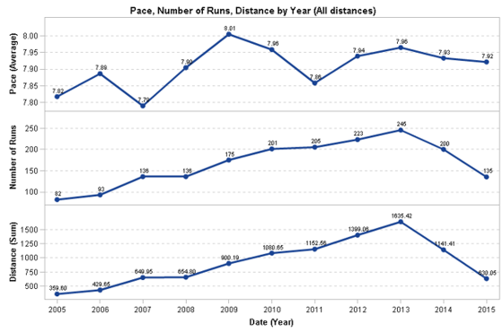
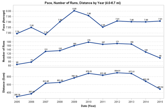
I plotted my average pace for each of the last 11 years. I also include the number of runs and the total distance run so I could see how the years compared. I could quickly see that my overall pace did decrease from 7.82 min/mi to 7.92 min/mi or 6 sec/mi. However, the data also showed some other, possibly more interesting, trends. For instance, my total mileage increased steadily until 2013 and then dropped off. While it may seem like I’m getting lazy, this is actually due to running accident I had in late 2014 in which I fell and fractured by elbow and hip socket. That injury prevented me from running in the last four months of 2014 and then a back injury while returning in 2015 caused me to lose several more months. Hopefully, my upward trend will return again.
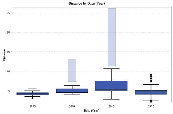
This data made it obvious to me that the types and lengths of runs I’m doing now is very different from where what I was doing in 2005 when I was still fairly new to running. It made sense to look at just how different it is. I decided to look at a box plot of the run distance for a few interesting years. I included the first and last, plus 2009 which seems to be my slowest, and 2013, which is the year I ran the most, including my first marathon. What is obvious is that I ran mostly short distances in 2005, mostly between four and five miles with nothing longer than 5.6 miles. In 2009, I started going longer. In fact, it was the year of my first half-marathon and my normal range was between 4.5 and six miles with a long run of 13.1.
By 2013, my typical runs were five to 7.5 miles with a decent number of runs between 10 and 26 miles. Clearly, it’s not really a good comparison of pace when the types of runs are so different. I can’t expect to run the same pace for 20 miles as I would for five miles.
So, I decided to just look at similar distance runs and see how my pace compares. I filtered to just include runs with a distance between four and 6.7 miles. In this range, the pace numbers didn’t really change much which was unexpected given that I removed the longer, presumably slower runs.
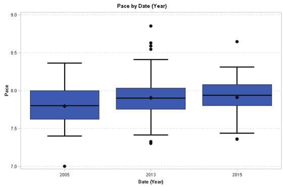
To understand this better, I looked a little deeper at the pace statistics across the more interesting years of 2005, 2013 and 2015 using a box plot. It showed that my pace is more consistent now then it was in 2005, but there were some outliers which were also a surprise. What were these relatively short runs that had such a slow pace?
I selected the outliers from 2013 and 2015 and created a selection filter to just include those entries. I converted to a list table to get information about each run. I used the dates to go back to my original running log to put the entries into context. It turns out that most of my slow runs were after really big runs during marathon training. This is a combination of being tired plus intentionally running slow to help recover after the long run. The other slow run this year was a particularly hilly run in the mountains of North Carolina.
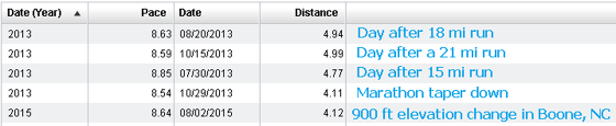
I annotated the screenshot in blue with the additional context about the run.
This led me to realize that runs are not independent activities. A run on any particular day could be affected by the previous day or days. I also realized that I ran a lot less often in 2005 than I do now, typically running three to four days a week compared to five days now, as shown when plotting the Number of Runs by month. Running less often would have provided more rest and a lot less fatigue that might reduce my overall average pace.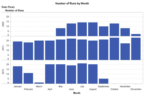
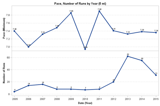
Given what I had learned so far, I decided to just look at my fastest pace for a very specific distance of 5 mi. I plotted the minimum pace over the years. In that scenario, my fastest paces in 2015 is just about 2 seconds faster than 2005, an insignificant amount.
Overall, my conclusion is that my pace is really pretty consistent at this point which is what the data from the general running population would predict given my age. I will be interesting to see how long that will last and plan to revisit my analysis periodically to see how I’m doing.

2 Comments
Love this stuff.... Great presentation of data.... Unfortunately for me, I already knew that I slowed down after 50.. the analytics would show me by how much... but not sure I really want to know that :). Any jobs at SAS for a career SAS user with a passion for data???
Great post!