There are 650 seats in the United Kingdom's House of Commons, but the result of this year’s general election is widely expected to hinge on the decisions made in under 150 constituencies.
Undecided voters are watching the political agendas closely to help them decide which party they want to run the country. Already, we have seen the flux of floating voters impacted by the media frenzy during the leaders’ debates.
Over the last year Conservative Peer and professional pollster Lord Ashcroft has been polling the election's 146 most marginal – or closely fought – seats. It will be these constituencies that will be the deciders on May 7.
The May2015 website, pulled together by the data journalists at The New Statesman does an admirable job of tracking the latest polls and predicting the fall out in 150 of the UK’s most vulnerable seats.
Since the Second World War six of the last 18 governments have been majorities. However it seems inescapable that 2015 will result in a hung parliament. This year it’s not only likely that no party will obtain a majority, but that it’s conceivable that the joint vote share of the two main parties could be under 60 per cent.
 The most seats wins but as each of the 650 seats has to be earned one by one, voter location is paramount. And inevitably coverage of the results focuses relentlessly on how sentiment is mapping across the country.
Whether it was the 80’s style walk on maps for TV presenters, or the rise of animated infographics like the BBC’s floating voter worm, mapping data is an essential part to how we predict election results. However, this year a huge number of individuals, agencies and news organisations seem to be getting in on the action of mapping their own data sets.
If you're SAS savvy (of course you are) here’s an experiment to try it yourself.
 The Ordnance Survey provides open source data for government boundaries and using SAS it’s a simple matter to plot the results.
The Boundary-Line data is available for download as a Shape ‘SHP’ file and response data as a ‘DBF’ file. You can combine this data with the polling results or any other open source results data (such as the social media data referred to in my previous blog post) to create datasets exploring the election outcomes across the UK.
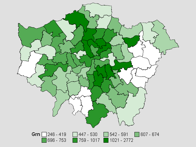
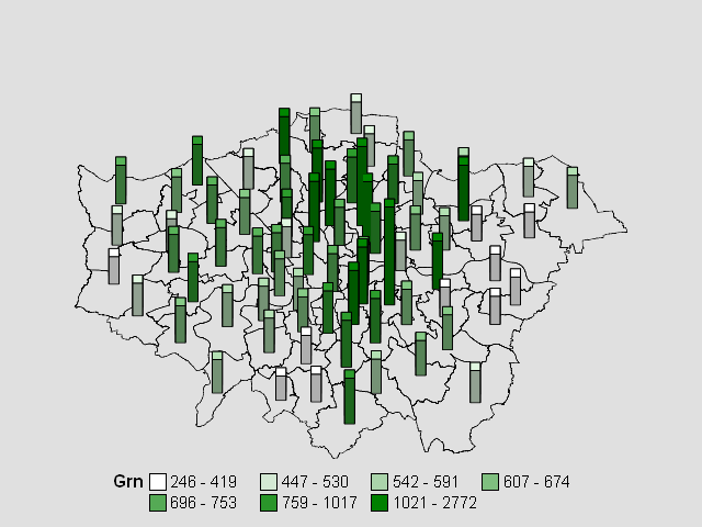
Here, I have zoomed in on the Green Party vote in London. Using SAS’ data analytics tools, I created a choropleth map to illustrate the number of votes in each borough. You can see this map above. The more votes the Green Party got in 2010, the greener the constituency. You can find out more about how I did this in my accompanying blog. An alternative approach to viewing the data is by green blocks as illustrated in the second map.
The Boundary-Line data is free for download, so you to try this yourself and share your findings with us. In the meantime, if you’re keen to find out more about government data and how analytics is shaping the future of our political thinking, check out our research with Civil Service World on big data in the public sector.

1 Comment
I didn't know you could get open source shape files from Ordnance Survey so many thanks for that.
Interestingly on the BBC Web Site there's an article which aims to show the relative bargaining power of the parties in the event of a hung parliament using something called the Banzhaf Power Index http://www.bbc.co.uk/news/32264701 - I must see if I can incorporate that into an infographic 🙂